April 10, 2026 • 17 min read
April 10, 2026 • 17 min read
The beauty category on Meta is one of the most visually saturated advertising environments that exists right now. Every scroll surfaces another serum, another foundation claim, another transformation promise. Most of it blurs together within seconds.
The ads that actually stop people in 2026 are not stopping them by being more beautiful than everything around them. They are stopping them by being more specific, more unexpected, or more honest. A close-up of real skin with freckles and a bold headline cuts through a feed full of studio-perfect faces precisely because it looks different from everything else running in that category. A grid of 48 foundation shades arranged in a top-down flatlay communicates inclusivity more effectively than any headline ever could. A celebrity couple with pimple patches gets shared before the paid campaign even needs to work.
Every ad on this list was chosen because it teaches a distinct lesson. No two brands are doing the same thing. That variety is deliberate — because the goal is not to copy any single ad, it is to understand the thinking behind it well enough to apply it to your own product and category.
We are still in the first half of 2026, so this list reflects what is actively running and performing right now. We will update it as more campaigns go live and more data comes through.
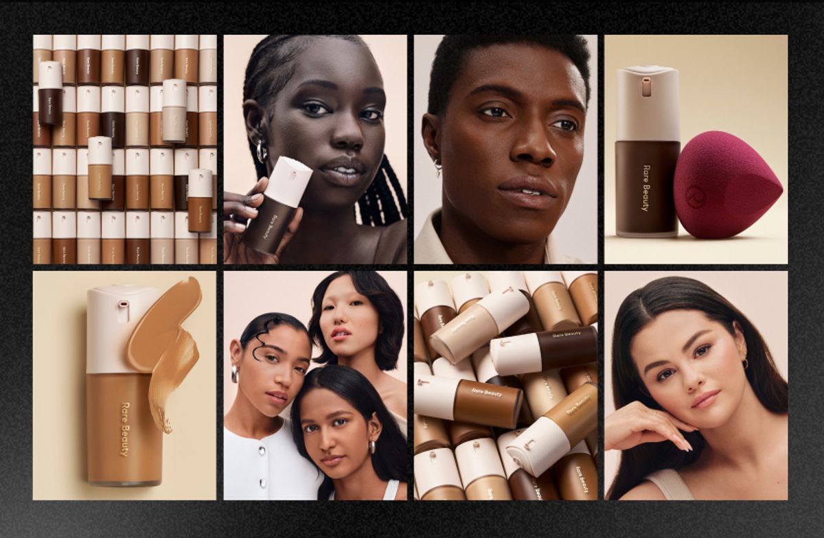
Rare Beauty — 48-Shade Foundation Grid
You know how most brands say "inclusive" in their caption and then show three foundation shades? Rare Beauty just showed all 48. Shot from above, arranged side by side in a grid, zero copy needed. The product does every single thing the headline would have tried to do - and does it better.
The caption runs a simple checklist - self-priming, self-setting, blurs and smooths - stacking benefits in the same clean rhythm as the grid itself. The whole thing feels like a product catalogue page that somehow became the most satisfying thing in the feed that day. 61.5K likes suggests it was.
What makes this worth studying is that there is no persuasion happening. There is only evidence. You look at 48 shades lined up and you either see your shade in there or you do not. That is a more powerful inclusivity argument than anything written language can construct.
The top-down flatlay is one of the most underused formats in beauty advertising. When your product has genuine range - shades, sizes, variants, finishes - arrange all of it and let the volume make the statement. No lifestyle context needed. No model required.
Stop writing "inclusive" in your copy and show your range instead. A grid of 48 shades is more convincing than any tagline you could write, because the viewer can see it rather than just read it.
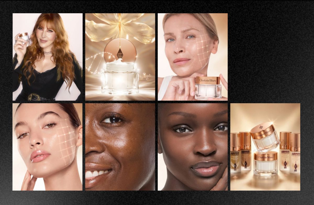
Charlotte Tilbury - Magic Cream Product Hero
Sometimes a static does not need graphical elements. It just needs to capture the emotion of wanting something.
Charlotte Tilbury's Magic Cream campaign does exactly that. Gold packaging, editorial lifestyle photography, clean layout. No aggressive CTA, no discount sticker, no benefit bullet points overlaid in bold text. Just a cream that looks like it belongs in the bathroom of someone whose life is already figured out. The copy on the product page calls it "a facelift in a jar" that "revives the look of skin in 28 seconds" - but the static itself does not work this hard. It trusts the visual to do the persuasion entirely, which is a very confident creative call that most brands are too nervous to make.
The new Magic Cream launched in March 2026 with a supercharged formula featuring a world-first Recoverstem Peptide - and the campaign creative reflects that confidence. There is no need to explain the innovation when the packaging already communicates premium and the aesthetic communicates trust.
When the packaging is genuinely beautiful, frame it and get out of the way. The busier you make the layout, the less premium the product feels. Restraint is a creative decision, not an absence of one.
Premium buyers do not need convincing - they need to see the product in a world they want to live in. If you are selling at a $100-plus price point, your static should feel like editorial coverage, not advertising copy.
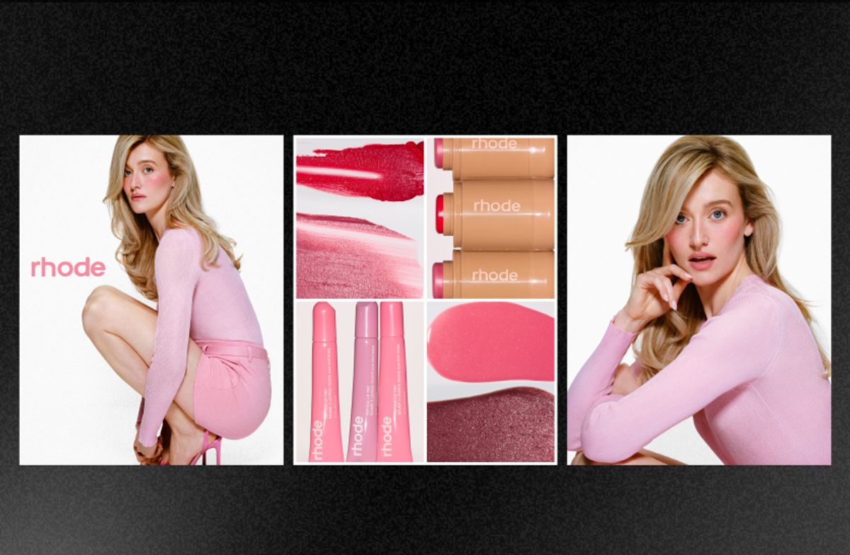
Rhode Skin — Sarah Pidgeon Tennis Editorial
Rhode put their product inside a tennis world and then deliberately forgot to make it look like a product ad. That is the entire strategy.
Sarah Pidgeon is an athlete, the setting is sporty and sun-lit, but the imagery reads fashion-forward and feminine rather than "sports campaign." The product appears naturally within the frame rather than being held up to camera with a branded smile. You could mistake this for a magazine spread, which is exactly the point. The sport gives cultural context. The fashion-forward framing gives aspirational lift. Rhode just shows up looking effortless inside both.
This is how a celebrity collab avoids looking like a paid post. The cultural moment does the heavy lifting. The product just lives inside it.
Do not centre the product in a celebrity collaboration. Put the talent in a world first and let the product exist within it naturally. The editorial context creates more desire than a product-forward composition ever will.
When you partner with a talent, give them something interesting to exist inside - a sport, a location, an activity. Context creates credibility in a way that a clean white backdrop with a held product simply cannot.
Rhode Skin — Anok Yai Lip Close-Up
One supermodel. One close-up. One set of lips. Nothing else.
This is the clearest example on this entire list of a static that does not need graphical elements. It captures the emotion — desire, texture, want — without a single word of copy or a single design element beyond the image itself. The Peptide Lip Treatment is almost secondary to what you are actually seeing, which is skin. And that is what makes you want the product.
In a feed full of cluttered beauty layouts, this single frame stops you cold. Not because it is flashy. Because it is so completely and deliberately minimal that it registers before your brain has time to scroll past. Rhode proves here that restraint is not a budget constraint - it is a creative choice that takes genuine confidence to commit to.
For lip, eye, or skin products - try stripping everything away and shooting one extreme close-up. No background elements, no text overlay, no graphic framing. Texture and proximity become your entire creative.
The best statics sometimes have nothing to copy technically. The lesson from this one is permission - permission to do far less than you think you need to. One image. One emotion. Done.
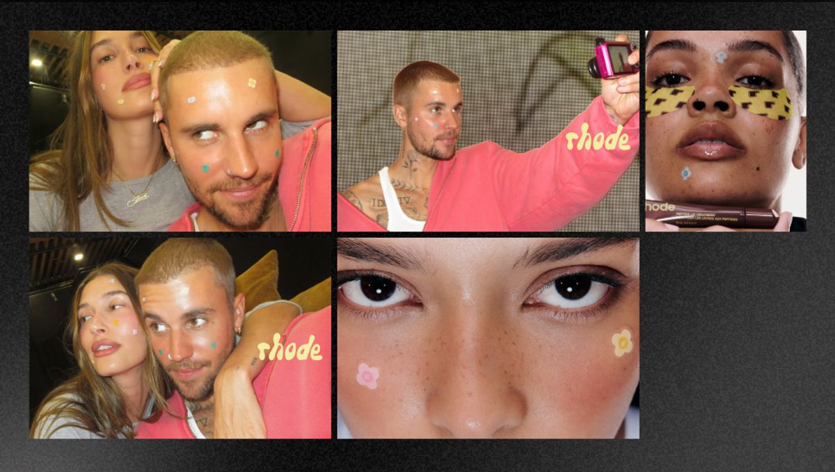
Rhode Skin — Hailey and Justin Bieber Spotwear Pimple Patches
Pimple patches on a celebrity couple. Deliberately unglamorous. Visibly human. And somehow the most magnetic thing Rhode has put out this year.
The power of this image is that it removes every layer of aspirational distance. These are two of the most photographed people on the planet, showing up with patches on their skin like everyone does on a Tuesday morning. That honesty is what made the image travel organically before the paid campaign even needed to do its job.
Rhode has now run three structurally different static formats across early 2026 - the editorial sport campaign with Sarah Pidgeon, the extreme close-up with Anok Yai, and this celebrity candid with the Biebers. Each one targets a different emotional moment in the purchase journey. That is not a coincidence. It is a creative system, and the system is the real thing worth stealing here, not any individual ad.
The candid aesthetic is a deliberate creative decision, not an accident. Low polish, real moments, unglamorous honesty - all of these need to be designed carefully to feel like they were not designed at all.
For any acne, skin-condition, or skin-positive product, removing the glamour is your most powerful move. An imperfect celebrity in your product earns more trust in a single frame than a perfect model earns across an entire polished campaign, because it gives people something to actually believe.
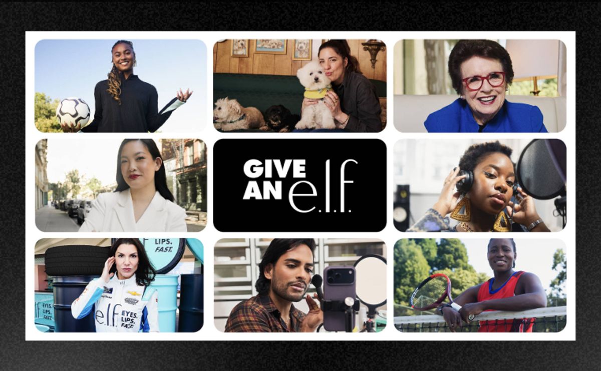
e.l.f. Cosmetics — "Give an e.l.f." Typography Campaign
No product. No model. No lifestyle imagery. Just bold typography, a bit of wordplay, and people staring straight down the camera who clearly give a damn about something.
The "Give an e.l.f." campaign works because the brand name is simultaneously the joke and the punchline. It turns e.l.f.'s annual impact report into a cultural statement - featuring Billie Jean King talking about board diversity, a NASA astronaut talking about women's rights, a Paralympian, a dog groomer, and a professional soccer player, all answering the same question: what do you give an e.l.f. about? The campaign ran across 40 digital screens in Penn Station, a two-page spread in the Sunday New York Times, and across social and digital — and it somehow feels native to all of them.
This is the most unusual ad on this list because it does not sell beauty at all. It sells belonging to a company that acts like it means something. And as it turns out, that sells beauty better than beauty advertising usually does.
Typography-first statics are the most shareable format in beauty right now because there is something worth sending — a joke, a feeling, a line that lands. No product for the viewer to consider, no look to aspire to. Just language that makes you feel something.
If your brand name or tagline has any wordplay potential, build a campaign around the language itself rather than the product. e.l.f. has been doing this for years and it keeps working because wit ages better than aesthetic trends do.
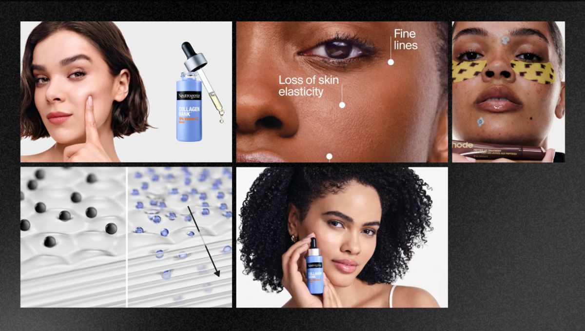
Neutrogena — Collagen Bank Clinical Lineup
"You lose up to 1% of collagen each year. Starting in your 20s."
That is the hook. Everything else is product and proof.
Neutrogena's Collagen Bank campaign is built on a single uncomfortable fact delivered with the calm confidence of a brand that already has the answer. The visual is clean — white background, product lineup, nothing competing for attention — and it borrows the visual grammar of a clinical trial rather than a beauty campaign. The patented Micro-Peptide Technology claim, the "2x smaller than leading anti-aging peptides" positioning, the Allure Award badge sitting quietly in the corner — all of it stacks clinical credibility without ever feeling cold or intimidating.
This is the anti-anxiety skincare ad. The fear is real, the solution is clear, and the brand comes across as the adult in the room who has already figured it out.
White background, products lined up, nothing competing for the eye. This format signals confidence. You do not need styling or a lifestyle context if your product can carry the frame on its own.
Lead with the uncomfortable truth that your product solves. "You lose 1% of collagen a year starting in your 20s" is a more compelling hook than "visibly younger-looking skin" because the fear is specific and the viewer can verify it. The scary fact is the brief. The product is the answer.
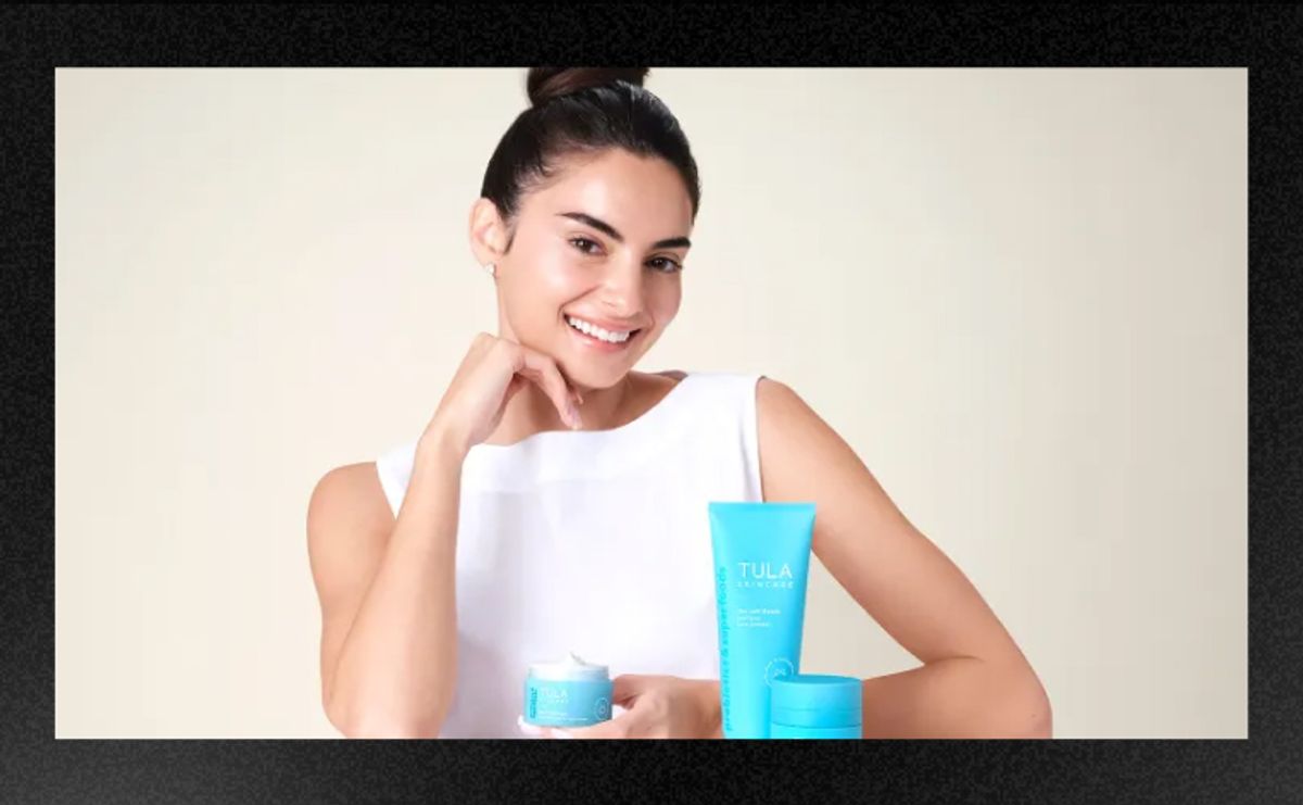
TULA Skincare — Paige DeSorbo Campaign
TULA turned a People Magazine interview into a campaign. Or maybe it is a campaign that looks like a People Magazine interview. The fact that it is hard to tell is the entire strategy.
Paige DeSorbo is casually holding TULA products in a lifestyle setting that reads completely editorial - the framing, the lighting, the composition all look like press coverage rather than advertising. The viewer's brain processes "this person uses this product and a magazine cared enough to run this" before it ever processes "this is a sponsored post." That sequence matters. The trust is established before the sale is even attempted.
TULA has been running this earned media aesthetic for a while now, and the sustained ad runtime in their category confirms it is working. An ad that looks like editorial converts differently than an ad that looks like an ad - and the difference shows up in every downstream metric.
Study the lighting, framing, and composition of editorial photography and then replicate that visual language in your paid creative. The closer you get to looking like something a magazine would run, the less psychological resistance the viewer brings to it.
Give your talent a story to tell and a world to exist in. The product appears inside that story - not the other way around. When the integration feels natural, the viewer trusts the recommendation at a completely different level than they trust a product-forward sponsored post.
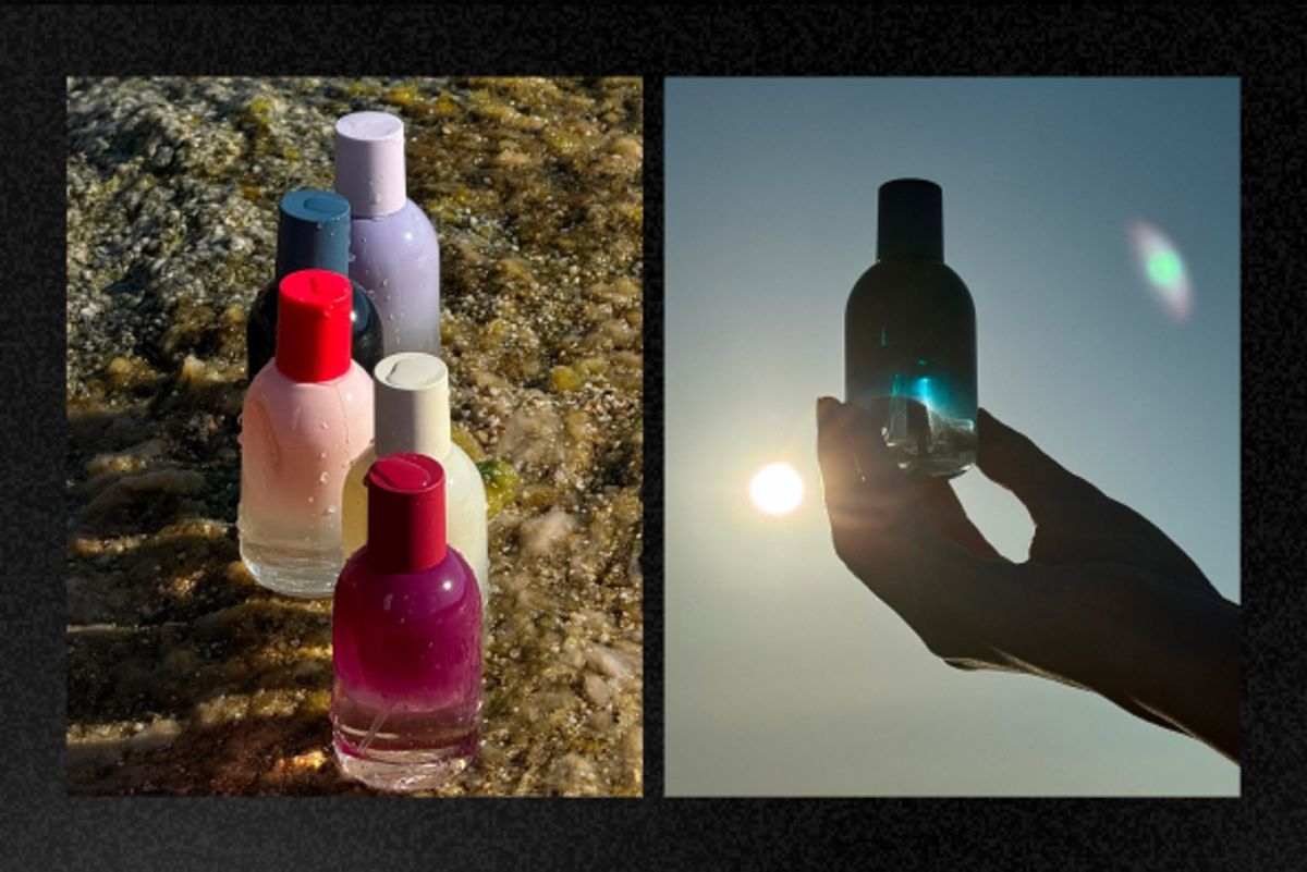
Glossier — "You" Fragrance Collection on Wet Rocks
Five fragrance bottles on glistening wet rocks. No people, no lifestyle context, no copy. Just product placed somewhere completely unexpected — and it somehow feels completely right.
Sometimes a static does not need graphical elements. Sometimes it just needs to put the product somewhere that makes you feel something, and then trust the feeling to do the rest.
Glossier hijacks a nature aesthetic here to make perfume feel elemental and a little wild - which is exactly the emotional territory a fragrance needs to occupy to justify its price point and its place in someone's daily ritual. The wet rocks communicate freshness and the outdoors before your brain consciously processes a single word. The timing against National Fragrance Day extends organic reach through search and hashtag discovery without the caption needing to announce the occasion directly. The product placement does the seasonal work while the imagery does the emotional work simultaneously.
For sensory products - fragrance, body oil, bath, texture-forward skincare - find a natural environment that triggers the sensation your product is designed to create. Wet surfaces for freshness and cleanliness. Warm textures for comfort and richness. The setting is your brief.
Product-in-nature statics are genuinely undersaturated in beauty right now. Most brands default to a lifestyle image with a person in it. An unexpected natural environment earns a second look precisely because it breaks the visual pattern of the category.
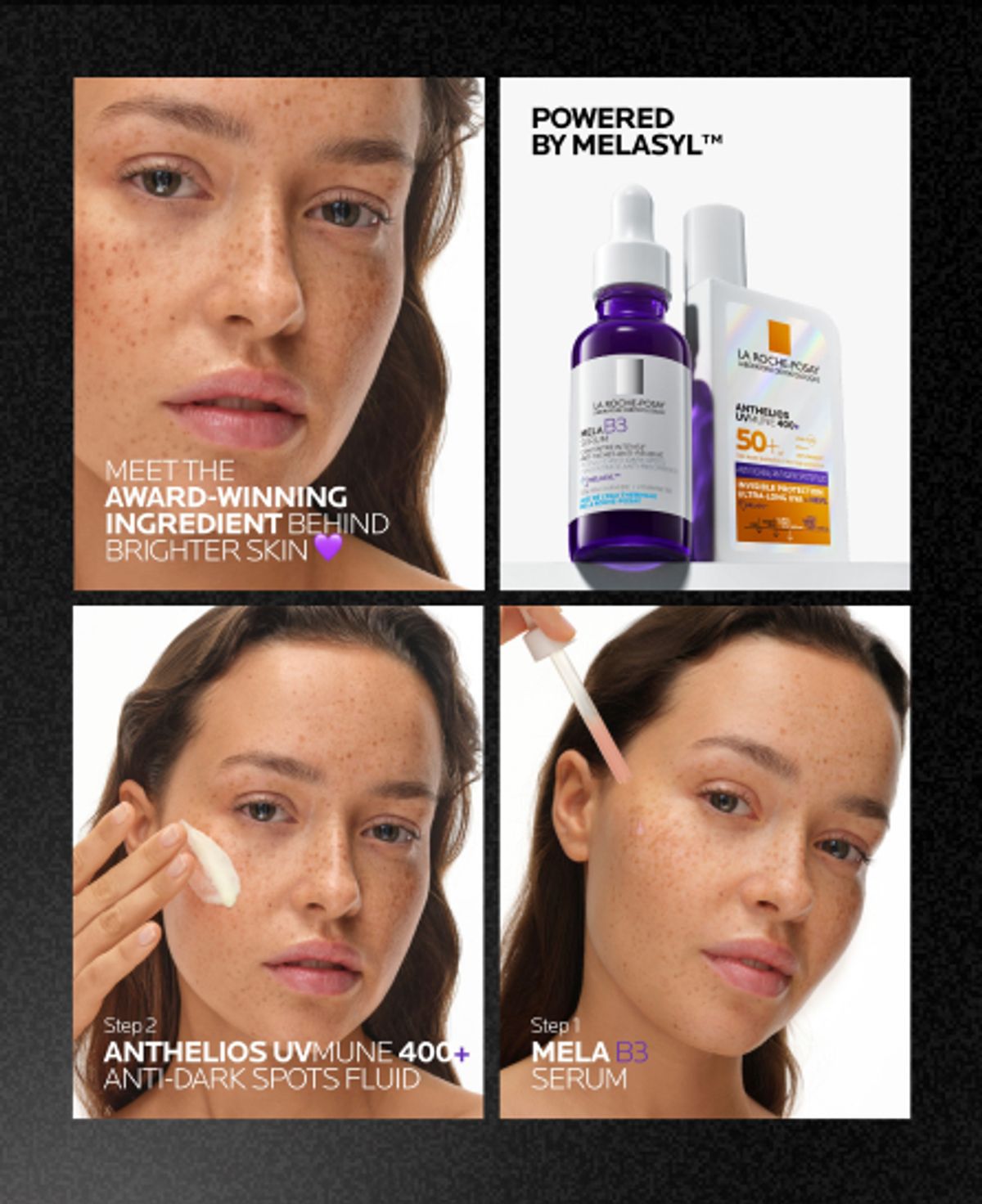
La Roche-Posay — "Meet the Award-Winning Ingredient"
Freckled skin. Bold headline. No perfection anywhere in sight.
La Roche-Posay leads with real skin texture - visible, unretouched, freckled - and drops bold typography directly over it: "Meet the Award-Winning Ingredient Behind Brighter Skin." It is a disarming creative choice for a clinical skincare brand. Leading with visible imperfection to sell a product that addresses it. The skin in the frame looks like the skin of someone who might actually need this serum, not someone who has already used it for six months.
The carousel that follows walks through a routine step by step, turning a single ad unit into a complete educational journey. By the end of the final card, the viewer has been introduced to the ingredient, shown the product, and walked through the routine — in that sequence. Which is the correct sequence, because it mirrors how a real purchase decision actually forms.
Bold headline typography placed over a real skin close-up is a high-contrast, high-impact combination that works particularly well in a feed full of polished studio imagery. Real texture is a creative choice, not a production compromise.
Lead with the ingredient before the outcome. For serums, treatments, and anything with clinical positioning - explaining the mechanism before making the transformation claim is how you build the kind of trust that brings someone back for a second purchase, not just a first one.
Every ad on this list has been running long enough to confirm it is working. The real question for any beauty brand is not whether these formats convert - it is whether your competitors are already running them in your category, and whether the window to differentiate is still open.
Vibemyad Ad Vault
Vibemyad Ad Vault is a dynamic ad library where you track the brands that matter to your business and view every ad they are running, all in one place. For beauty brands, this means you are not manually checking the Facebook Ad Library brand by brand and screenshotting what you find. You track your competitors inside Vibemyad Ad Vault and their ads surface directly in your library, continuously updated as new creative goes live.
What makes it genuinely useful for the kind of creative research this blog is about is the filtering. Vibemyad Ad Vault supports performance-based filters - so instead of browsing everything a competitor is running, you can filter down to the ads that are actually performing.
You can also filter by same industry and market, which means you are not just looking at what one competitor is doing — you are seeing what the entire category is running, what formats are appearing repeatedly, and where the gaps are. A format showing up across multiple brands in your category is a signal the approach is validated. A format that nobody in your category is running is a gap worth moving into.
Vibemyad Ad Spider
Vibemyad Ad Spider sits alongside Ad Vault as the brand-level intelligence layer - tracking creative themes across competitor campaigns, mapping how a brand's messaging has shifted over time, and surfacing the whitespace in your category that no competitor has claimed yet.
Vibemyad Ad Gen
Once you have found a format worth acting on - the ingredient-hero carousel, the extreme close-up, the editorial lifestyle integration - Vibemyad Ad Gen is where the production happens. Ad Gen has turned agentic. Rather than selecting from a preset menu of modes, you open a conversation with the Vibemyad Ad Gen agent and tell it what you want to create. You can describe the format, point to the concept you found in Vibemyad Ad Vault, explain your product and brand, and the agent handles the creative production through that conversation. It is ad creation through chat - which means the brief and the build happen in the same place, without switching tools or translating research into a separate design brief.
The workflow is straightforward.
Get notified when new insights, case studies, and trends go live — no clutter, just creativity.
Table of Contents

Arpita Mahato
Content Writer, Vibemyad

Arpita Mahato
Content Writer, Vibemyad

Arpita Mahato
Content Writer, Vibemyad