March 29, 2026 • 10 min read
March 29, 2026 • 10 min read
Every B2B marketer has a swipe file. The problem is most swipe files are full of polished ads that look great but teach nothing. This one is different. Each ad below is broken down so you can take the idea back to your next brief today.
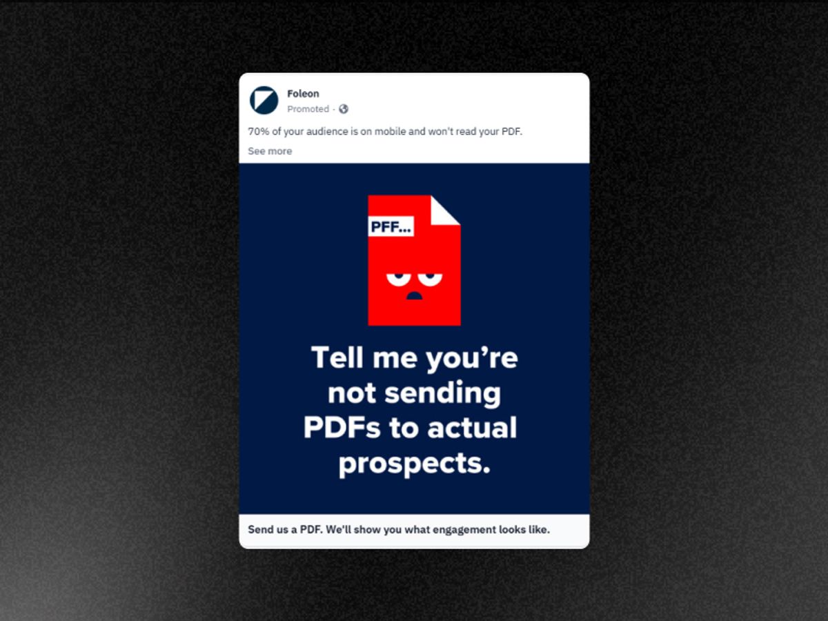
Foleon Static Ad
Sending PDFs to prospects is not a pain point Foleon invented. It is something every B2B marketer does and quietly suspects is not working. The ad names it, which feels less like advertising and more like a colleague leaning over and saying "you know that thing you're doing? Yeah, stop."
The CTA is another genius move. "Send us a PDF" asks for something the prospect already has. No calendar booking, no form, no commitment. The barrier to action is as low as it could possibly be while still initiating a sales conversation.
Identify the specific behavior your ICP performs every week that your product makes obsolete. Call it out by name, not by category. Then build a CTA that asks for something they already have rather than something they have to create or commit to.
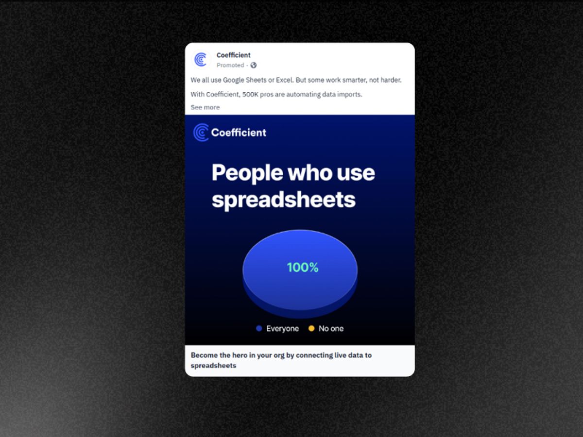
Coefficient Static Ad
Most B2B ads spend their entire headline budget trying to earn that attention. This one earns it in a single visual.
The identity-level value proposition is the second layer. "Become the hero in your org" does not sell a spreadsheet automation feature. It sells the feeling of being the person who fixes the data problem everyone else has been complaining about. LinkedIn's audience is professionally identity-driven in a way no other platform is - people on LinkedIn care deeply about how they are perceived at work. Coefficient speaks directly to that motivation without ever mentioning it explicitly.
Use a single-joke meme visual to earn attention on LinkedIn before your copy has to do any work. Then pair it with an identity-level value proposition rather than a feature claim. The joke gets the stop. The identity gets the click.
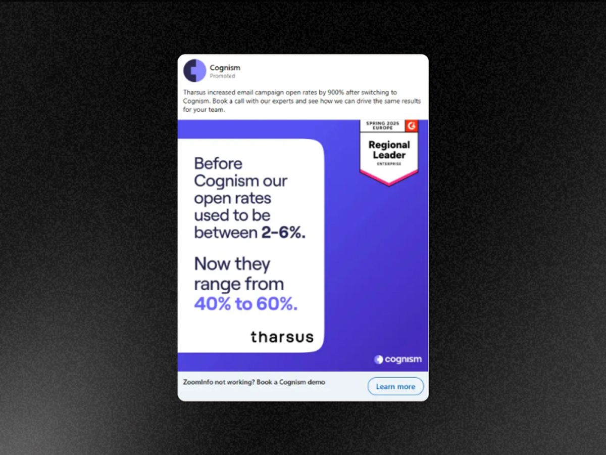
Cognism Static Ad
The before and after format works because it removes every layer of interpretation between the viewer and the result. There is no "up to" qualifier, no "results may vary" buried in small print, no paragraph explaining the methodology. There is a number the prospect recognises as their current reality — 6% open rate — and a number they want — 60%. The gap between those two numbers is the entire sales argument made in one static image.
The format also works because it implicitly credits the prospect with intelligence. It does not explain what an open rate is or why it matters. It assumes the viewer knows, which signals that this ad was made for them specifically rather than for a generic audience.
If you have a before and after metric from a real customer, that is your entire static ad. Remove everything except the two numbers and the label connecting them to your product. The explanation belongs on the landing page, not in the ad.
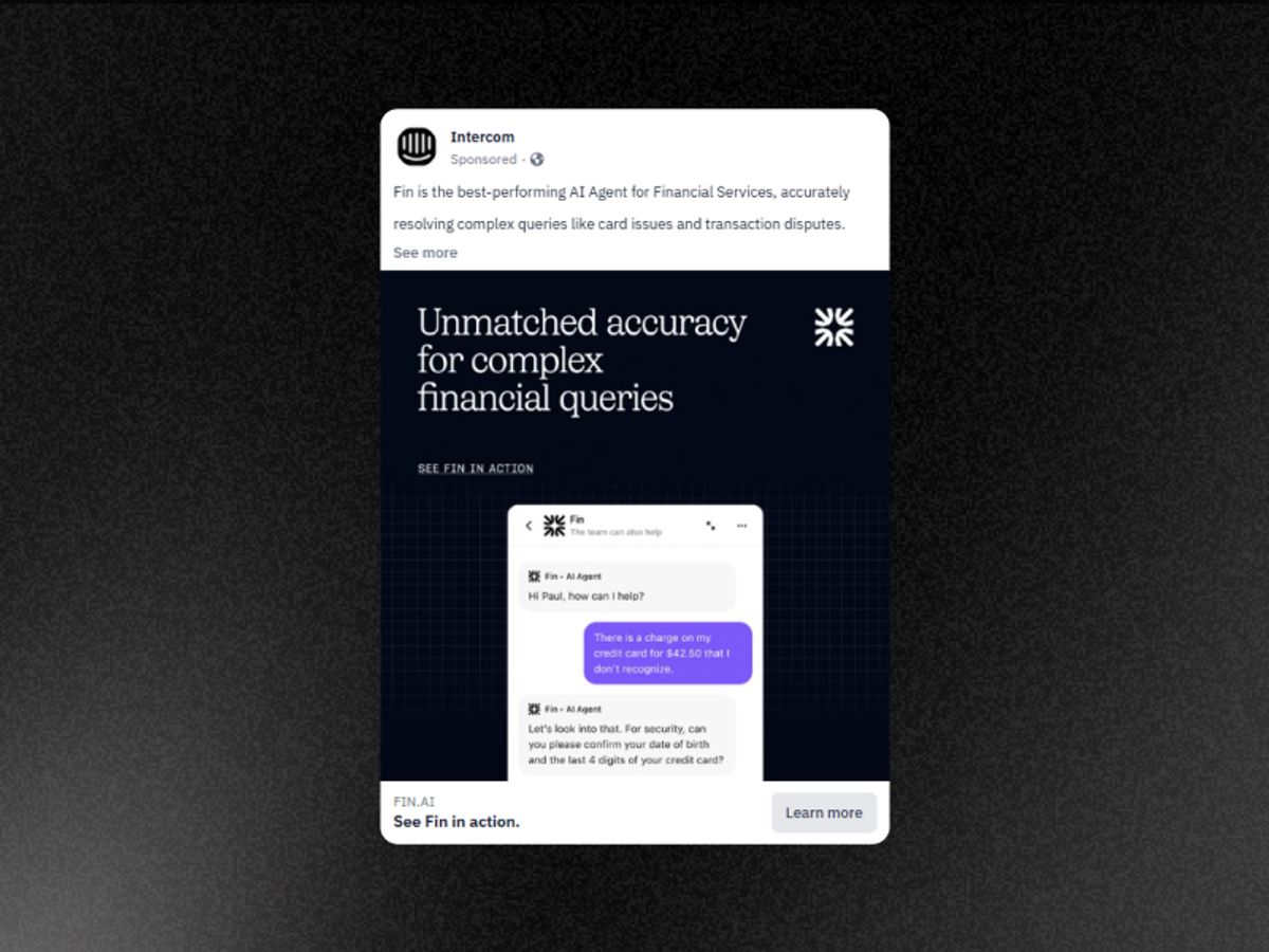
Intercom Static Ad
The specificity of "$42.50" is the entire creative decision. A round number like "$50" or a vague reference to "billing queries" would read as a marketing mockup. A specific, slightly awkward number like $42.50 reads as real. The viewer's brain processes it as an actual customer interaction rather than a staged demonstration. That single detail does more trust-building work than a paragraph of copy about AI accuracy.
The product UI screenshot format removes the gap between the ad and the product entirely. The viewer is not being told what Fin does — they are watching it happen. Demo beats claim in every format, but in static advertising the live UI screenshot is the closest you can get to a real demo without a video.
Show your product solving a specific, realistic problem with a specific, slightly imperfect number. Round numbers and generic scenarios signal marketing. Odd numbers and specific scenarios signal reality. The CTA should invite the viewer to see more of what they just saw, not ask them to commit to something larger.
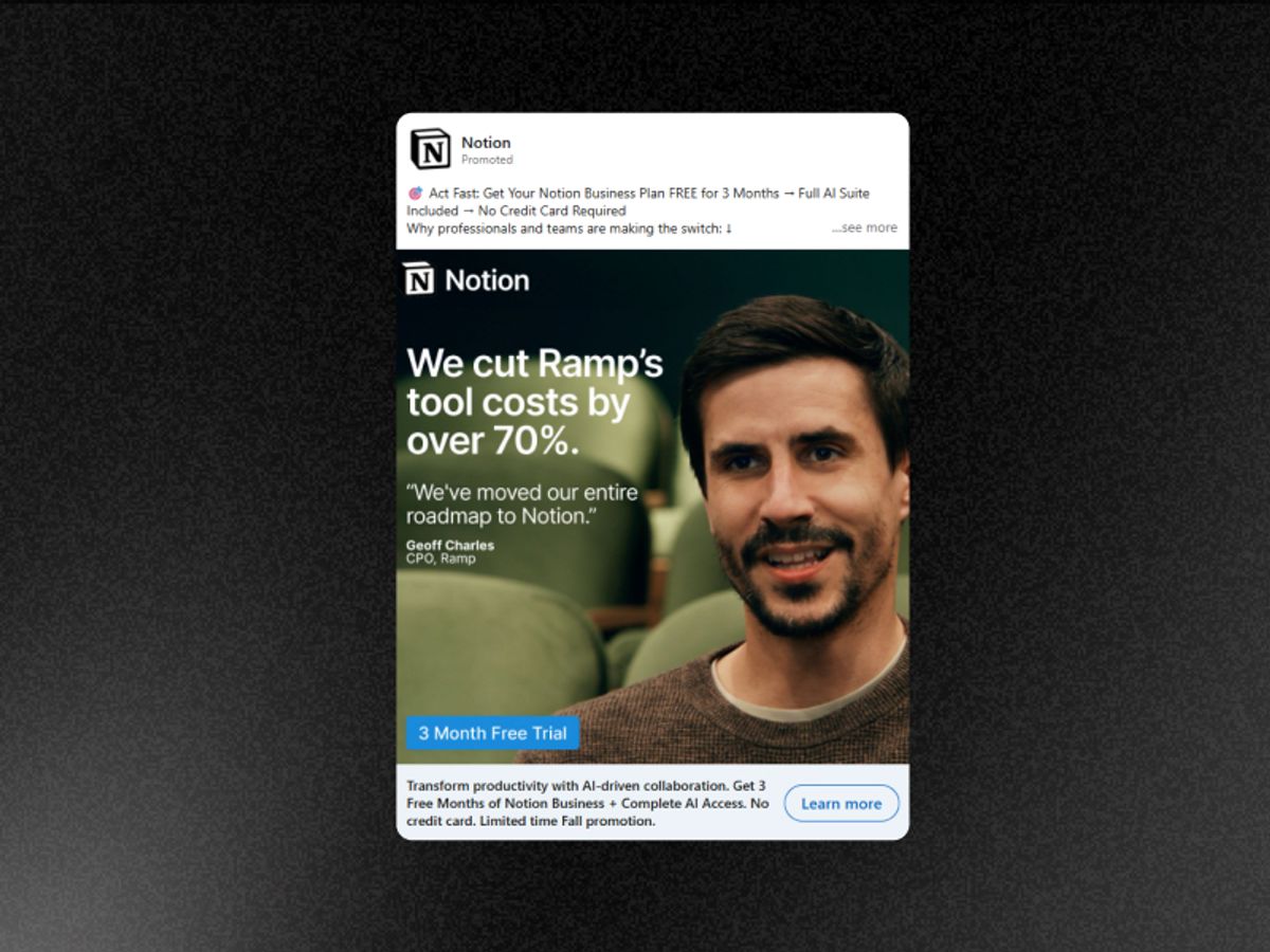
Notion Static Ad
Notion's target audience — operators, founders, and finance-conscious SaaS teams — has one objection above all others: we already have too many tools. "Cut tool costs by 70%" answers that objection before the viewer has formed it. The Ramp logo matters as much as the metric because Ramp is a company Notion's exact target audience knows, respects, and aspires to operate like. The combination of a credible logo and a specific cost reduction metric makes the ad feel like a peer recommendation rather than a vendor claim.
The restraint of the design is the final lesson. There is no subheading, no supporting copy, no secondary CTA. The ad trusts the metric and the logo to do all the work. That trust is justified — adding more copy would only give the viewer more reasons to disengage before the key message lands.
Find the metric from a customer your target audience already respects and lead with it. Then remove everything from the ad except the metric, the customer logo, and your branding. Trust the combination to work without explanation.
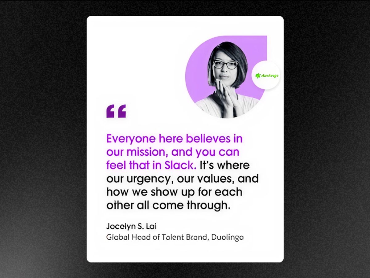
Slack Static Ad
Name plus title plus recognizable company logo is the highest-trust format in B2B static advertising. The claim is fully verifiable — the viewer can look the person up. The logo stacking tells a prospect something no brand copy can say as efficiently: companies smarter than you already made this decision. The minimal visual design makes the quote the only thing competing for attention. Nothing else in the frame gives the viewer anywhere to look except the testimonial.
For B2B static ads your creative hierarchy should be: metric or quote first, then name and title, then company logo. If your design competes with your quote for attention, your design is wrong.
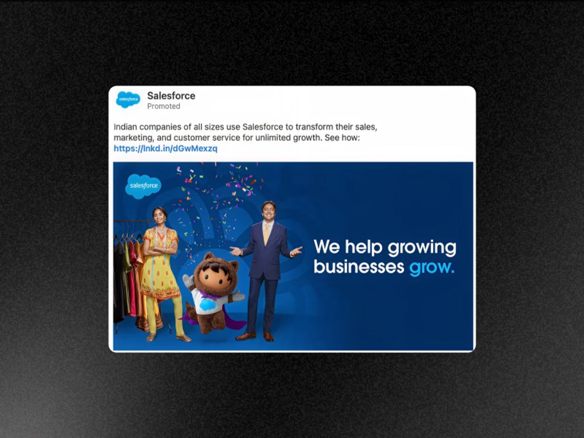
Salesforce Static Ad
"Companies like yours" does something generic B2B ads never do — it tells the viewer the ad was made for them specifically. Localization at the industry and regional level makes the viewer feel seen before they have read a single word of copy.
Take your best-performing generic B2B static ad and create three localized versions — by region, by industry vertical, and by company size. The creative cost is minimal. The relevance signal to the viewer is significant.
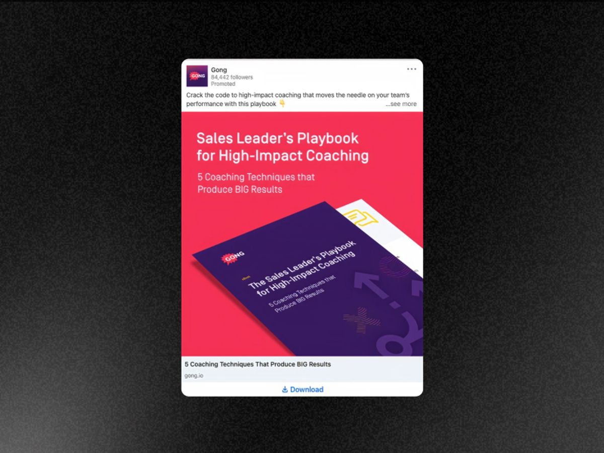
Gong Static Ad
Gong's data is the product. Running infographic ads that share proprietary insights does two things simultaneously — it demonstrates the value of the platform and builds Gong's authority as the source of truth for revenue intelligence. The ad is also the proof of concept.
If your product generates data, publish that data as your ad. The insight is the hook. The source of the insight is the product pitch.
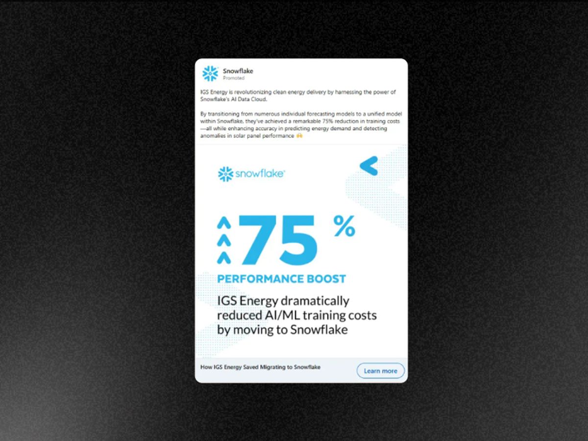
Snowflake Static Ad
Giant metric typography works because it converts the ad into a billboard. The viewer does not need to read — the number does the work from a distance before any deliberate attention has been paid. In a LinkedIn feed of dense professional content, a single oversized number stops the scroll more reliably than any headline.
Take your strongest single metric and make it the only thing in the frame. Set the type size so large that the number is readable as a thumbnail. Everything else is supporting cast.
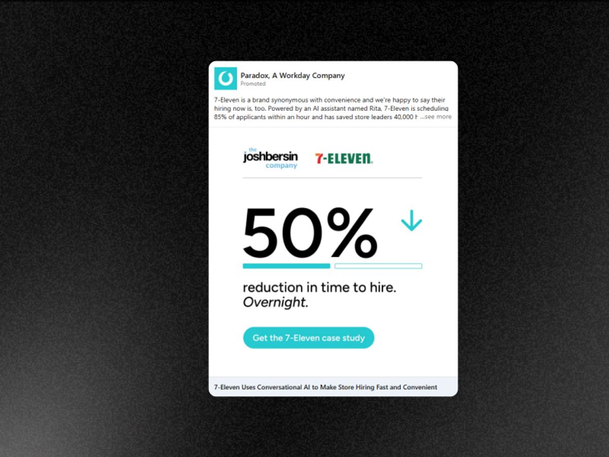
Paradox Static Ad
Two claims compressed into five words. The percentage handles the magnitude. "Overnight" handles the speed objection — the single biggest barrier in enterprise software adoption is time to value. Workday answers it in one word. The typography treatment makes both claims impossible to miss even at thumbnail size.
Compress your metric and your speed of value into the same headline. How big is the result and how fast does it happen? Both questions matter to a B2B buyer and both can be answered in under ten words.
Every ad in this list removes the brand's claims and replaces them with something the viewer trusts more. A behavior they recognise in themselves. A joke that names their exact problem. A number before and a number after. A product doing the thing it promises in real time. A metric from a company they already respect.
The best B2B static ads do not ask the viewer to trust the brand. They give the viewer a reason to trust the evidence.
Before you brief a single B2B static ad, it is worth knowing what your competitors have already tested and scaled — and then generating your own version in seconds.
Vibemyad Ad Vault
Vibemyad Ad Vault lets you search for ads by category, format, and keyword. If you want to find every B2B static ad running in your space right now, you can filter to it directly. You can also track specific competitors — once added, Ad Vault shows you every static ad they are running on Meta, how long each one has been active, and which creatives they are scaling. A competitor static ad running for 60 days is proof the format and message are working. You see it before you spend anything testing your own.
Vibemyad Ad Gen
Once you know what works in your category, Vibemyad Ad Gen generates your own B2B static ad variations in seconds. Brief it with your customer metric, your behavior call-out, or your before and after numbers — and get multiple creative variations ready to test without a designer or a production timeline.
Get notified when new insights, case studies, and trends go live — no clutter, just creativity.
Table of Contents

Arpita Mahato
Content Writer, Vibemyad

Arpita Mahato
Content Writer, Vibemyad

Arpita Mahato
Content Writer, Vibemyad