June 29, 2026 • 13 min read

June 29, 2026 • 13 min read
We took one real product, The Whole Truth's almond millet cocoa protein bar, and asked two of the best AI image generators to put it in a lifestyle ad. Here is the real wrapper, followed by what ChatGPT and Gemini each did to it.
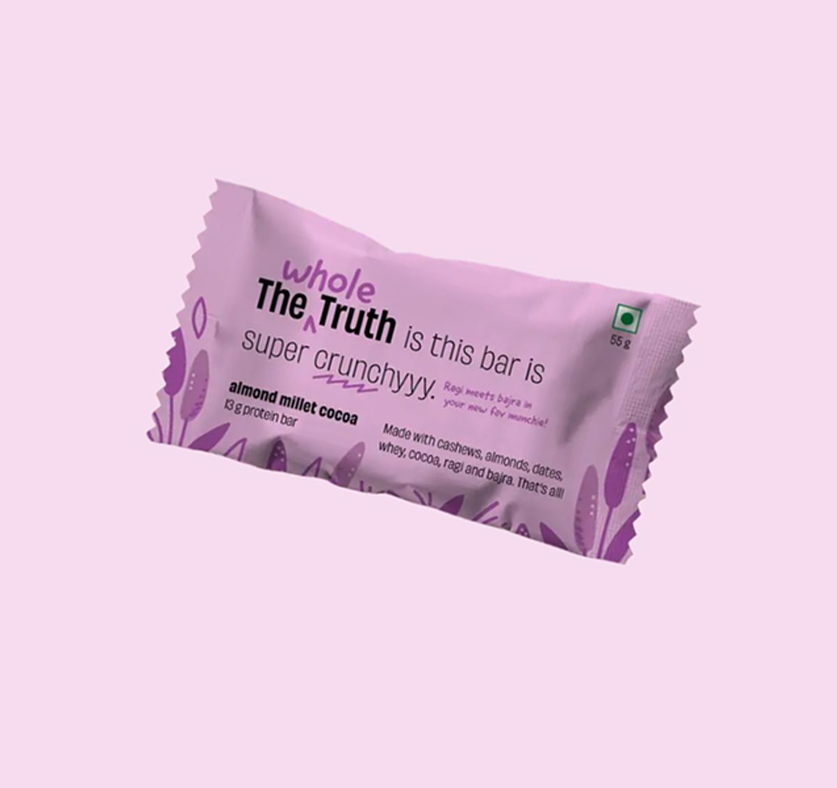
The Whole Truth, almond millet cocoa protein bar
The real wrapper says, clearly: "The Whole Truth is this bar is super crunchyyy," with "almond millet cocoa, 13 g protein bar" below it, and an ingredient line that reads "Made with cashews, almonds, dates, whey, cocoa, ragi and bajra. That's all!"
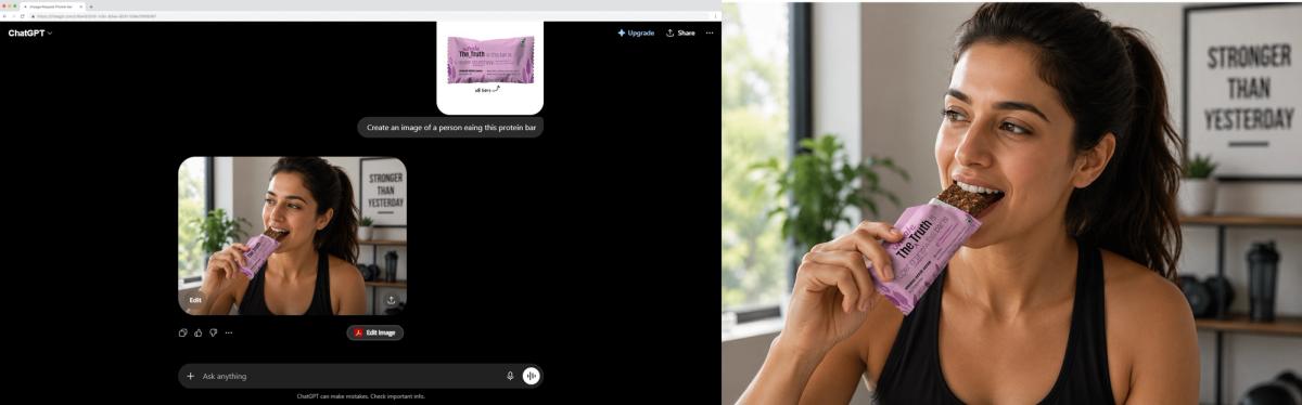
ChatGPT, given the real The Whole Truth wrapper and asked to put it in a lifestyle shot, returns a polished image where the bar reads "The Truth" down the side and the entire flavor line, protein callout, and ingredient list have collapsed into unreadable marks.
ChatGPT kept the purple and the general vibe and destroyed every word that mattered. "Super crunchyyy" became "super crunmaitiYs baris." The brand lockup is scrambled. The flavor line and the ingredient block underneath are a smear of letter-shaped marks that spell nothing. Nobody could buy from this, because the pack no longer says what the product is.
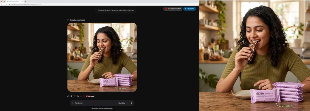
Gemini, given the same wrapper and prompt, keeps "super crunchyyy" readable on the front bar but turns the smaller flavor line, ingredient copy, and the repeated back-of-pack text on all five stacked bars into nonsense.
Gemini got closer and still missed. "Super crunchyyy" survived because it is the largest text on the pack. But the smaller flavor line garbled, the ingredient copy turned to nonsense, and the back-of-pack text on the stacked bars is unreadable gibberish repeated five times. Closer is not usable. A shopper zooming in on a listing sees the broken text instantly.
The pictures look expensive. The lighting is perfect, the styling is real, the model is convincing. And both are completely unusable, because on a packaged product the words on the label were the entire job, and both tools turned "almond millet cocoa" into noise.
• AI generated images with text usually fail on packaging because most image models do not actually spell. They treat text as a visual texture to imitate, not as words to get right, so flavor names come out misspelled and ingredient lists come out as gibberish, exactly as ChatGPT and Gemini did to The Whole Truth's wrapper above.
• The reason is structural. A diffusion model learns to predict pixels that look statistically correct, and a block of label copy looks, to the model, like a pattern of text-shaped marks rather than a fixed sequence of specific letters, so it renders the rhythm of text without the meaning.
• A single short word often survives, which is why poster and logo tools can claim readable text, and why Gemini kept "super crunchyyy" but lost everything smaller. Dense packaging is the opposite problem, because every extra line, panel, and small-print row is another chance for the model to drift into nonsense.
• The text that breaks first is exactly the text that matters most on a CPG pack: the flavor name, the ingredient list, the net weight, the certifications, and the full nutrition or supplement facts panel.
• The usual fixes do not hold. Longer prompts reduce the damage a little but cannot guarantee correct words, and pasting the text on later in a design tool looks flat and fake the moment the label has to wrap around a real curved or foil surface.
• Vibemyad Ad Gen renders the dense real text on your packaging legibly, and when a first generation does not nail it, a "Fix Product Text" button regenerates the visual with the actual packaging text intact, in one session at vibemyad.com/sessions.
The short answer is that most AI image generators were never built to spell, because spelling is not what they do. A diffusion model creates an image by starting from random noise and refining it, step after step, into something that matches the patterns it learned during training. At every step it is asking a single question: do these pixels look statistically right for what was requested? It is a machine for producing things that look correct, not things that are correct, and for a block of text those are two very different goals.
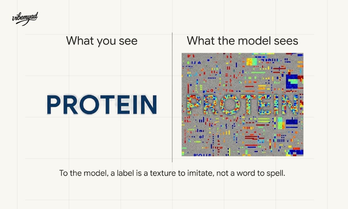
What you see vs what models see
Here is the part that explains every garbled wrapper you have ever seen. To the model, a line of text is not a sequence of specific letters that must spell a specific word. It is a visual pattern, a band of small high-contrast marks with a certain rhythm and spacing, the way a brick wall is a pattern or a patch of grass is a pattern.
The model has learned what "text-shaped stuff" looks like, so it can reproduce the look of text convincingly: roughly the right letter forms, roughly the right spacing, a believable density.
What it has not learned is that those marks have to obey the rules of language. There is no character-level control telling it that this exact slot must hold a P, then an R, then an O. So it fills the space with marks that have the texture of writing and none of the meaning, and you get "PORTEIN" instead of "PROTEIN," or a paragraph that looks like an ingredient list from across the room and dissolves into noise up close.
You can see this exact failure in the ChatGPT result above. It did not reach for the wrong letters the way a tired person would. It produced "super crunmaitiYs baris", a string with the rhythm and density of the real tagline and none of its words. That is not a spelling mistake. It is the model painting something tagline-shaped.
This is also why the failure feels so random. The model is not making a spelling mistake the way a person does, by reaching for the wrong letter. It is approximating the appearance of words without ever operating on words in the first place, so the errors are not near-misses, they are confident gibberish.
It is the same averaging behavior that makes a generic food generator hand back a plausible stranger instead of your actual dish, just pointed at language instead of at a plate.
If text rendering is a known weakness across the board, you might expect it to be a small, even annoyance everywhere. It is not. On most images, text is incidental, a sign in the background, a word on a t-shirt, something the eye forgives. On a packaged product, the text is the point, and that changes everything about how much the weakness costs.
A single large word is the easy case, which is the whole reason poster and logo tools can show off readable type. They are rendering a few big characters as the focal point of an otherwise clean design, and at that size, with that much room, the model has its best chance of landing each letter. CPG packaging asks for the opposite of that on every axis at once. The text is small, it is dense, and there is a lot of it, a flavor name, a tagline, a net weight, a row of certification icons, an ingredient paragraph, and a full facts panel, all competing for space on one surface. Each of those elements is a separate opportunity for the model to drift, and the small dense ones are where drift turns into a smear. The pack reads fine in a thumbnail and falls apart the instant a shopper looks closely, which on an ecommerce listing is the first thing they do.
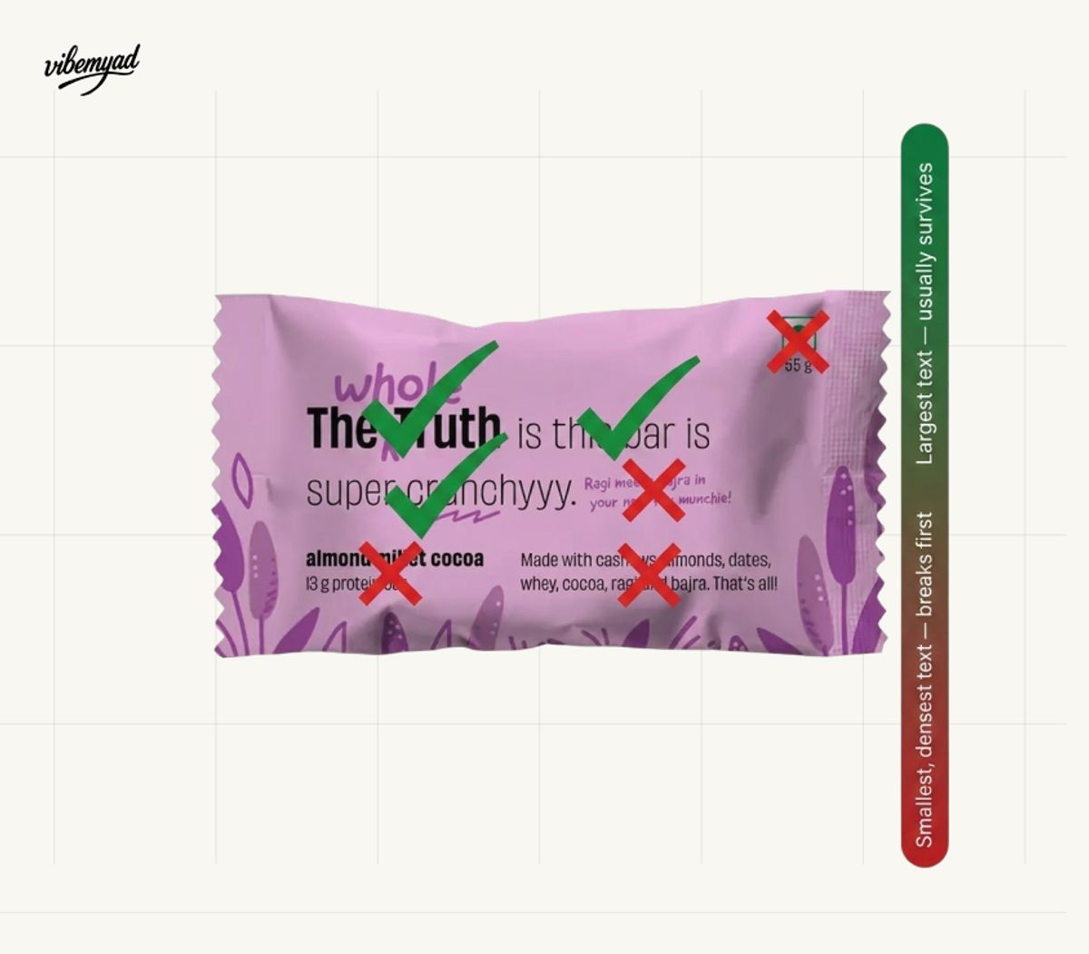
This is exactly what Gemini did in the opening. It held "super crunchyyy", the biggest line on the pack, and lost everything beneath it. That is not Gemini being careless. It is the predictable shape of the failure: the larger and more isolated the text, the better its odds, and the smaller and denser it gets, the faster it collapses.
Then there is the surface itself. Packaging text does not sit on a flat plane. It wraps around the curve of a protein powder tub, bends along the contour of a stand-up pouch, and catches the light on a foil chip bag. The model now has to keep the letters correct and bend them believably around a three-dimensional shape under realistic lighting, which compounds the difficulty rather than adding to it. The more real and ad-like the shot, the harder the text becomes to hold, which is the cruel opposite of what a brand actually needs.
Not all label text fails equally. The pattern is consistent once you know what to look for, and it tracks almost perfectly with the text that carries the most weight for a CPG brand. The bigger and more isolated a piece of text is, the better its odds; the smaller and denser it is, the sooner it collapses.
The flavor name and the brand name, usually the largest type on the pack, are the survivors, though even they slip often enough that "PORTEIN" is a familiar sight. The net weight and short claims like "gluten-free" or "high protein" sit in the middle, frequently close but just as frequently off by a letter or a digit. The real carnage is in the dense zones: the ingredient list and the nutrition or supplement facts panel. These are small, packed, multi-line blocks, and they are exactly where a model that approximates the look of text produces pure nonsense, rows of letter-shaped marks that spell nothing, numbers that are not numbers, a panel that has the shape of a facts table and none of the facts.
That ordering matters because it maps onto the categories where this is most painful. A bag of chips or a protein bar lives and dies on a flavor name and a few bold claims. A protein powder tub crowds a full nutrition table, mixing instructions, and a wall of callouts onto one surface.
A supplement bottle carries a dense, regulated facts panel where every line is meant to be exact.
Chips are the clearest case of all, because a reflective, wrinkled foil bag makes the text even harder to hold, and we put that to the test by running a real chips pack through ChatGPT and Gemini to see exactly where the flavor name falls apart.
These are the products where readable text is non-negotiable, and they are precisely the ones a redraw-based tool fails hardest, because there is simply more text on them to mangle.
Faced with garbled labels, most people reach for one of two workarounds, and both have a ceiling you hit fast.
The first is to write a more specific prompt, spelling out the exact words you want and hoping the model honors them. This helps at the margin. A shorter, more explicit instruction can nudge the model toward the right characters on the largest text. But it cannot guarantee correct words, because the underlying problem is not vagueness, it is that the model is not operating on letters in the first place. You can ask more clearly and still get confident gibberish, and the denser the text, the less your prompt can save it. Prompting is a dial that reduces the damage, not a switch that fixes it.
The second is to generate the packaging without any text and paste the real label on afterward in a design tool. On a flat, straight-on mockup, this can limp along. As a way to make real product visuals, it breaks down quickly, because a label pasted on flat looks pasted on flat. It ignores the curve of the tub, the angle of the shot, and the way light falls across a foil surface, so the more dynamic and appealing the image, the more obviously fake the flat label becomes. You end up trapped in stiff, front-facing angles, the least compelling shots for an ad, and you are back to hand-compositing the label onto every format and every product every time anything changes, which is exactly the manual repetition AI was supposed to remove.
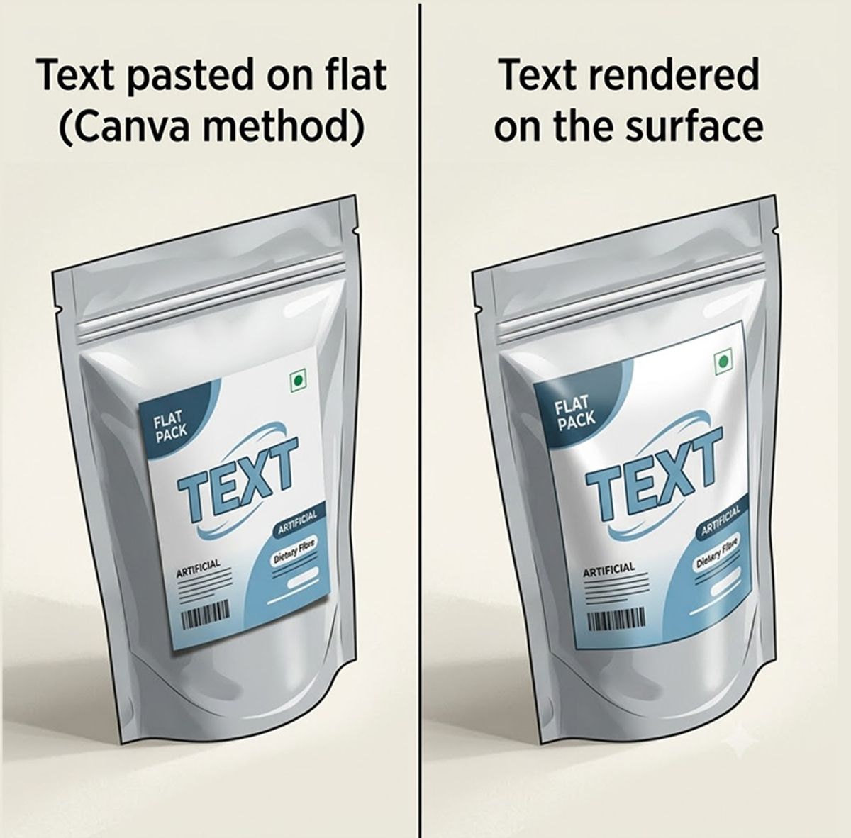
This is the trap with both workarounds. They treat the broken text as something to patch after the fact, when the only real fix is to not break it in the first place.
The fix is not a cleverer prompt or a better paste job. It is a tool that is built to render the real text on your packaging as text, and to correct it when it slips, rather than approximating the look of a label and leaving you to clean up the mess.
Vibemyad Ad Gen generates packaged-product visuals where the dense text on the pack stays legible and consistent, even when the packaging is crowded with copy, and exports at every Meta and ecommerce spec in one chat session at vibemyad.com/sessions. You describe the product, or start from a photo of the real pack, and the output keeps the actual words on the label readable instead of dissolving them into noise. The flavor name reads as the flavor name. The claims read as the claims. The dense panels stay sharp enough to use on a marketplace listing where a shopper will zoom in.
The part that closes the gap is what happens when a first generation does not get the text exactly right, which is always the moment these tools usually leave you stranded. Instead of regenerating blindly and hoping the next roll of the dice lands, you click "Fix Product Text," and Vibemyad Ad Gen produces generations that carry the real text as it appears on the packaging. The correction is the feature. You are not fighting the model with longer and longer prompts; you are telling it to lock the actual label copy, and it does, so the text on the pack matches the text on the product.
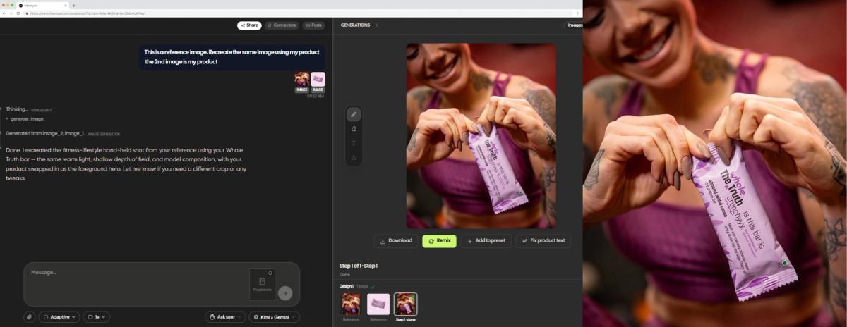
The same The Whole Truth bar that ChatGPT and Gemini turned to gibberish, recreated in Vibemyad Ad Gen from the reference shot and the real product.
The honest boundary: Vibemyad Ad Gen makes static images and carousels. It does not set up your Pixel, build your lead form, choose your objective, or manage targeting and budget; those stay in your Ads Manager. What it removes is the hardest part of using AI for packaged goods at all, which is getting accurate, legible label text onto an ad-ready and marketplace-ready image, reliably, instead of settling for a beautiful render that says "PORTEIN."
• AI image generators mangle text because most of them imitate the appearance of words rather than operating on actual letters, so they render the texture of a label without the meaning, and the failure shows up as confident gibberish rather than near-miss typos.
• The weakness is mild on incidental text and severe on packaging, because a CPG pack is small, dense, multi-panel text wrapped on a real curved or reflective surface, and every additional line is another chance to drift.
• The densest, most important text breaks first, the ingredient list and the nutrition or supplement facts panel, which is exactly the text that chips, protein bars, protein powders, and supplements cannot afford to get wrong.
• Vibemyad Ad Gen renders the real packaging text legibly and offers a "Fix Product Text" button that regenerates with the actual label copy intact, so the words on the image match the words on the pack, in one session at vibemyad.com/sessions.
Every garbled wrapper traces back to the same root, which is that the model was never reading your label as words; it was painting something label-shaped. You can fight that with longer prompts forever and still get "PORTEIN," because the problem is not how you asked, it is what the tool is doing. The only real fix is a generator that holds the actual text on your packaging and corrects it when it slips, all the way to an ad-ready image.
Get notified when new insights, case studies, and trends go live — no clutter, just creativity.
Table of Contents


Rahul Mondal
Product, Design and Co-founder, Vibemyad

Rahul Mondal
Product, Design and Co-founder, Vibemyad


Arpita Mahato
Content Writer, Vibemyad