February 06, 2026 • 8 min read

February 06, 2026 • 8 min read
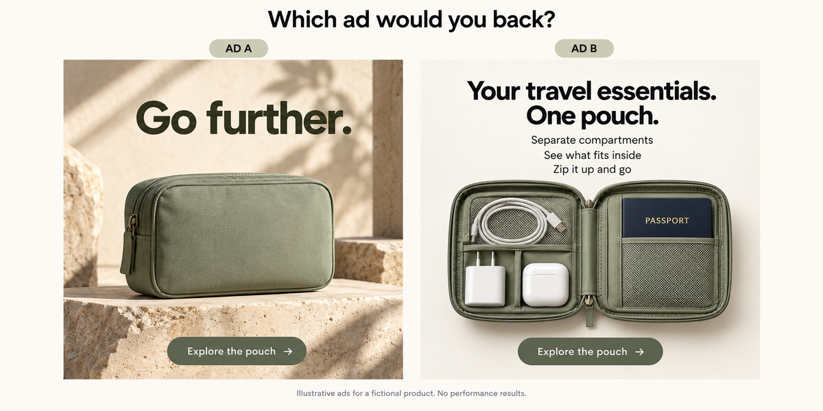
Pick A or B before reading. These are illustrative ads for a fictional product, not a measured performance comparison.
Look at the two ads above. Same fictional product, two different ways of selling it. Which one would you choose for people who have never heard of the brand? Pick A or B, and keep your reason in mind.
Some of you will choose A. I can see why: the lighting is beautiful, the composition feels considered, and the pouch looks premium. It is the kind of image you might approve quickly in a design review.
I would back B as the first idea to test with an unfamiliar audience. It tells me what the pouch is for and shows what fits inside. Before you agree or disagree, read the checks below. Then come back to this image and see whether your choice changes.
These ads have not been tested, so we cannot name a sales winner. The exercise asks whether the design gives a shopper enough useful information to consider buying. More copy is not automatically better; a clearer explanation is the point.
For a sales campaign, likes and compliments are not enough. Look at purchases, acquisition cost and whether those orders make commercial sense. An ad can produce orders while costing more to acquire a customer than the business can afford.
Check the evidence before diagnosing the creative. How much delivery did the ad receive? How many purchases are you comparing? Are purchase events and order values recording correctly? One extra order can change the ranking when the numbers are small.
Use consistent date ranges and attribution settings. Reconcile reported purchases with store orders, allowing for differences in attribution, and identify test or internal orders. If the measurement is wrong, a better-looking ad will not fix the report.
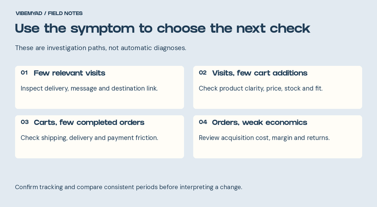
Use the symptom to choose an investigation. A funnel metric alone does not prove the cause.
Put yourself in front of the image without the knowledge you have as its founder. Can you identify the product? Can you tell what it helps you do? Is there a reason to choose this one?
Look again at Ad A from the opening. The lighting, shadows and styling make the pouch look desirable. But “Go further” leaves the viewer to work out what goes inside and why they need it. Ad B opens the pouch and shows the compartments in use. For someone new to the product, that is useful information.
The fix depends on the missing information. Name the product if the category is unclear. Show it in use if the mechanism needs explanation. Make a relevant feature visible if that feature is the reason to buy.
That does not mean putting the entire product page into the image. Choose the information someone needs to understand the argument. Our guide to what makes an effective ad explains this connection between the product, benefit and evidence.
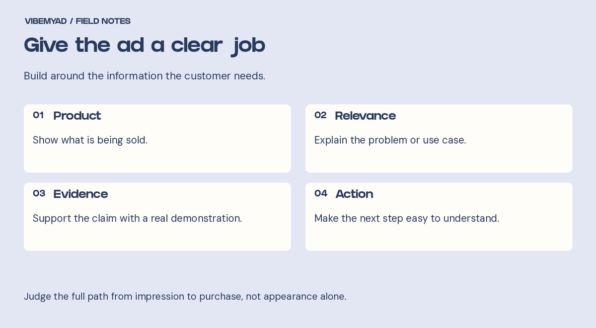
Give the ad a clear job
A dramatic opening can create curiosity that the product cannot satisfy. If the interesting part of the ad has little to do with the purchase, a high click rate can become a distraction in your review.
Read the opening beside the rest of the ad. Does the product deliver the answer it promises? Does the scene show a situation your customer recognises? Could the same headline advertise almost anything?
I would test a clearer buying reason before making the opening louder. A claim about saving space should lead into a visible space-saving explanation. A price message should make the relevant quantity and terms understandable.
Also review who can buy and what the campaign is intended to achieve. If people outside your delivery area see the offer, or the campaign is configured around an action that differs from your sales goal, the message is only part of the investigation.
A shopper can understand the product and still decide it is not worth the price. Ask what they receive, what they would use instead and why your option deserves consideration.
For a bundle, make the contents clear. For a premium product, explain a meaningful difference and support it. For an unfamiliar brand, provide credible product information and genuine customer evidence where available.
A discount is one possible change, not the automatic answer. It may reduce the hesitation while making each order less profitable. Work out what you can afford before changing the offer, and avoid inventing urgency to cover a weak proposition.
If you need ideas to investigate, follow our D2C ad research guide. Competitor messages can suggest buying questions; their public ads do not reveal which offer will be profitable for you.
Open the actual ad destination on a phone. Check that the advertised product, variant and offer are easy to find. A visitor should not have to search the whole store to reconstruct the deal they just clicked.
For the fictional pouch, suppose the ad shows a large size but the page defaults to a smaller one. That is a concrete mismatch worth correcting. It does not establish that the photograph failed.
Check whether the page loads, the main action works and product questions have clear answers. Read it at mobile size, where crowded text or an obstructive overlay may be more obvious. Shopify's guide to diagnosing traffic without sales also recommends examining the store journey and technical friction.
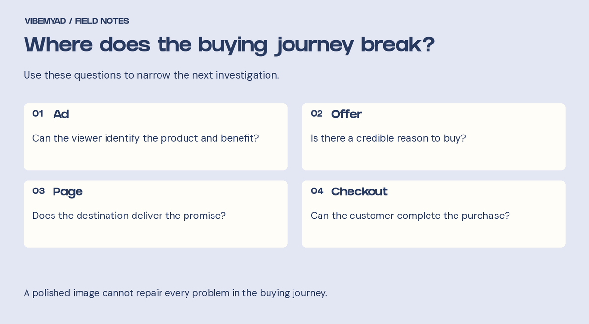
Where does the buying journey break?
If people add products to the cart but orders remain weak, inspect shipping charges, delivery estimates, stock availability, discount conditions and payment errors. Treat each as a question to check rather than assuming one metric identifies the cause.
Make delivery costs and conditions easy to find before the final step. Shopify's shipping guidance describes publishing rates so customers can check costs before checkout.
Use your store's supported test process to inspect the purchase path. Keep test orders separate from genuine customer results. If a required payment method fails or the advertised item cannot ship to the intended market, address that operational issue before asking the designer for new colours.
A new background and a different crop may still repeat the same selling argument. If the original argument is weak, those changes leave the main question unanswered.
Write down what the next ad should test. Are you comparing convenience with durability? Or are you testing two openings for the same demonstration? Those are different assignments. Our creative testing guide separates concepts from variations.
If performance has declined, inspect what else changed: the offer, inventory, destination, delivery or customer mix. Repeated exposure may deserve investigation, but a worse week does not prove creative fatigue. Compare enough evidence to make a useful decision before replacing every asset.
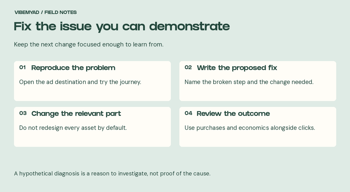
Prioritise demonstrated problems, then test specific explanations for weak results.
Start with a problem you can reproduce, such as a broken link, missing variant or failed checkout step. Then address the most credible explanation for weak results. If the product is unclear, test an explanation. If the price feels unsupported, improve the buying argument and evidence.
For the fictional pouch, the sequence might be: correct the default size, clarify what fits, then compare a packing demonstration with a portability message. These are hypothetical fixes, not a reported campaign result.
Record the change and review purchases and acquisition economics alongside clicks. Keep other major conditions comparable where practical. That makes the next decision easier than changing the headline, offer, page and audience together and guessing which part mattered.
Scroll back to the two ads and make your choice again. If you picked A because it looked more polished, ask what you now know about the product from that image. Then compare it with the open compartments and visible contents in B.
My preference is still B for introducing this product. It answers practical questions that A leaves open. I would keep that clarity and improve the styling, then test it. A may have a role with shoppers who already understand the pouch, but that is a different audience and a different question.
Before approving your next creative, finish this sentence: “After seeing this ad, the customer will understand...” If the answer is only that the brand looks good, the ad may need another pass.
Vibemyad Marketing Agency can review the ads and the buying journey, identify what needs attention and build the next tests. Bring the ads, destination pages and recent results so the review starts with evidence.
Get notified when new insights, case studies, and trends go live — no clutter, just creativity.
Table of Contents


Arpita Mahato
Content Writer, Vibemyad


Rahul Mondal
Product, Design and Co-founder, Vibemyad

Arpita Mahato
Content Writer, Vibemyad