October 15, 2026 • 13 min read

October 15, 2026 • 13 min read
You have probably bought a gift for someone who gives you very little help. They say they do not need anything. You open a few tabs, reject half the options and start wondering whether a gift card would be easier.
That is the person I want a Christmas ad to help. They need to see who the product is for, why that person would want it and whether buying it will be straightforward.
When I review a holiday creative, I cover the sale badge and ask: would this still give me a reason to consider the product? If the answer is no, adding snow and a larger discount will not finish the brief.
These ten Christmas ad examples offer different ways to approach your 2026 Facebook campaign. Some sell a ready-made gift. Others introduce a seasonal product, an extra incentive or something the shopper might want for themselves.
These are archived creatives, not announced 2026 offers or verified sales winners. Nine records list Facebook; the Lendava record lists Instagram and is included as a visual reference. UK retailer and price examples are labeled. The analysis concerns the visible images, not unobserved targeting or sales results.
The buyer may never use the product. They are choosing on someone else's behalf, which gives your ad a different job from the one you run during the rest of the year. A useful gift ad helps them picture the recipient enjoying it and answers enough questions to make the choice feel manageable.
For example, a regular customer may know which skincare product they want. Someone buying skincare for a friend could need a clear description of the set, its contents and who it is intended for. You cannot assume they understand your range.
Our Black Friday ad examples focus on presenting offers. Here, I would settle the gifting reason first, then decide which offer belongs beside it.

RingConn. Archived creative retrieved through VMA. Browse the brand’s Meta ads.
Put yourself in the buyer's place for a moment. They may know very little about smart rings. They are looking for something their partner would enjoy opening. RingConn shows its product box above torn wrapping paper, so the ad gives them a gift to picture before asking them to consider the device.
I like the decision to show the packaging. Buying for someone else involves presentation as well as usefulness, and a neat box answers part of that question. But the image leaves another question open: what does the ring do? A shopper discovering the category needs more than the promise of a perfect gift.
For a lesser-known product, I would keep the unwrapping scene and add one useful reason the recipient would want it. The destination page should then explain sizing and the buying process. The caption's instruction to visit a bio also needs changing if your Facebook ad links directly to a product page.
Test the wrapped version against an image of the ring being worn, with the same offer. That tells you whether the gifting context adds enough to deserve the space.
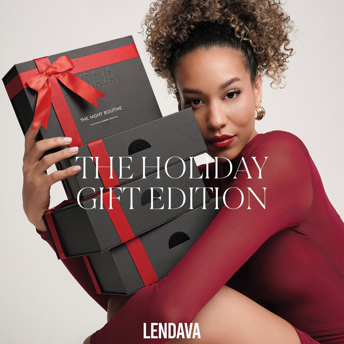
Lendava. Archived creative retrieved through VMA. Browse the brand’s Meta ads.
The black boxes and red ribbons do much of the work here. Lendava has a person hold the gift edition close to her, making the packaging feel like something substantial rather than a small thumbnail beside a sale badge.
This particular archive record lists Instagram, so I am including it as a visual reference for a Facebook campaign, not claiming it ran on Facebook. The idea transfers: if your gift packaging is part of the reason to buy, let people see it.
There is a limit to what this execution explains. We can see the boxes, but we cannot see their contents. I would use another image to open one of them and lay out exactly what comes inside. You can make that the second card of a carousel or test it as a separate ad.
Keep the packaging true to the order. If a ribbon, gift box or personal note costs extra, the ad and product page should make that clear. A beautiful presentation loses its value when the delivered parcel feels like a different purchase.
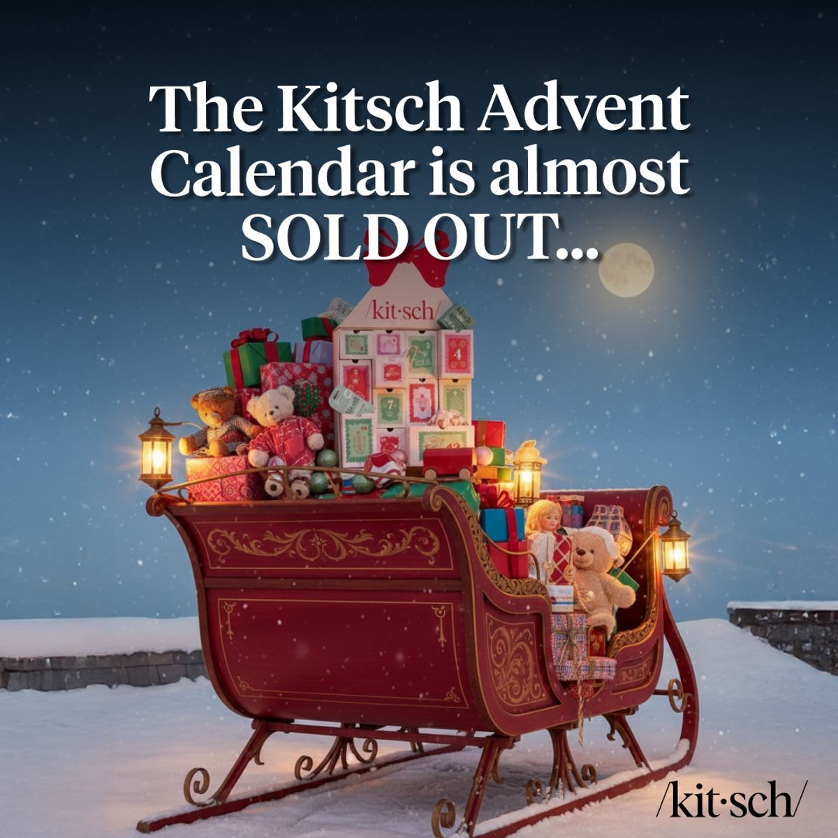
Kitsch. Archived creative retrieved through VMA. Browse the brand’s Meta ads.
Kitsch puts its advent calendar in a sleigh and leads with a stock warning. This is a different Christmas purchase from a shampoo bar: the calendar is tied to a countdown, which changes when someone needs to receive it.
The calendar belongs near the start of a holiday campaign. Waiting until the final shopping days of December would miss much of the reason to buy this format. Plan around when the recipient starts using the product, then work backward through delivery and packing time.
I would make the contents easier to judge in the next creative. The festive scene tells us the occasion; an open-calendar view could tell us whether the contents suit the recipient and justify the price. Our carousel ad examples show ways to give those messages separate cards.
The scarcity line is the advertiser's claim, not a stock level we have checked. Only use that kind of language when your inventory supports it. A genuine order deadline is useful enough without inventing a shortage.
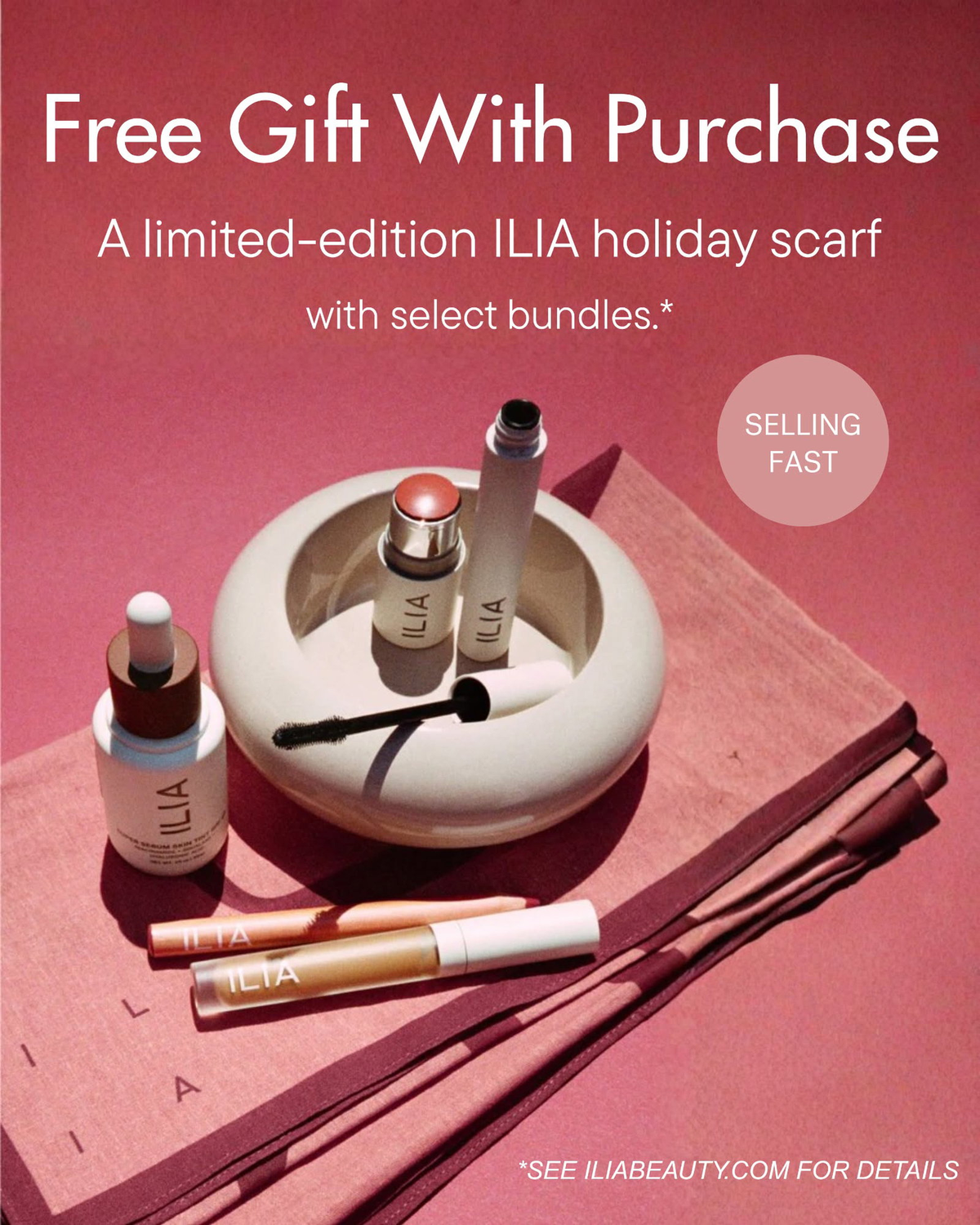
ILIA Beauty. Archived creative retrieved through VMA. Browse the brand’s Meta ads.
ILIA lays out the makeup with a folded scarf and explains that the scarf comes with selected bundles. The extra item is visible, which gives the shopper something to assess beyond the word "free."
This is an offer I would consider when the bundle already makes sense for the recipient. The scarf can add to the presentation, but the buyer still needs to want the makeup. An unrelated freebie cannot answer questions about the main purchase.
The phrase "with select bundles" matters. I would send the click to the eligible bundles and make the scarf conditions easy to find there. If someone lands on the full catalog, they have to figure out which combination qualifies before they can even decide whether they want it.
A useful creative test would show the bundle alone in one version and the same bundle with the scarf in another. Keep the offer available in both. You are testing whether showing the gift helps communicate the offer, rather than changing the entire deal halfway through.
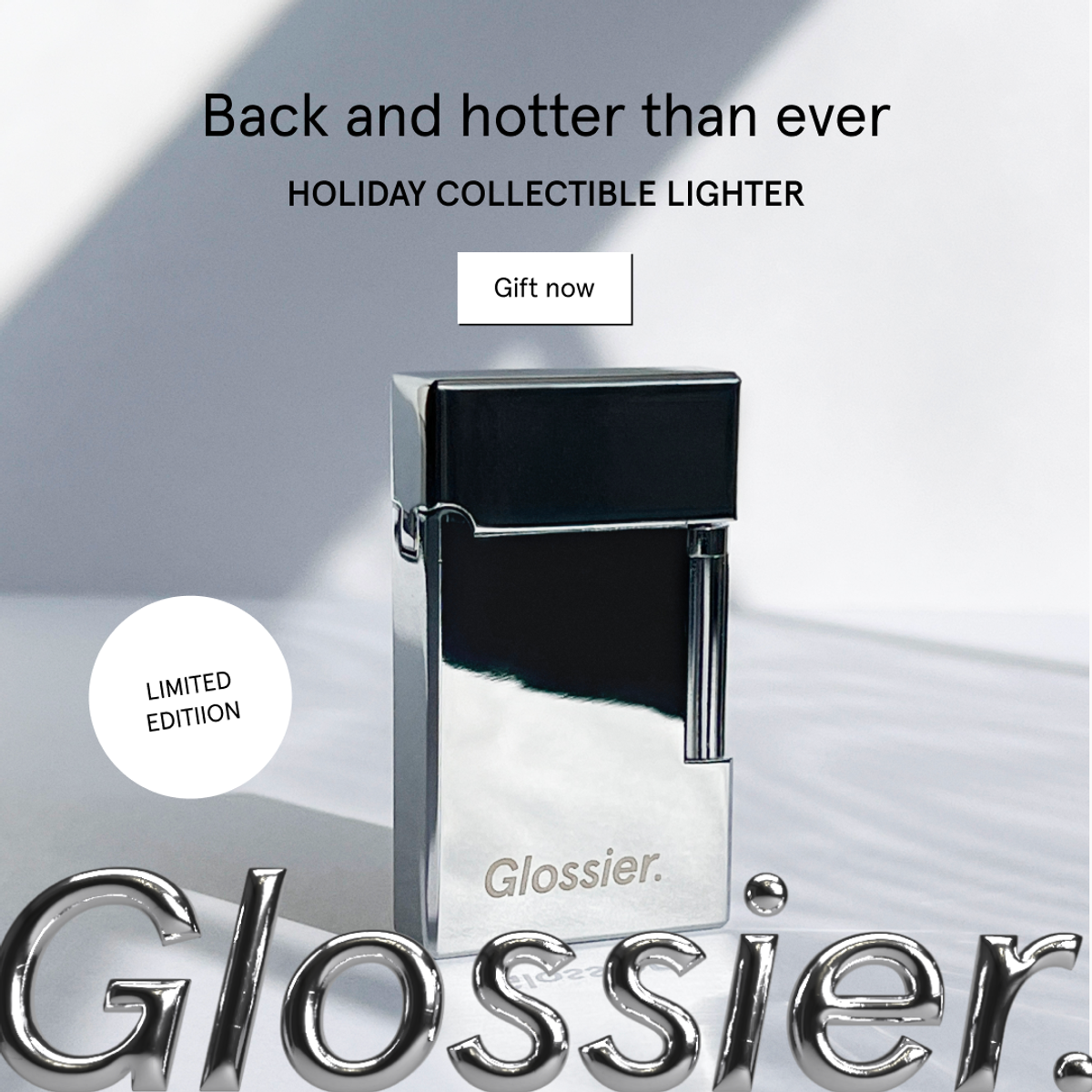
Glossier. Archived creative retrieved through VMA. Browse the brand’s Meta ads.
A reflective lighter fills this Glossier ad. The copy identifies it as a holiday collectible, with a small limited-edition badge beside it. The object gets almost all the attention.
This is an interesting gifting idea because the appeal depends partly on the recipient's relationship with the brand. Someone buying for a Glossier fan has a reason to consider branded merchandise beyond the products that person already buys.
I would keep this separate from a campaign introducing the brand to strangers. A new customer may need a practical explanation of the item, while a fan may care more about the design and its place in the collection. That is a testable audience difference, not a claim about who received this particular ad.
If your own seasonal item is genuinely limited, explain what is limited: the color, the packaging or the production run. A badge becomes more useful when the customer understands what would be unavailable later.
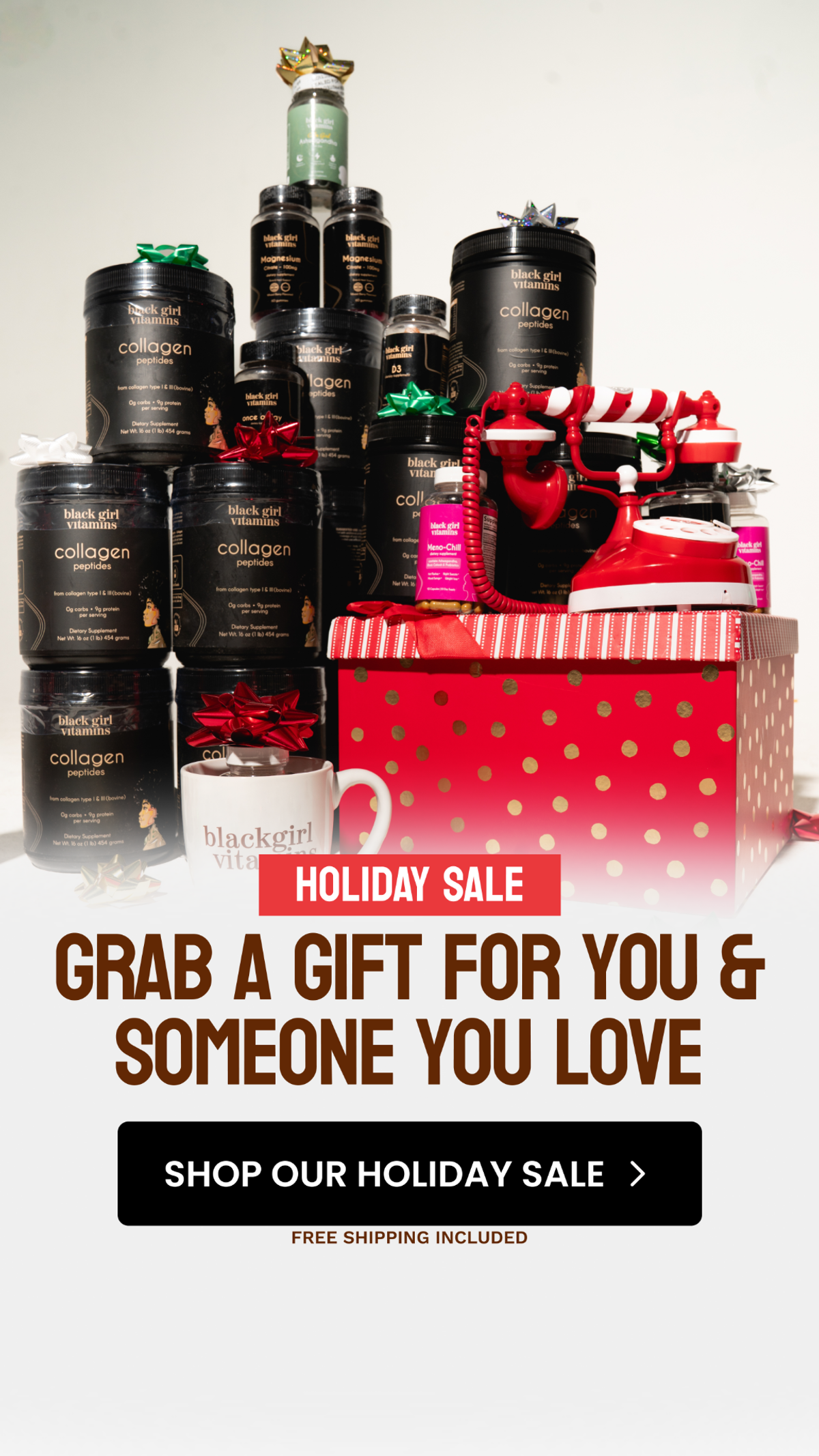
Black Girl Vitamins. Archived creative retrieved through VMA. Browse the brand’s Meta ads.
The line invites the shopper to choose something for themselves as well as someone they love. Below a stack of products, the ad gives a holiday sale CTA and mentions free shipping. It makes room for the person doing the shopping.
I would test this angle for products people already buy regularly. Someone replenishing their own order might consider a second purchase for a friend, particularly when the product is already familiar to that friend.
The crowded product arrangement is the part I would simplify. A clearer version could show two selections and explain who each is for. That would connect the visual to the two-person idea more directly. With supplements, avoid implying that the same product suits every recipient; the buyer still needs the product information.
Also, do not turn this into an assumed multibuy offer. The visible creative promotes a holiday sale and shipping, but it does not establish that a second item is free. Your copy should describe the actual basket terms.
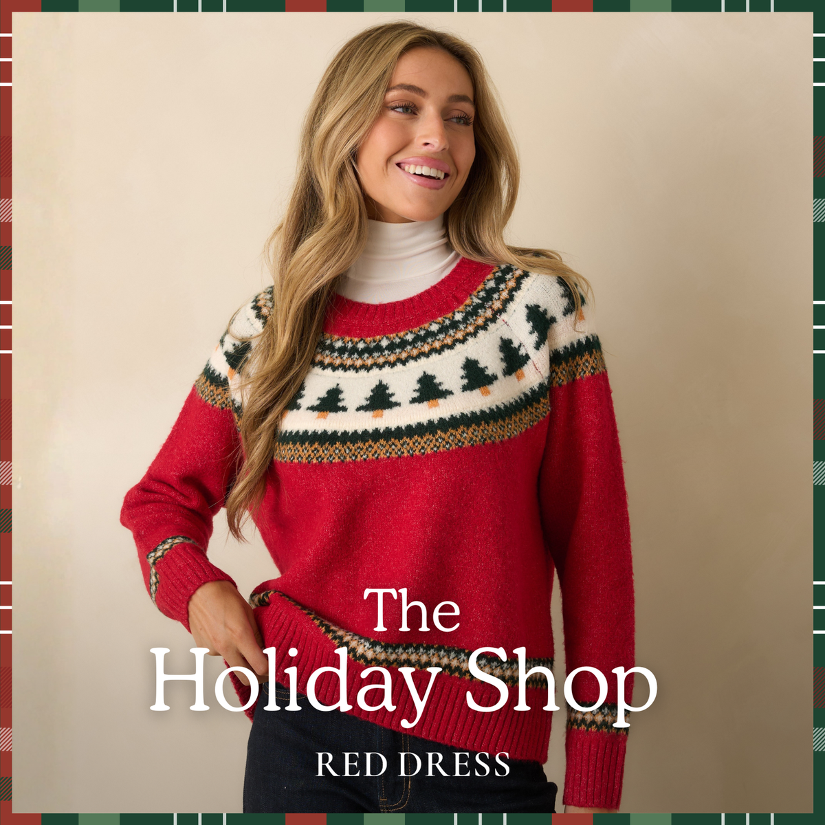
Red Dress. Archived creative retrieved through VMA. Browse the brand’s Meta ads.
A person wearing a festive sweater carries this Red Dress ad. The small collection headline lets the photograph establish the season. There is no percentage offer taking attention away from the outfit.
This belongs in the selection because Christmas spending includes things people buy to use themselves. A sweater for a family gathering has a different brief from a sweater chosen as a gift. The wearer wants to imagine the occasion and understand the fit.
I would build the accompanying copy around a specific use the product can support, such as a holiday dinner, then link to the pictured item or a tightly related collection. If the ad shows a particular sweater, do not make the shopper search through dozens of unrelated dresses to find it.
For your test, keep the garment constant and change the setting or crop. A full outfit can help someone judge the overall look; a closer view can reveal texture. Our product ad examples explore how much explanation different purchases need.
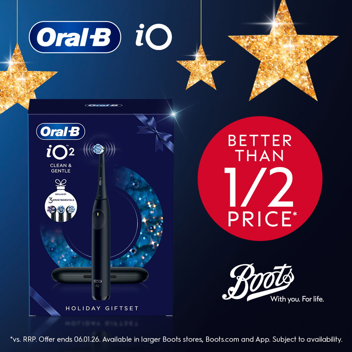
Oral-B. Archived creative retrieved through VMA. Browse the brand’s Meta ads.
Oral-B shows the boxed iO2 gift set beside a large price promotion. The image gives the buyer a recognizable product, the specific model and a package labeled for gifting. A practical purchase has been presented as something ready for the occasion.
This example ran with Boots branding and UK offer terms. I would borrow the clarity of the named set, not its discount or old deadline. For a US campaign, the actual price, retailer and delivery terms must match the destination page.
The box provides some product information, but small packaging text can disappear on a phone. If the included extras are a reason to choose the set, bring them into the main copy or show the contents outside the box.
A useful comparison would keep the set and price unchanged while testing the closed gift box against an unpacked view. One emphasizes presentation; the other makes the contents easier to inspect. Neither wins automatically because it looks more festive.

Selfridges. Archived creative retrieved through VMA. Browse the brand’s Meta ads.
Selfridges places champagne, fragrance, makeup and a candle together, with a direct invitation to find a Christmas gift. The mix gives an undecided shopper several possible starting points.
A small D2C catalog can use this idea too. You could show a few choices for different tastes or budgets, provided each choice leads somewhere useful. You do not need the range of a department store to reduce the effort of picking a gift.
What I would change is the guidance between the products. The assortment shows possibilities, but a buyer still has to decide which one fits the recipient. Short labels or a carousel could make that choice easier without covering the products in copy.
This is a UK retailer reference, and the image includes alcohol. Use the selection idea for your own eligible products and market. The useful lesson is how the ad starts a shopping decision, rather than evidence that a mixed assortment outperforms a single-product ad.
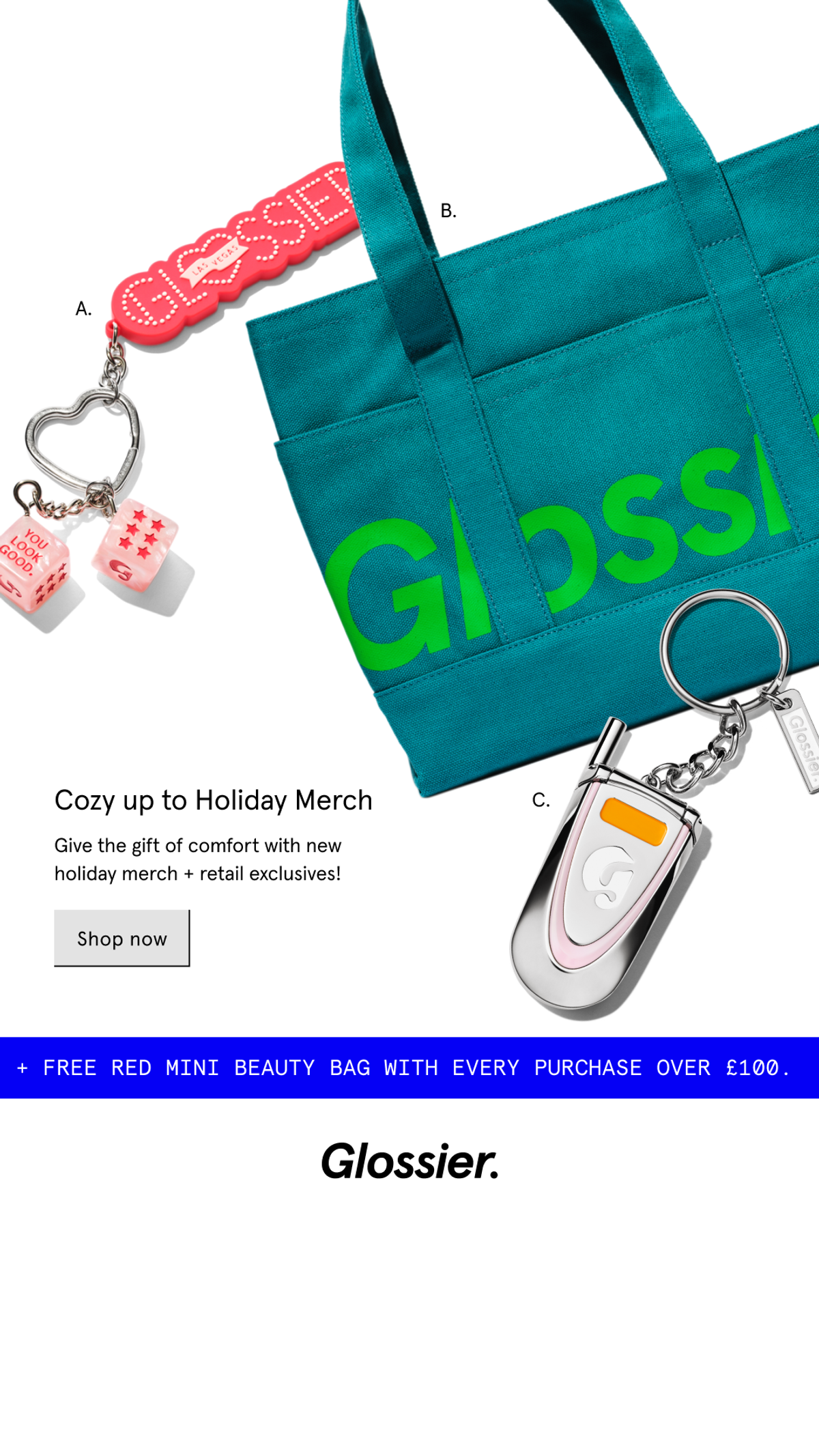
Glossier. Archived creative retrieved through VMA. Browse the brand’s Meta ads.
This second Glossier example has a different job from the collectible lighter. It shows a tote and keychains, labels them A, B and C, and gives shoppers a small collection to browse. The colored products stand out against a mostly white background.
I would use this structure when several items belong to the same gifting collection but deserve to be seen individually. Keep enough space between them that a shopper can understand each object. The labels would be even more useful if the accompanying copy named the items or explained the choices.
The extra beauty bag comes with a spending threshold shown in pounds. That makes this a UK-price reference. If you use a threshold incentive, the buyer should be able to see which products count and whether their basket qualifies without doing detective work.
For a smaller brand, test the collection against its most promising individual item. If one product draws most of the interest, give it its own ad and keep the assortment for shoppers who want options. The collection photograph does not have to carry every stage of the campaign.
Start with a product you can supply reliably and a recipient you can describe without stretching. Write down why that person would appreciate it. If the only answer is "it is on sale," the brief needs more thought.
Then prepare a manageable set of genuinely different ideas. For the same product, I would consider these three:
Keep the product and offer consistent where possible. That makes it easier to interpret the creative results. If you change the product, discount, audience and landing page together, you will have several explanations for whatever happens. Our creative testing guide explains how to organize the comparison.
I would also read the ad with the destination page open. Is the pictured gift box included? Can the buyer find the size or variant? Is a personalized item subject to a different return policy? Does the free-shipping line have a threshold? These are the details that can turn an interested visitor into someone who leaves.
An advent calendar, a dinner outfit and a Christmas Day gift do not share the same useful delivery date. Build your schedule around the product's occasion and your own fulfillment capacity.
Early in the shopping period, introduce the product and the recipient. As your confirmed order cutoff approaches, make the deadline prominent. Once you can no longer support Christmas delivery, replace that message with an option you can fulfill, such as an eligible digital gift card, or stop promising arrival before Christmas.
None of the examples above verifies your shipping window. Get that date from your operations team and carriers, including the conditions and regions it applies to. Do the same for any personalization lead time.
After launch, look at purchases, acquisition cost and what remains after discounts, product costs and shipping. Clicks can show that a creative attracts attention. They cannot tell you whether the gift campaign makes money.
Creative references reviewed October 15, 2026. Historical offers and advertiser claims are reproduced for analysis. VMA archive records identify placements; they do not establish campaign profitability or the audiences who saw an ad.
Get notified when new insights, case studies, and trends go live — no clutter, just creativity.
Table of Contents


Rahul Mondal
Product, Design and Co-founder, Vibemyad

Rahul Mondal
Product, Design and Co-founder, Vibemyad


Ananya Namdev
Content Writer, Vibemyad