October 14, 2026 • 10 min read

October 14, 2026 • 10 min read
You have five product photos and an empty carousel to fill. The easy move is to put one photo on each card and call it an ad. But what is someone supposed to learn when they swipe?
That is where I would start. Perhaps they need to see the product in use, compare two options or understand why the bundle costs more. Each card should help with that decision.
These ten Facebook carousel ad examples show different ways to use the format. Some build a sequence; others let people browse. I’ve picked them for the creative choices visible in the screenshots, not because we have access to their sales results.
If you are still deciding what your ad needs to communicate, start with what makes an effective ad. Here, we’ll focus on how to distribute that message across cards.
A carousel ad contains multiple cards a viewer can swipe through. Those cards can show different products, different details of one product, or steps in an explanation. In this article, the images are published screenshots of real brand creative, including examples from different markets. They show the available cards, not necessarily every card in the original ad.
My preference is to decide between two approaches before designing: a sequence where order matters, or a collection where each card stands alone. Mixing them without a reason can leave the viewer unsure why they should keep going.
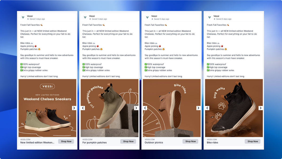
Brand creative, screenshot reproduced for commentary via Foreplay. Historical example; shown terms and prices may no longer apply.
A waterproof shoe is easy to describe and harder to make interesting. I like this example because it gives the buyer something to imagine doing in the shoe.
The visible sequence introduces the Weekend Chelsea, then pairs individual shoes with activities. The product stays prominent while the surrounding illustrations supply the context.
For a D2C brand, I would test this against a plain colour-selection carousel. Keep the product range and offer the same; change whether the cards organise the choice by colour or by occasion. That helps answer whether people need help choosing a variant or recognising a use for the product.
Try it with: a bag for commuting, weekends and flights, or a drink for different hosting occasions. Use situations the product can genuinely serve.
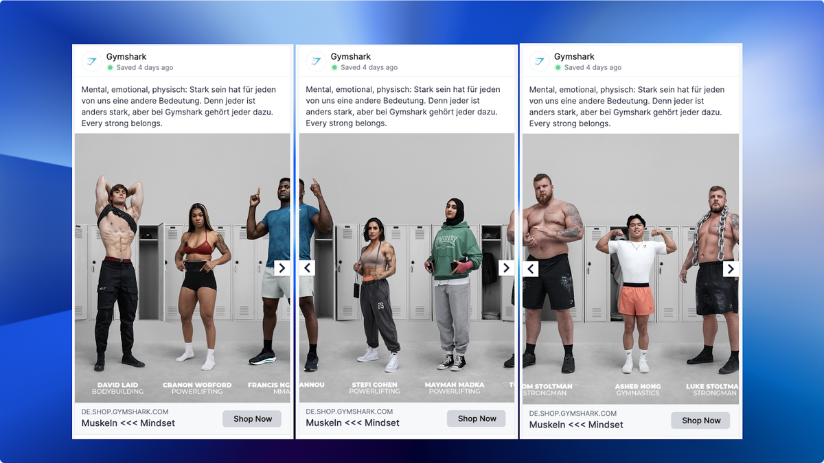
Brand creative, screenshot reproduced for commentary via Foreplay. Historical example; shown terms and prices may no longer apply.
Notice how the gym setting continues across the visible cards. Different athletes occupy the same scene, so the carousel feels like a wider photograph you are moving through.
My caution with this approach is that the visual can become the entire project. Before spending time lining up edges, decide what the viewer should understand after seeing the people and products. For a smaller apparel brand, that might be fit across different bodies or how one collection looks on several people.
I would also check every crop on its own. A person may only see one card. If that crop hides the garment or cuts away the important detail, the connected picture is asking too much of the viewer.
Try it with: a small collection photographed in one setting. Give every card a useful view, even before the swipe.
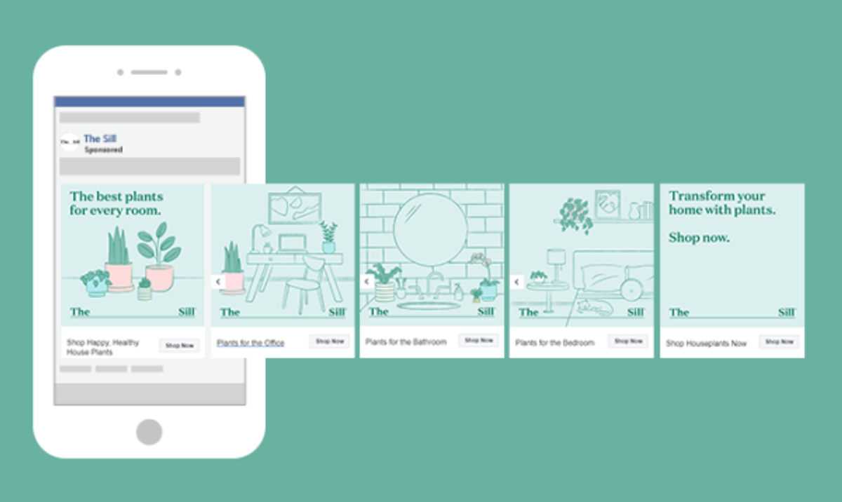
Brand creative, screenshot reproduced for commentary via The Brief. Historical example; shown terms and prices may no longer apply.
The Sill opens with plants for every room, then shows an office, a bathroom and a bedroom before closing with a shopping prompt. The cards organise the choice around where the plant will live.
That is a useful starting point when someone wants your product but doesn’t know which version to buy. I would rather help a first-time plant buyer find something for their desk than ask them to choose between unfamiliar plant names.
For your own carousel, take the question customers ask before purchasing and turn the answers into cards. A home fragrance brand could organise scents by room; a storage brand could organise products by the space they fit. Make sure each recommendation is genuinely suitable, and send the shopper to the relevant selection.
Try it with: a category where choosing the wrong item feels risky. Help people recognise their situation before asking them to compare products.
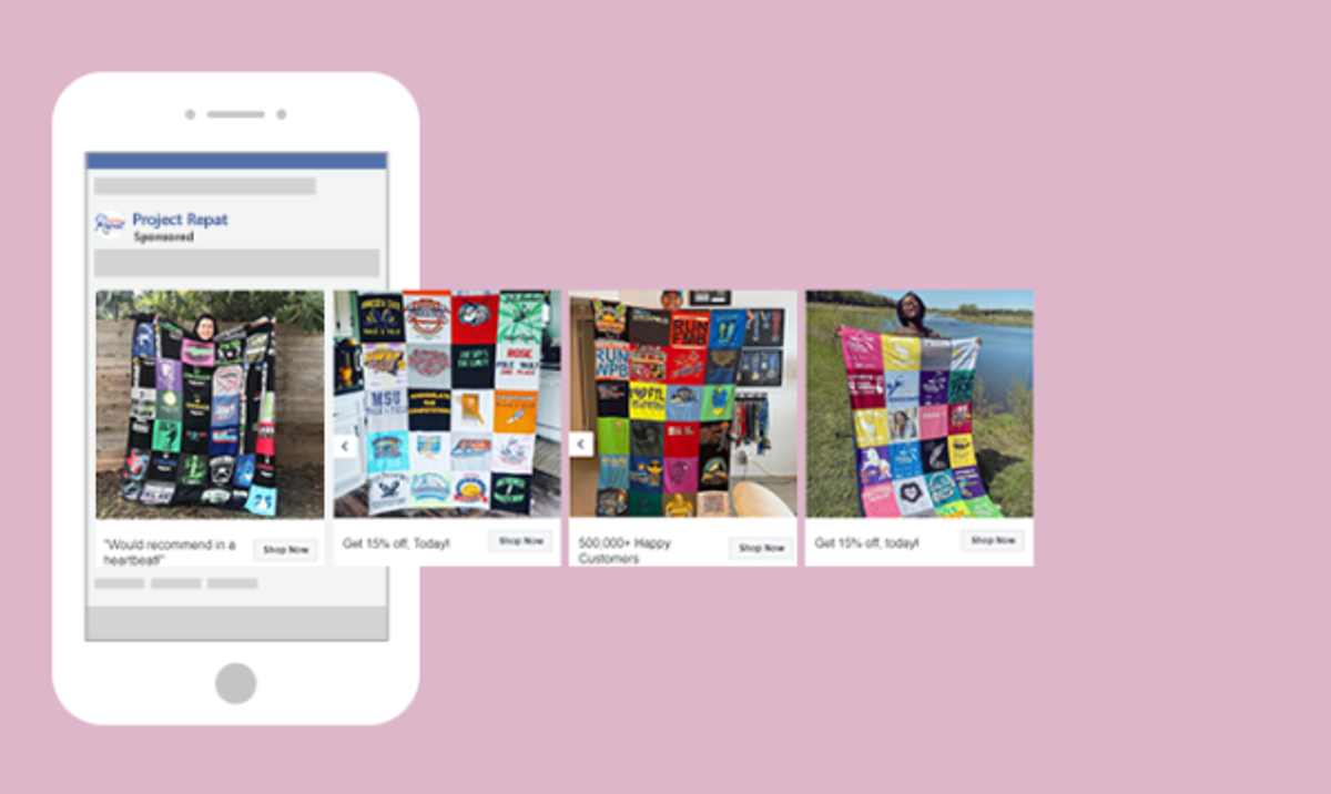
Brand creative, screenshot reproduced for commentary via The Brief. Historical example; shown terms and prices may no longer apply.
Project Repat shows finished T-shirt quilts, including people holding them up. The card captions add a recommendation, a customer-count claim and an offer. Those are the advertiser’s claims in the historical screenshot, not figures we have verified.
For a personalised product, I want to see what an ordinary customer actually receives. A polished studio photo alone may leave me wondering whether my order will look anything like it.
I would build a similar carousel around several real finished orders, with permission to use the photos. Show the whole product first, then add a close-up if workmanship is a common concern. Where a review accompanies an image, use the customer’s actual words and make the connection clear.
Try it with: personalised gifts or made-to-order products. Use customer evidence to answer “What will mine look like?” before leading with a discount.
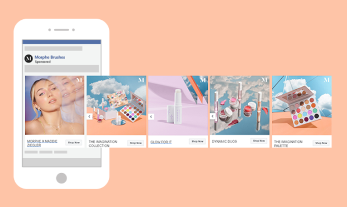
Brand creative, screenshot reproduced for commentary via The Brief. Historical example; shown terms and prices may no longer apply.
Morphe’s visible sequence starts with faces, then moves through a collection, a single product, a duo and a palette. There is a visual connection between the makeup and the products someone can shop.
The idea I would test is simple: show me a look I want to understand, then help me find the items behind it. A palette photograph can show the available colours; a face can show why I might care about them.
For a smaller beauty brand, I would tighten the sequence around one achievable look. Use the actual products featured in that look, label their role and link to the matching items. Avoid implying that a product created a result if it wasn’t used.
Try it with: makeup or a styling range. Compare a finished-look opening with a product-only opening while keeping the offer the same.
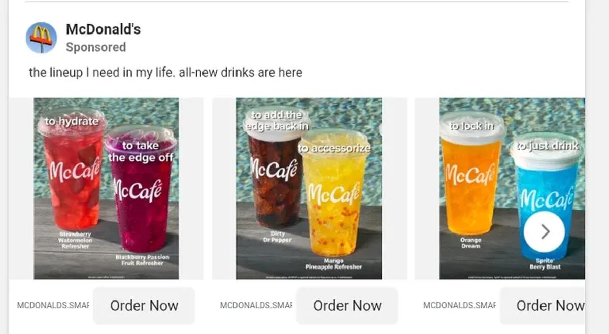
Brand creative, screenshot reproduced for commentary via Atria. Historical example; shown terms and prices may no longer apply.
The drinks are grouped under short mood or occasion labels. The images give the viewer several options without asking them to start by learning every product name.
For an unfamiliar D2C product, I would borrow the organising idea rather than the humour. Start with the situation in which someone might want it: a quick breakfast, a long afternoon or a gift for a host. Then show the product that fits.
Be precise about the difference between an occasion and a product claim. Saying a drink belongs at a picnic is different from promising a physiological effect. The copy still needs to match what the product can substantiate.
Try it with: a range that feels confusing when sorted only by SKU. Test occasion labels against plain product names.
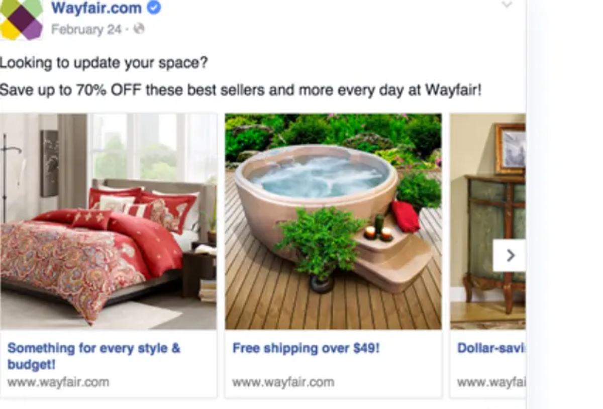
Brand creative, screenshot reproduced for commentary via Atria. Historical example; shown terms and prices may no longer apply.
Wayfair’s visible cards move across different home products under one broad shopping message. This is browsing, rather than a story that depends on a particular ending.
A brand with a wide range can use that distinction. You don’t have to force unrelated products into a problem-solution narrative. Let each card introduce a useful entry point and make the destination obvious.
I would still narrow the selection enough that it feels intentional. A first-apartment collection, a summer refresh or a group of gifts under a particular budget gives the range a reason to sit together. Filling every available card with stock you want to move is a merchandising decision; it is not automatically a persuasive ad.
Try it with: several distinct products that share a buyer or occasion. Judge the resulting purchases, not just which card gets curiosity clicks.
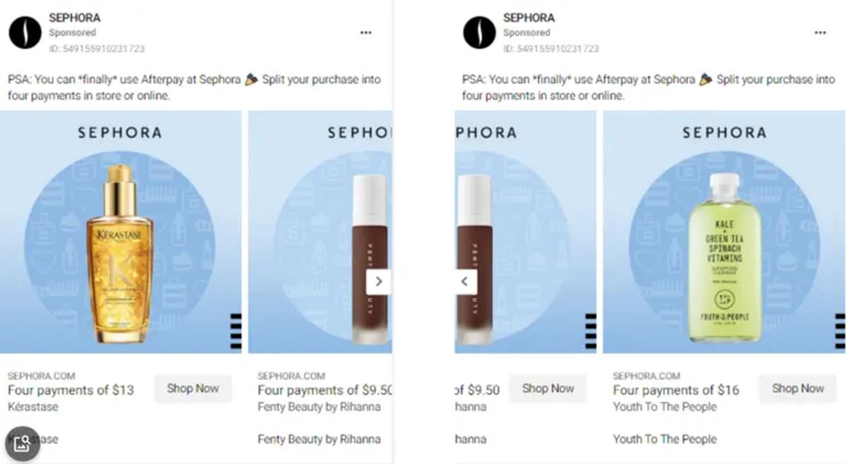
Brand creative, screenshot reproduced for commentary via Atria. Historical example; shown terms and prices may no longer apply.
Sephora pairs beauty products with installment-payment information. The buyer sees the item and the payment framing together rather than having to remember an explanation from an earlier card.
I would consider this approach only when payment flexibility is a real part of the offer and relevant to the audience. A premium product does not necessarily need a discount; some buyers need a clearer explanation of how they can pay.
For your own version, make the full price and payment terms easy to find. A smaller installment number should help a shopper understand the purchase, not conceal its total cost. Compare this angle with a product-benefit version before assuming price is the main objection.
Try it with: a higher-priced product and an existing payment plan. Treat affordability as a hypothesis to test.
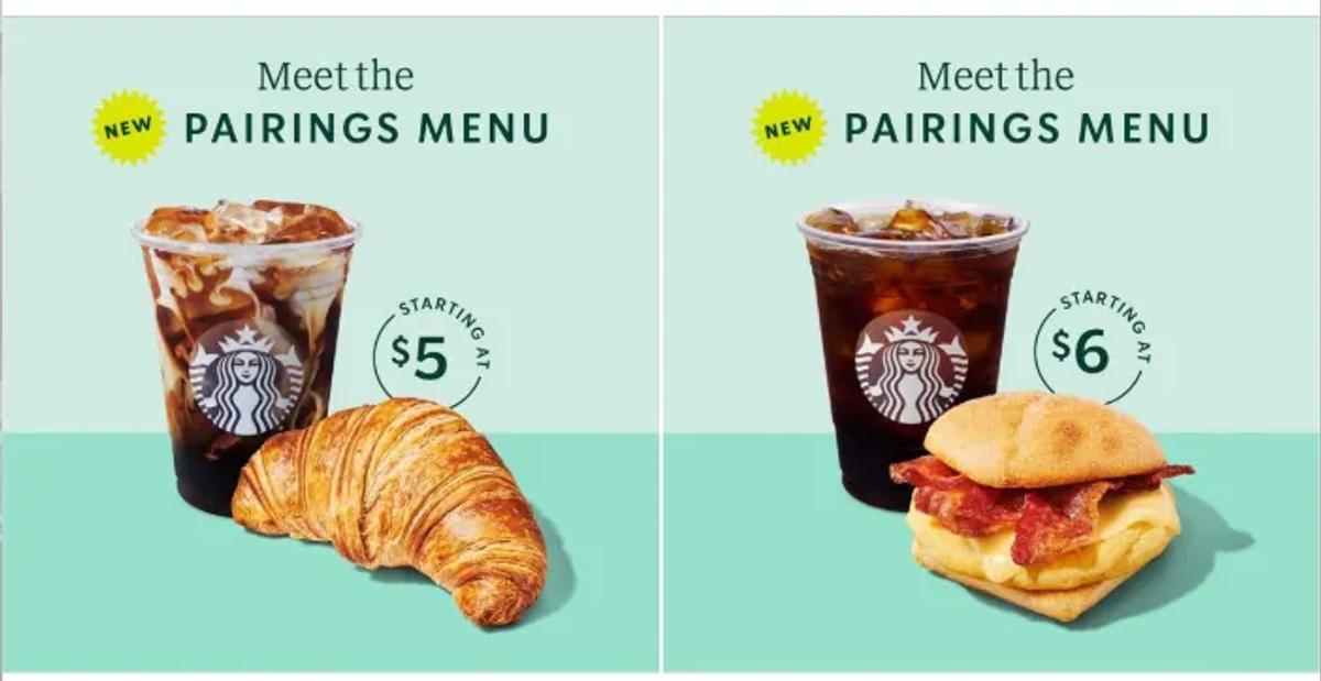
Brand creative, screenshot reproduced for commentary via Atria. Historical example; shown terms and prices may no longer apply.
The pictured cards pair a drink with food and display a starting price. The combination is the offer, so the shopper can understand what belongs together at a glance.
This is an angle I would explore for a D2C brand whose products are naturally used together. A cleaning starter kit or a simple skincare routine can be easier to evaluate than several separate purchases.
Start with the customer’s task, then build the bundle around it. Include the actual contents, make variant differences visible and explain what the price covers. The carousel can compare two useful combinations; it doesn’t need to turn into a catalogue of every possible bundle.
Try it with: two or three genuinely useful combinations. Test whether shoppers prefer the complete kit or choosing items individually.
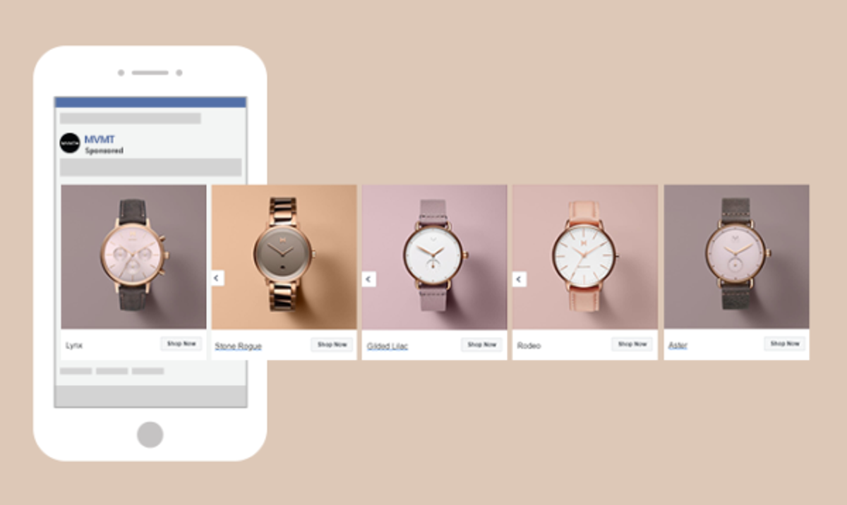
Brand creative, screenshot reproduced for commentary via The Brief. Historical example; shown terms and prices may no longer apply.
MVMT presents five watches at a similar scale, with restrained backgrounds and a product name beneath each. Differences in the dial, strap and finish become easy to spot.
I would use this approach when the shopper already understands the product and mainly needs to choose a style. In that situation, consistency does useful work: the photography stops competing with the choice.
For your own shoot, keep the angle, crop and lighting comparable across variants. If you are selling bags, don’t photograph one from the front and another half-hidden on a model, then expect a fair comparison. Name the differences that matter, and make sure the selected card leads to the right variant.
Try it with: one familiar product in several finishes or colours. If shoppers still hesitate, test a second version explaining how to choose between them.
Pick the question your product page, reviews or sales conversations keep answering. Build the carousel around that question before choosing a visual style.
For a sequential story, check the ordering and placement options available in Ads Manager before launching. Preview the actual delivery formats rather than assuming the design file is exactly what everyone will see. Meta’s carousel format page is the starting point for current setup guidance.
For an ecommerce sales campaign, I would judge the test against purchases and acquisition cost, with clicks and landing-page behaviour helping explain the result. A carousel can attract swipes without attracting the right customers. See our creative testing guide for D2C brands for a fuller approach.
Looking for references in your own category? Follow our guide to researching ads for your D2C brand to turn competitor observations into ideas you can test.
Examples and screenshots: Foreplay’s carousel collection Atria’s carousel analysis, and The Brief’s carousel examples. Commentary and proposed tests: Vibemyad Marketing Agency. Brand imagery belongs to its respective owners. This article does not claim these brands are Vibemyad clients.
Get notified when new insights, case studies, and trends go live — no clutter, just creativity.
Table of Contents


Rahul Mondal
Product, Design and Co-founder, Vibemyad

Rahul Mondal
Product, Design and Co-founder, Vibemyad

Rahul Mondal
Product, Design and Co-founder, Vibemyad