October 15, 2026 • 14 min read

October 15, 2026 • 14 min read
You have a good product, a set of clean photographs and a designer ready to make ads. The brief says, "Make it look premium." But when the first design arrives, it leaves a more important question unanswered: why would someone buy this?
That is the question I would settle before choosing the layout. A protein bar shopper might want the numbers. Someone buying glasses wants to see the fit. A couple considering a sleep product may need to understand whether it can suit both of them.
These 12 product ad examples show how brands approach those different decisions. Each has a real static creative, a breakdown of the choices visible in it, and a test I would consider for a D2C brand. We do not have these campaigns' sales data, so this is creative analysis, not a ranking by performance.
A product ad promotes a particular item or range and gives the audience a reason to consider buying it. The reason might be a useful feature, an appealing design, a clear offer or evidence that addresses a doubt.
A photograph can carry that message, but it does not automatically do so. When reviewing product advertisement examples, ask what the person learns beyond the fact that the product exists. Our guide to what makes an effective ad explores that distinction in more detail.
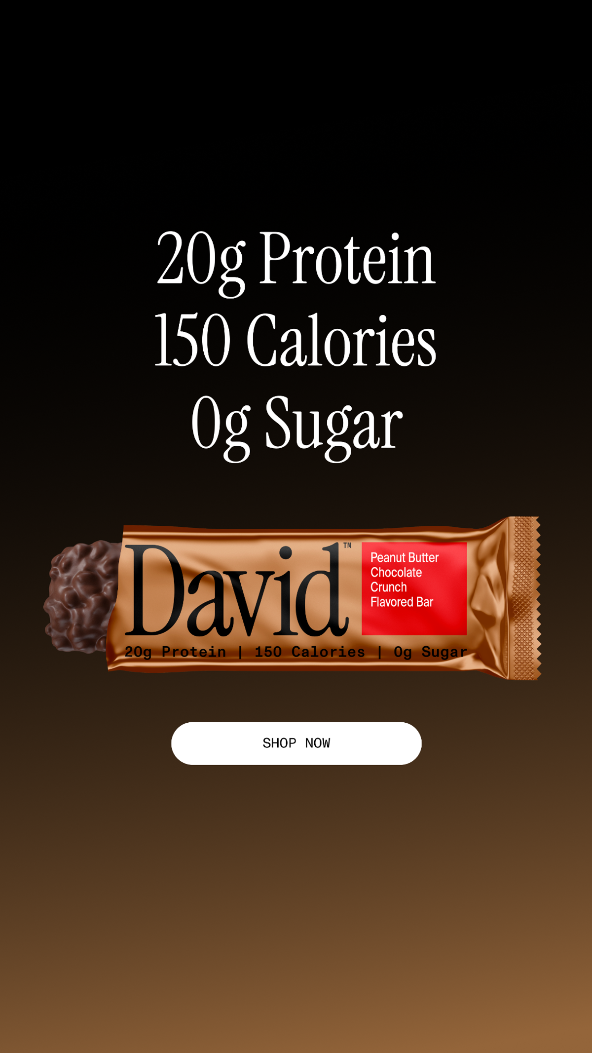
David Protein creative, retrieved through VMA on October 15, 2026. Browse the brand’s Meta ads.
Before you read the flavor on the wrapper, you see three numbers: 20g protein, 150 calories and 0g sugar. The partially unwrapped bar gives the ad something appetizing to look at while the headline handles the product information.
I like the order here. Someone comparing protein bars can understand the proposition without hunting through a label. The ad assumes those three measures matter to the buyer, which is a much more specific choice than calling the bar a healthy snack.
For your product, find the details customers actually compare. A power bank might lead with capacity and weight; a storage container might lead with dimensions. Use figures you can support for the exact item shown. These are the nutrition claims in this particular David creative, not a statement about its entire range.
My next test: keep the same bar image and compare this numbers-led headline with a taste-led headline. That tests the buying motivation before changing the design.
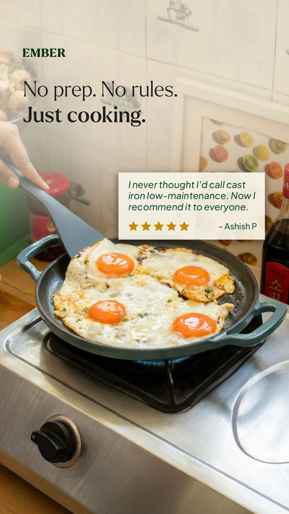
Ember Cookware creative, retrieved through VMA on October 15, 2026. Browse the brand’s Meta ads.
A pan full of eggs is more useful here than an empty pan on a pedestal. It puts the product into a familiar cooking moment. Above it, the headline promises less fuss; the customer quote addresses the expectation that cast iron takes work to maintain.
The quote is doing a particular job. It speaks to someone who likes the idea of the product but is reluctant to deal with its upkeep. A generic five-star review would lose that connection.
If I were briefing an ad for cookware, I would start by reading the questions people ask before ordering. Are they worried about cleaning, weight or food sticking? Pick one, then choose a visual and a genuine review that address it. A cooking image supports the story, although it does not prove a low-maintenance claim by itself.
My next test: pair the same objection with a short cleaning demonstration. See whether showing the task is more persuasive than describing it.

Warby Parker creative, retrieved through VMA on October 15, 2026. Browse the brand’s Meta ads.
The image looks like a casual photo: a person wearing the frames, with a short caption naming the style and finish. You can see how the glasses sit on a face, which a product cutout cannot tell you.
For glasses, that is part of the purchase decision. I can like a frame on a white background and still have no idea whether I would wear it. The photo gives me a useful reference point for the size, shape and overall look.
This approach also gives the shopper a searchable product name. If they want these exact frames, they should not have to guess which pair appears in the ad. One face will not answer everyone's fit questions, so I would build additional versions with different people rather than expect this one photograph to do everything.
My next test: compare the on-face image with a clean product shot of the same frame. Keep the product name and offer consistent.
If customer evidence is the missing piece in your ads, see our testimonial ad examples for more ways to use reviews and customer experiences.
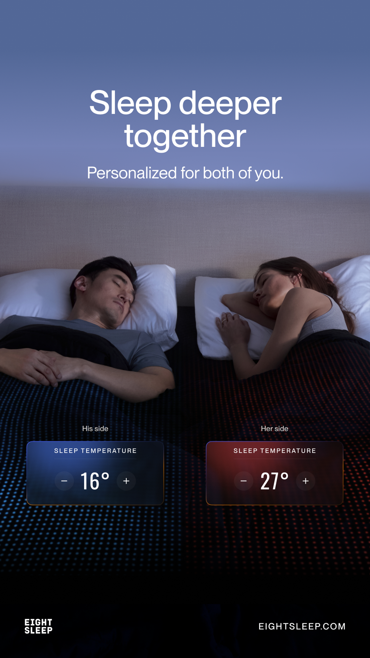
Eight creative, retrieved through VMA on October 15, 2026. Browse the brand’s Meta ads.
Two people share a bed, but the graphic gives each side a separate temperature setting. The blue and red treatments explain the difference before the viewer needs to understand the technology.
This is the example I would show a founder who keeps saying their product is personalized. Personalized how? Here, the answer is visible: two people can want different things from the same bed.
The headline connects the feature to sleeping together comfortably. The controls below supply the explanation. Those displayed temperatures illustrate the ad's message; they are not sleeping recommendations. We also cannot establish the headline's sleep benefit from the image alone.
For a product with an adjustable feature, show the settings alongside the situation that makes them useful. A technical diagram has more purpose when the reader can recognize their own problem in it.
My next test: compare this couple-focused message with a version for one sleeper. That would test which customer situation deserves more creative attention.
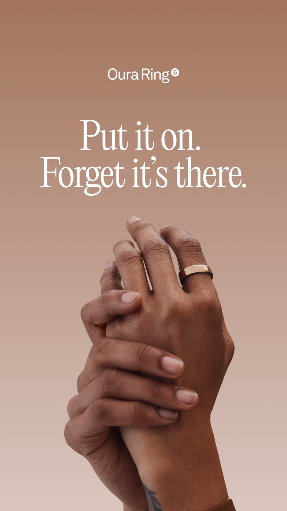
ŌURA creative, retrieved through VMA on October 15, 2026. Browse the brand’s Meta ads.
Oura shows the ring on a hand with a short message about putting it on and forgetting it is there. There is no dashboard or list of measurements in this particular creative.
That choice makes sense as a response to a different question: will wearing this feel like a chore? For someone who already understands smart rings, the reassurance may be more useful than another feature list.
I would be more cautious with a completely unfamiliar audience. The image could pass for a jewelry ad, so the surrounding copy or another version needs to establish what the product does. Minimal copy works best when it leaves out information the buyer already has.
My next test: retain this image, then add one plain sentence explaining the product's function in a second version. Compare whether that extra context helps new visitors reach the product page and buy.
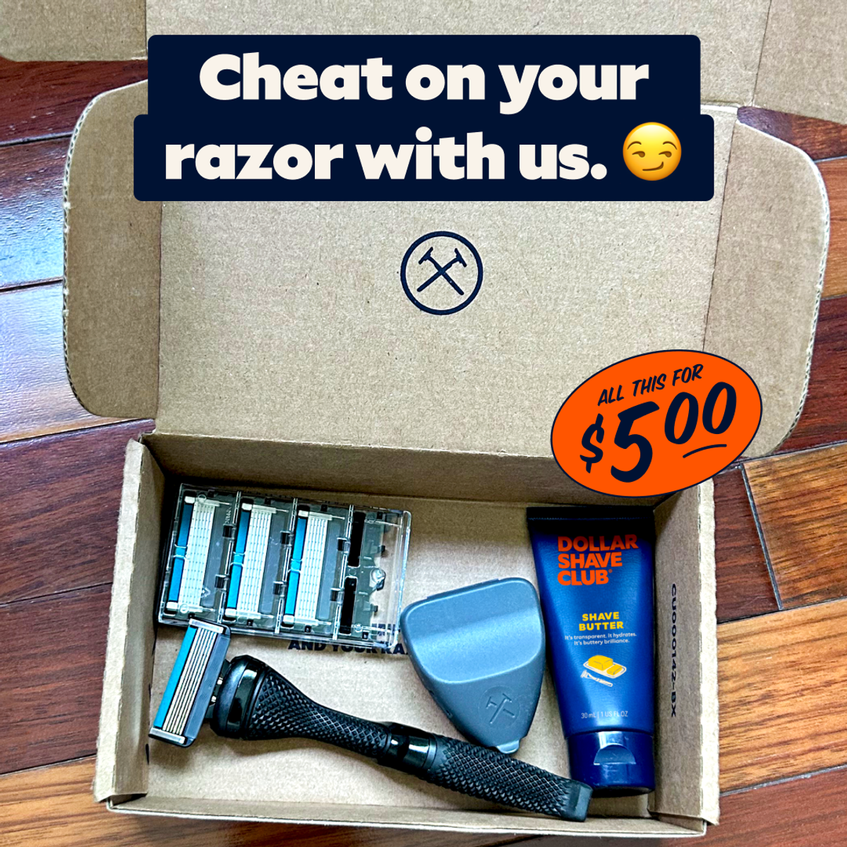
Dollar Shave Club creative, retrieved through VMA on October 15, 2026. Browse the brand’s Meta ads.
The open box shows the razor, cartridges and shaving product together. A price sticker tells you what the pictured bundle is being offered for, while the headline invites you to switch from your current razor.
The box matters as much as the price. If the ad only said $5, I would still be asking what I get. The contents give the offer a shape I can evaluate.
For a D2C brand with a starter kit, show the actual items and make the first-order cost clear. Then make sure the destination explains delivery charges, eligibility and any recurring commitment. An attractive entry price loses its usefulness if the customer discovers a different deal after clicking. The pictured promotion is an archived creative, not a current offer we are recommending.
My next test: compare the starter kit with a single-product offer at a similar entry cost. Measure purchases and contribution margin after the incentive.
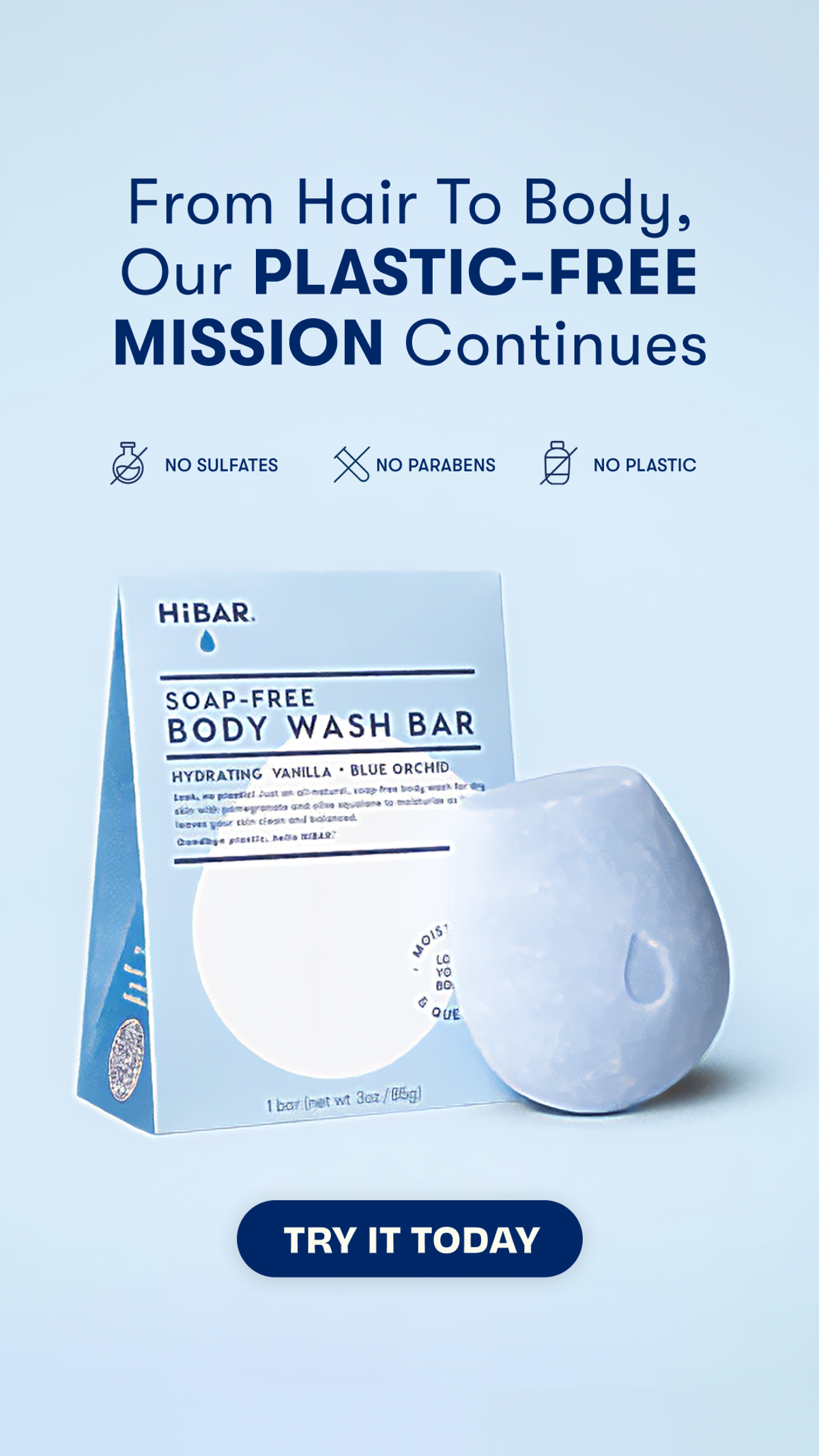
HiBAR creative, retrieved through VMA on October 15, 2026. Browse the brand’s Meta ads.
HiBAR places its plastic-free message above a body wash bar and its box. The product name tells the viewer what the unfamiliar shape is for, and the button gives them a next step.
This is what I want from a values-led product ad: something concrete enough to understand. The packaging and bar let the reader connect the message with an item they could put in their bathroom.
A broad environmental slogan would ask the customer to take more on trust. Even here, the visible creative cannot substantiate every product claim; the landing page needs to explain the relevant materials and details. For your own version, name the specific change you have made and show it clearly.
My next test: compare the packaging angle with a product-use angle. Learn whether buyers respond more to the format, the routine or the reason for changing it.
Need to explain why someone should switch? Our comparison ad examples focus on the differences a buyer can evaluate.
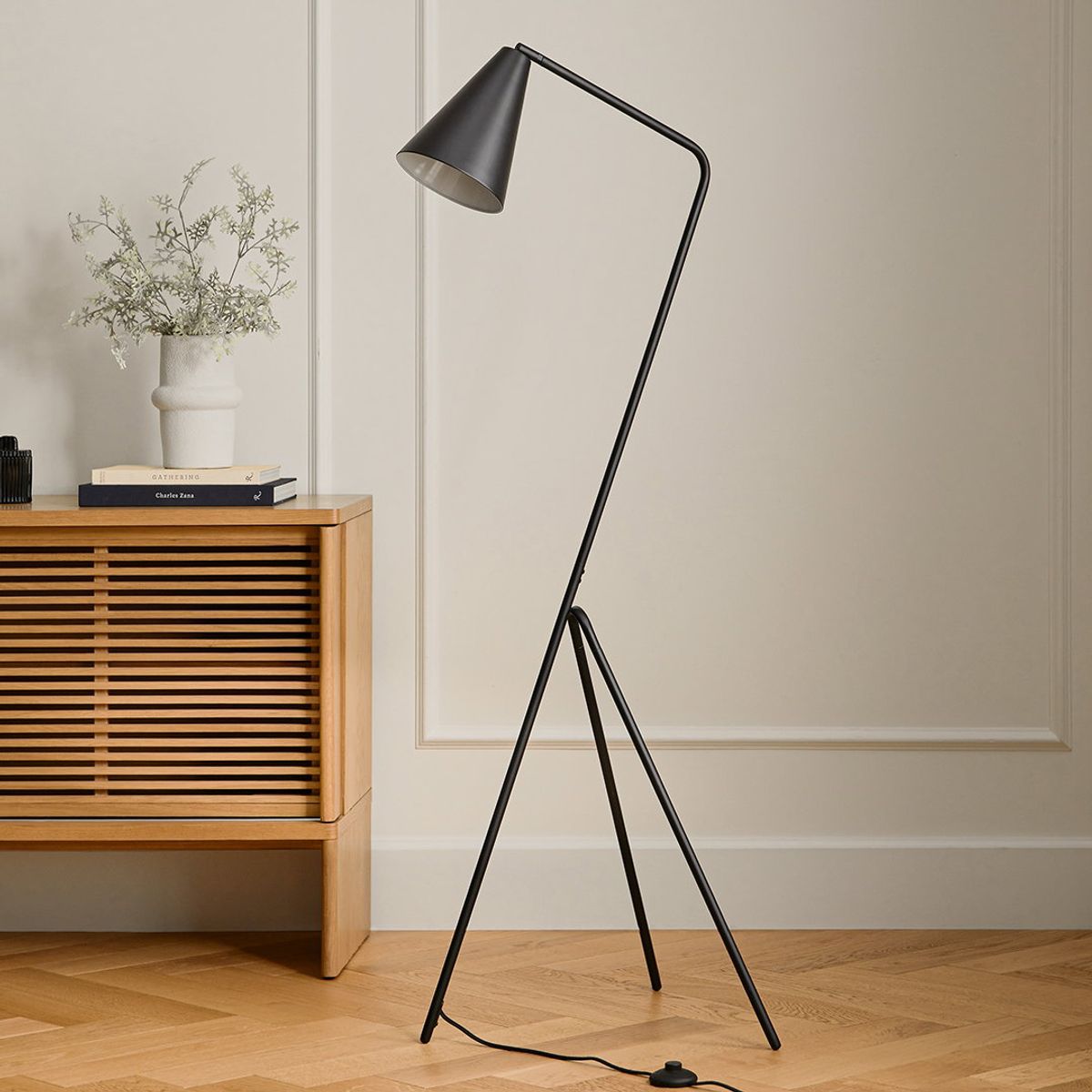
Article creative, retrieved through VMA on October 15, 2026. Browse the brand’s Meta ads.
Article places a floor lamp beside a cabinet, with books and a vase nearby. The room gives the lamp scale and shows how its shape works with other furniture.
This is a useful counterpoint to ads filled with product information. A person shopping for a lamp may understand its function already. Their question is whether it belongs in the room they are putting together.
I would still give the shopper an easy route to the exact lamp. The scene earns interest, but dimensions, materials and price need to be available when they click. If the surrounding furniture takes all the attention, the styling has become a distraction.
My next test: photograph the same lamp in two believable room styles. Compare which setting attracts buyers, then use that insight to plan the next shoot.
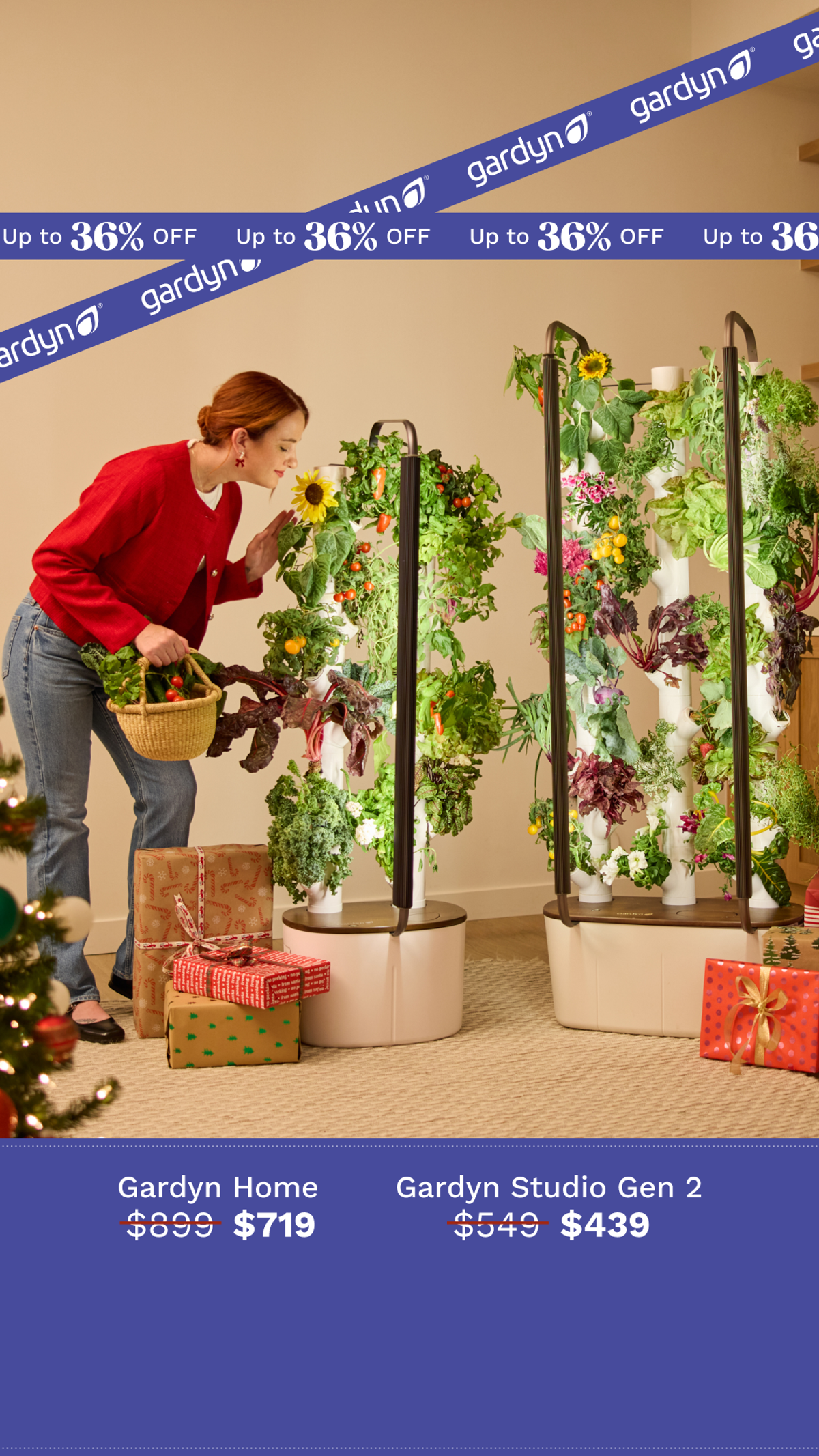
Gardyn creative, retrieved through VMA on October 15, 2026. Browse the brand’s Meta ads.
A person stands beside two indoor gardens, giving the viewer a rough sense of their size. Labels at the bottom name the models and show separate prices. The plants make the intended use immediately apparent.
For an unfamiliar physical product, scale is buying information. A close-up of leaves might look attractive, but it would not tell me what I am inviting into my kitchen.
I would make the connection between each model and its label clearer. With two products, two names and two prices, the reader should not have to work out which details belong together. A line or a label closer to each garden would help this comparison.
My next test: keep the person and two models, align the labels with the products, and test an everyday setting against the seasonal one. Leave detailed dimensions to a clearly linked product page.
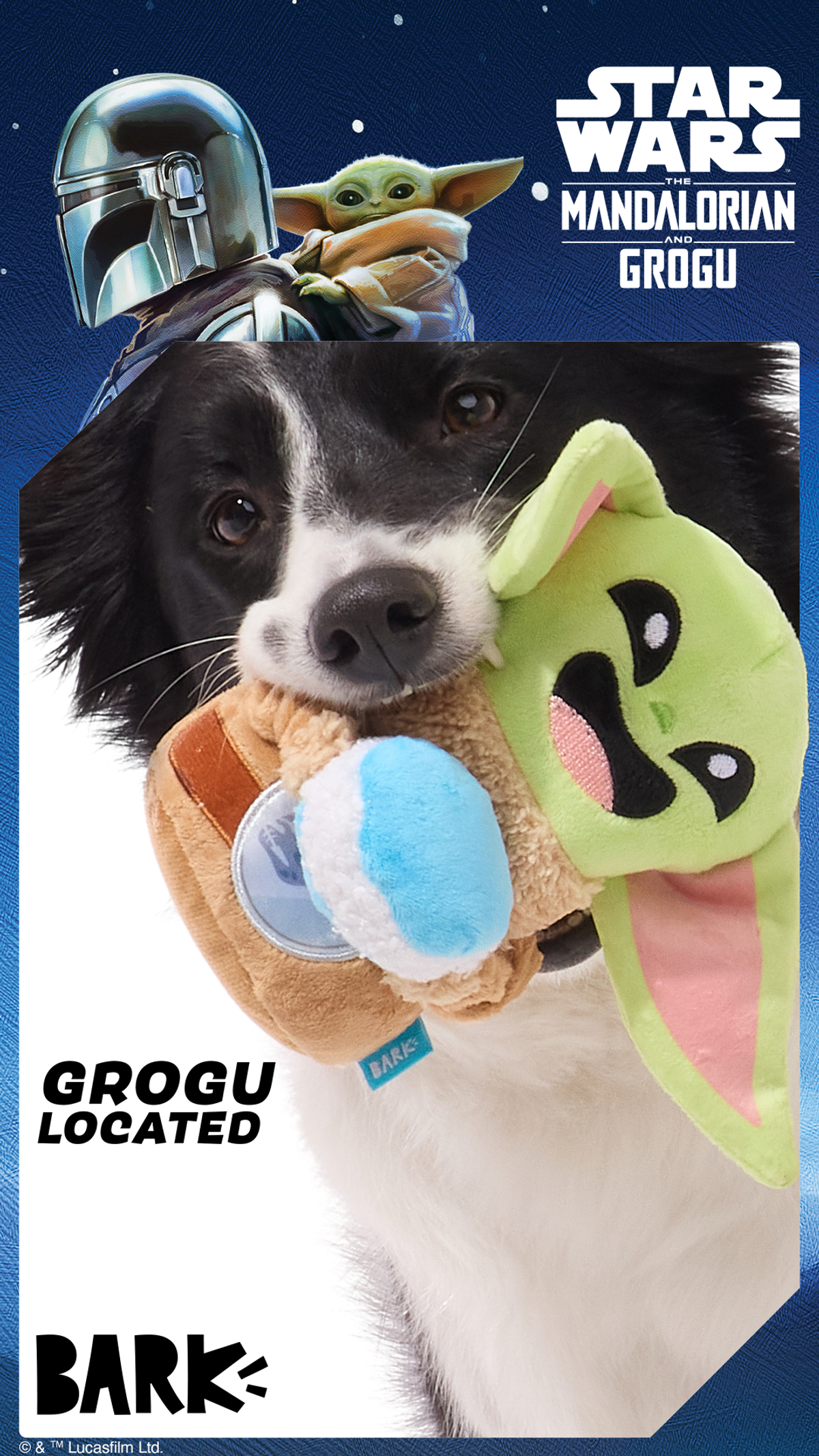
BarkBox creative, retrieved through VMA on October 15, 2026. Browse the brand’s Meta ads.
A dog holds a Grogu-themed toy, and the Star Wars branding makes the collection recognizable. The image puts the toy with its intended user instead of leaving it as a piece of merchandise on a shelf.
The appeal has two audiences: the dog gets a toy, and the owner recognizes something they enjoy. That is more specific than trying to sell the same generic pet message to every dog owner.
For your brand, consider whether a collection connects with a real customer interest, occasion or community. A licensed collaboration is one way to do it, but the broader lesson is to make the product relevant to a particular person. The ad still needs a route to the correct collection and a clear explanation of what an order includes.
My next test: compare the dog-with-toy photograph with a contents shot of the same collection. See whether the character appeal or the clarity of the offer contributes more to purchases.
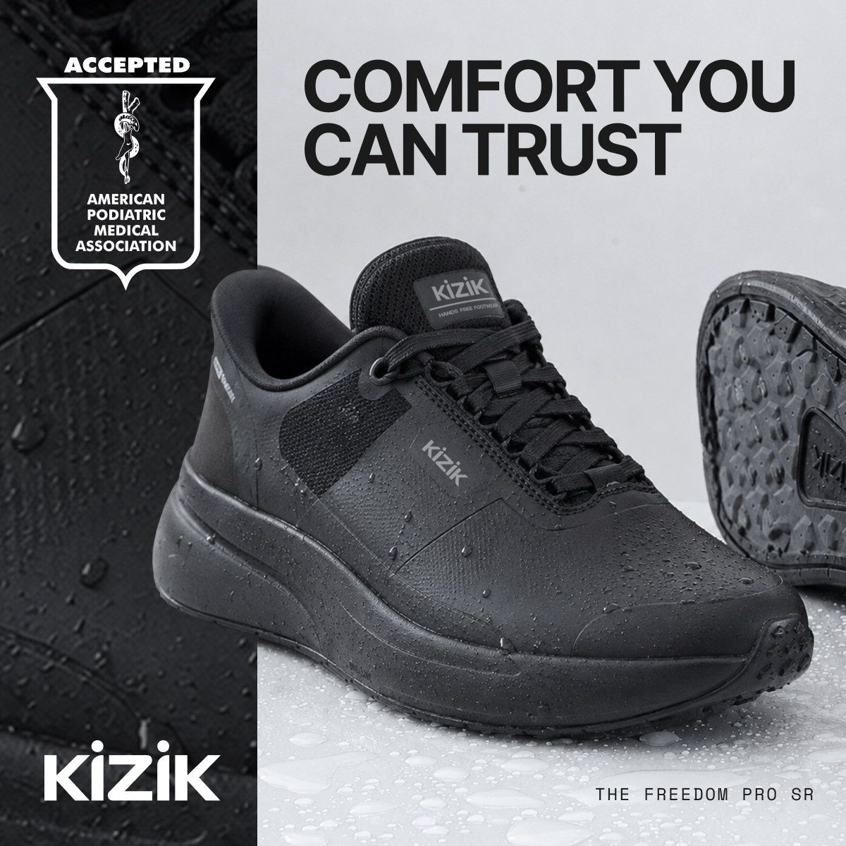
Kizik creative, retrieved through VMA on October 15, 2026. Browse the brand’s Meta ads.
The headline promises comfort. Beside the shoe, a prominent acceptance seal from the American Podiatric Medical Association gives the reader another detail to evaluate. A separate view of the sole also makes the product easier to inspect.
The useful choice is proximity. The reassurance is beside the promise, where someone deciding whether to believe it can see both. It is not buried in a paragraph below the image.
I would keep the meaning of the seal precise. This creative displays an acceptance mark; it does not establish that the shoe will resolve a particular person's discomfort. If your product has a relevant certification or award, use the authorized mark and explain what it covers. A badge for an unrelated achievement will not answer the buyer's concern.
My next test: compare this reassurance angle with a version showing the shoe in its intended daily setting. Learn whether trust or use context is the bigger missing piece.
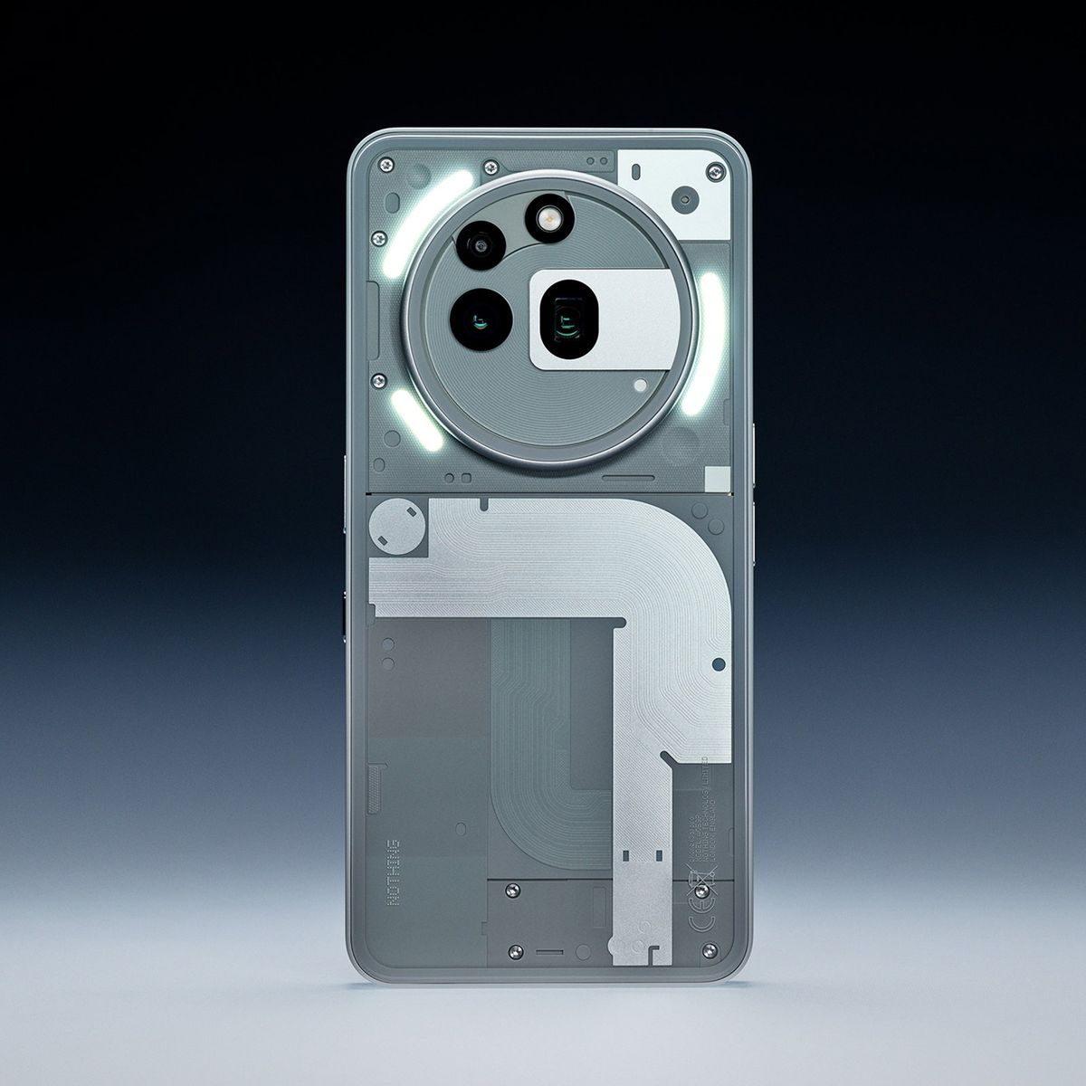
Nothing Technology creative, retrieved through VMA on October 15, 2026. Browse the brand’s Meta ads.
The phone's rear design fills the image. The circular details, visible-looking components and illuminated elements give the viewer something distinctive to inspect without a large headline.
I would use this kind of ad when appearance is a meaningful part of the purchase. Some products can communicate a difference through the product photograph itself. A visually ordinary item usually needs more help explaining why someone should choose it.
The limitation is clear too: this image does not explain the camera, battery or price. It gives the shopper an aesthetic reason to look closer. For people comparing specifications, I would prepare another version that answers those questions instead of adding every possible message to this one.
My next test: keep the same photograph and add one verified feature relevant to the target buyer. Compare the response with the clean design-led version.
Start with the reason for the purchase. David makes the nutritional proposition easy to scan. Warby Parker shows fit. Article supplies room context. They are answering different questions, so copying the same amount of text or the same visual treatment across all three would miss the point.
Before briefing your next ad, write down the question you want it to answer. Then choose the evidence:
Sometimes that answer fits in one image. If it needs several views, our carousel ad examples show how to give each card a purpose. If the buyer needs to recognize a problem first, look at the problem-solution examples.
For a brand starting from scratch, I would choose three different reasons to buy before making a dozen visual variations. For a bag, those might be what it holds, how it looks when worn and how it keeps things organized. Keep the product, offer and destination comparable so the creative question is clear.
Then give each idea the assets it needs. A packing demonstration requires a view into the bag; a style message needs someone wearing it. Changing the background color on the same product photo will not test those three ideas properly.
Judge the results against the campaign's business goal. For a sales campaign, purchases, acquisition cost and margin matter more than how many people liked the design. Clicks and product-page behavior can help explain why an ad did or did not lead to orders.
When one idea shows a promising result, make variations of that idea: a clearer opening, another demonstration or a different piece of proof. The Vibemyad creative testing guide explains how to structure the comparison. No example in this article can tell you in advance which angle your customers will choose.
All 12 creatives were retrieved from the VMA ad library and visually reviewed on October 15, 2026. They include examples from different markets. Prices, promotions and product claims belong to the original advertisers and may have changed. Images are shown for commentary; the brands are not presented as Vibemyad clients.
Get notified when new insights, case studies, and trends go live — no clutter, just creativity.
Table of Contents


Rahul Mondal
Product, Design and Co-founder, Vibemyad

Rahul Mondal
Product, Design and Co-founder, Vibemyad

Rahul Mondal
Product, Design and Co-founder, Vibemyad