October 15, 2026 • 13 min read

October 15, 2026 • 13 min read
You have decided to run a Black Friday sale. Someone opens a design file, types “30% OFF,” adds a product photo and asks whether it is ready to launch.
I would ask one more question: will the person seeing this ad know why they should want the product in the first place?
A returning customer may only need the offer. Someone meeting your brand for the first time might need to see what the product does, what comes in the box or why it is worth considering. Those are different briefs, even when the discount is identical.
These 12 Black Friday ad examples show how brands handle those choices. Each includes the actual creative, what I would take from it and where I would change the execution for a D2C campaign.
These are archived ads selected for planning your 2026 campaign, not newly announced 2026 offers. Some use UK prices. We do not have the campaigns' sales results, so the analysis concerns the creative rather than verified performance.
A Black Friday ad should make the product and promotion understandable: what the shopper can buy, what they receive, which conditions apply and where to go next. Add an end date when the deadline is part of the offer.
The right amount of information depends on what the audience already knows. That is also the starting point in our guide to what makes an effective ad.
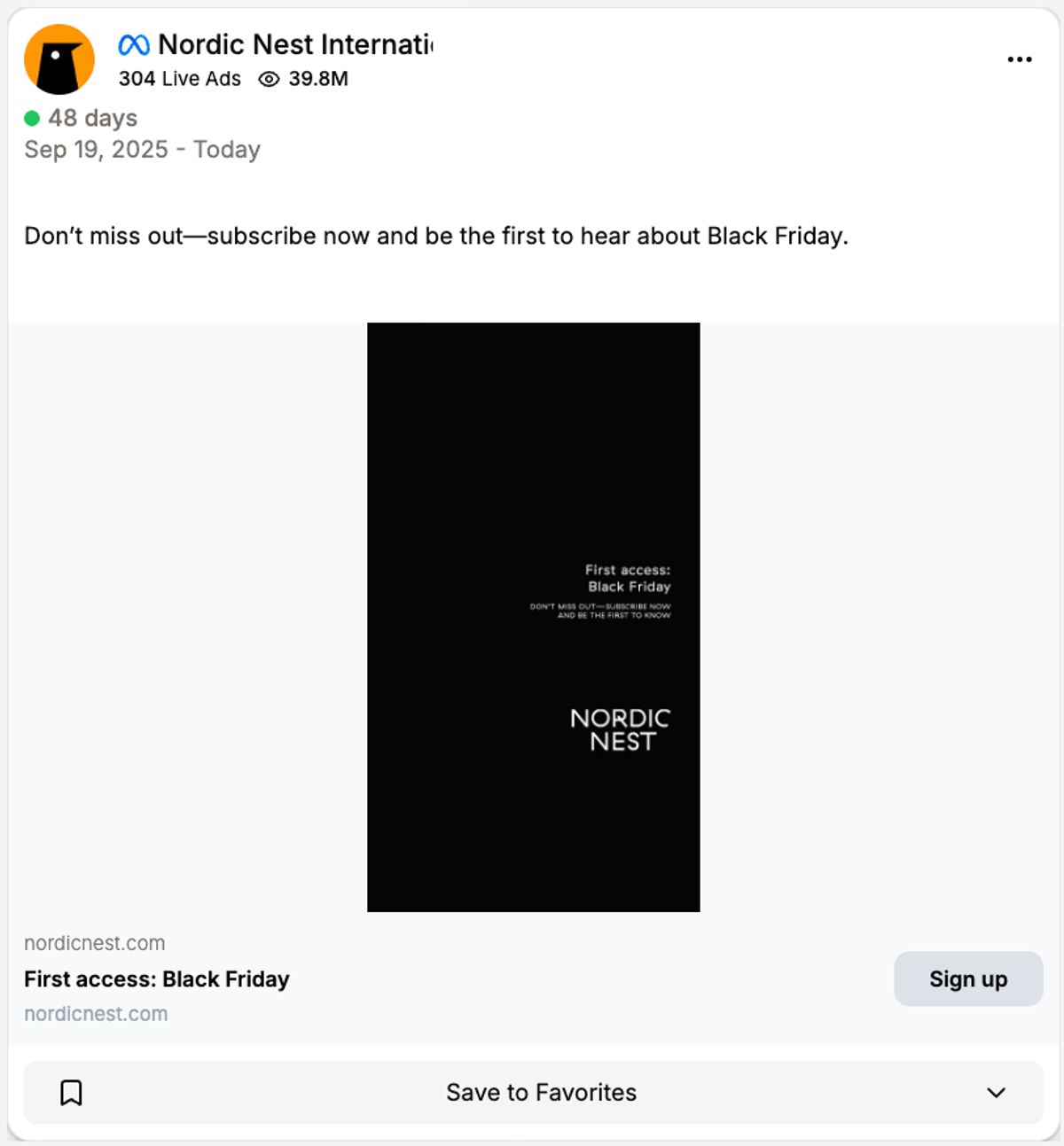
Nordic Nest. Ad preview reproduced from Trendtrack. Analysis concerns the visible creative and copy; platform metrics in the screenshot are not verified results.
This ad asks for a signup before asking for an order. The accompanying copy invites people to hear about Black Friday first, and the button leads with that action. The dark creative keeps the first-access message separate from a live sale.
I would use this approach when the sale is still being prepared and we have a worthwhile reason for someone to join the list. The promise needs to mean something: an earlier shopping window, for example. Simply collecting addresses and sending the same announcement everyone else gets would be a weak exchange.
The next page should make the promise specific. Tell people what they will receive and how they will hear from you. Then judge the campaign by the purchases those subscribers make during the sale, as well as the cost of collecting each signup.
This is a useful opening stage for a 2026 campaign. It is not a substitute for product ads once the sale starts. A new visitor still needs to know what the store sells.
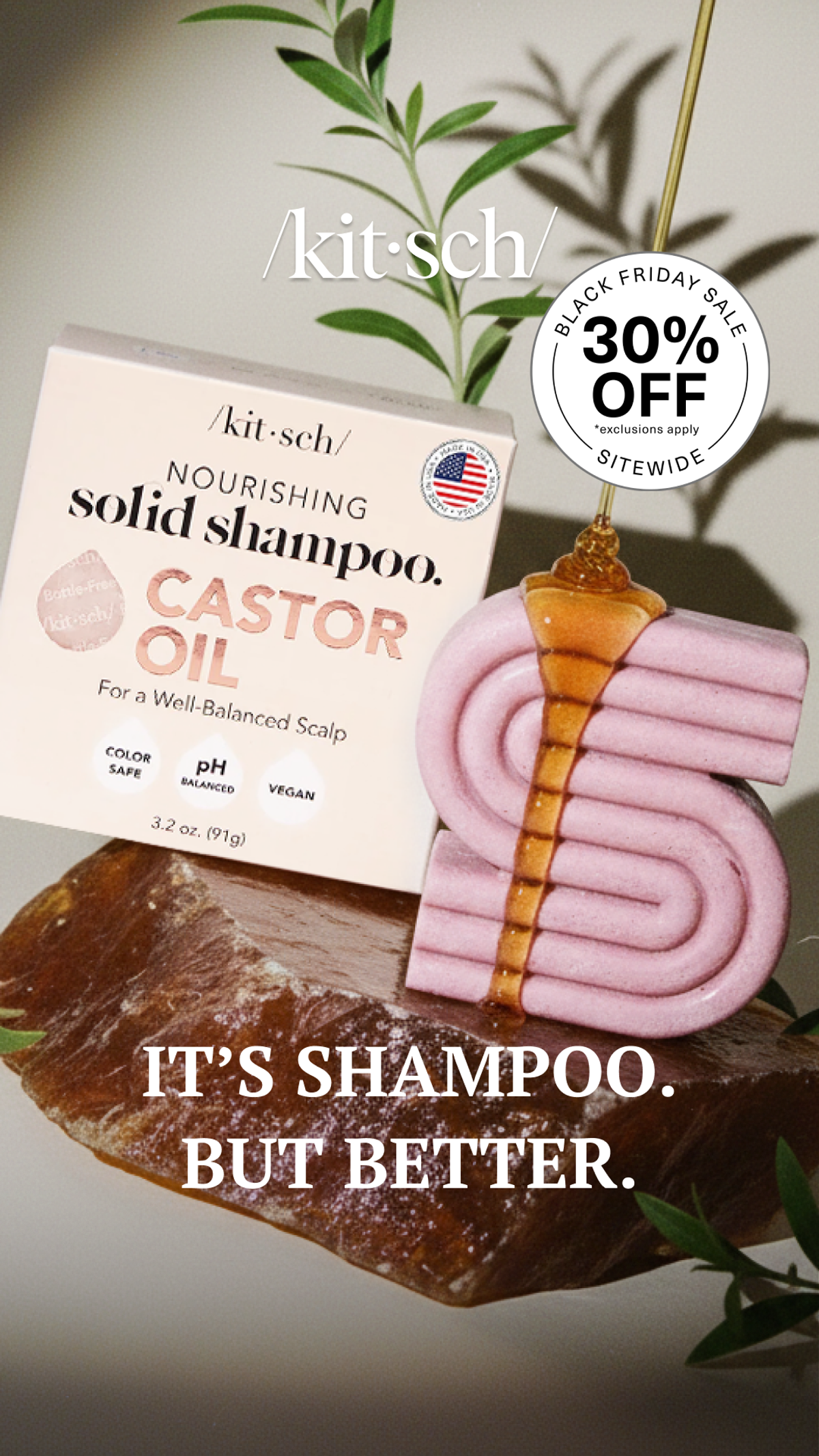
Kitsch. Archived creative retrieved through VMA. Browse the brand’s Meta ads.
Kitsch gives the shampoo bar most of the space. You see the packaging, the solid product and oil being poured over it. The sale sits in a round badge, while a short line at the bottom introduces the product as a different take on shampoo.
That order makes sense for a shopper who has never bought a shampoo bar. A discount on an unfamiliar object needs some explanation. The product name and recognizable bathroom category do more useful work than another oversized sale headline would.
I would borrow this layout for a product that needs a little introduction: show what it is, give one clear reason to consider it, then add the promotion. Keep the reason specific. Our product ad examples show several ways to do that without squeezing a full product page into the image.
One test worth running is this product-first composition against an offer-first version, using the same product and discount. Let purchases tell you which order suits your audience.
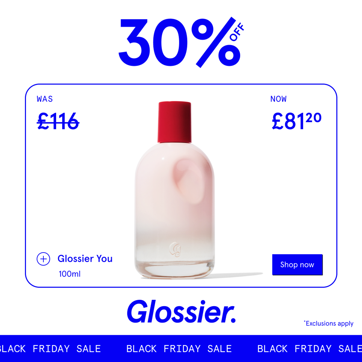
Glossier. Archived creative retrieved through VMA. Browse the brand’s Meta ads.
Glossier puts a 30% discount at the top, then shows the old and new prices on either side of the perfume bottle. The shopper can see both the saving and the amount they would pay. The product name and size sit inside the same frame.
I like this because it answers a practical question that percentage-only ads leave open: how much is it now? Someone comparing gifts can judge whether the bottle fits their budget without doing the calculation themselves.
This is a UK-price example, with £116 reduced to £81.20. A US brand should use its own verified dollar prices and eligible product, rather than converting this offer or copying its figures. Keep the product image, size and destination page consistent.
For your Black Friday ad copy, a simple “Was [price], now [price]” can be enough. Test it against the percentage headline if you want to learn which expression of the same offer is easier for your buyers to act on.
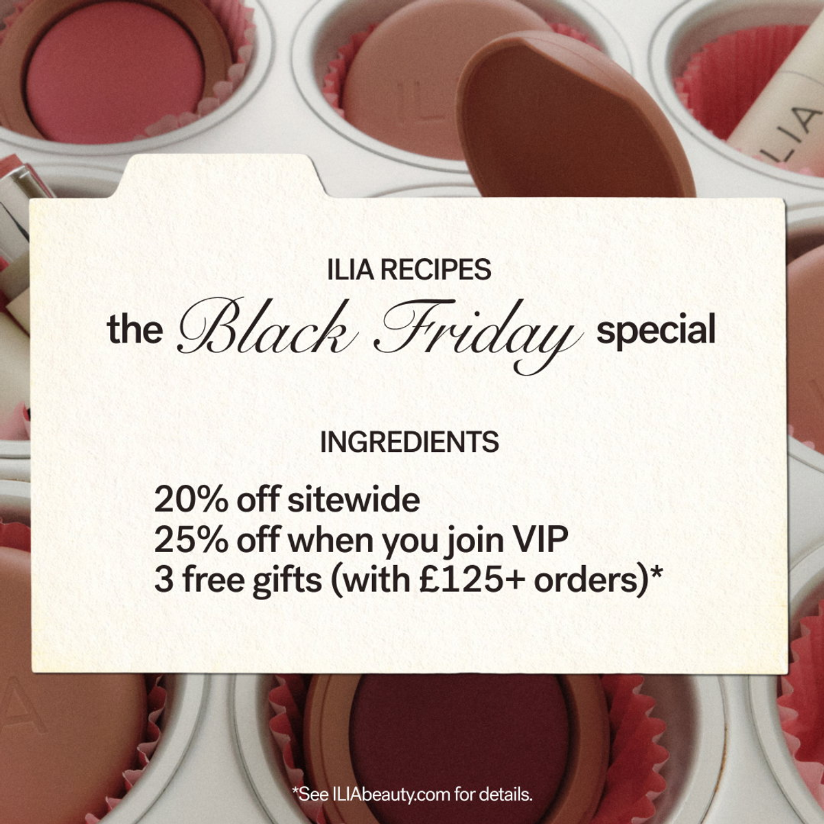
ILIA Beauty. Archived creative retrieved through VMA. Browse the brand’s Meta ads.
ILIA presents its promotion as a recipe card, with makeup arranged behind it. The three offer lines sit together: a standard discount, a larger discount for joining VIP, and gifts above a spending threshold. The format gives each condition its own line.
There is a business decision behind that layout. The brand is asking the shopper to consider joining a program or building a larger basket, as well as buying a product. Writing only the largest discount in the headline would hide part of that decision.
The pictured promotion uses pounds, so treat it as a UK-market creative reference. For your version, state who qualifies and whether the minimum spend is before or after discounts. The next page should explain the same rules in the same language.
I would test the full offer against a simpler version promoting just the VIP benefit. If people click but abandon when they see the conditions, the ad may be attracting interest in an offer they misunderstood.
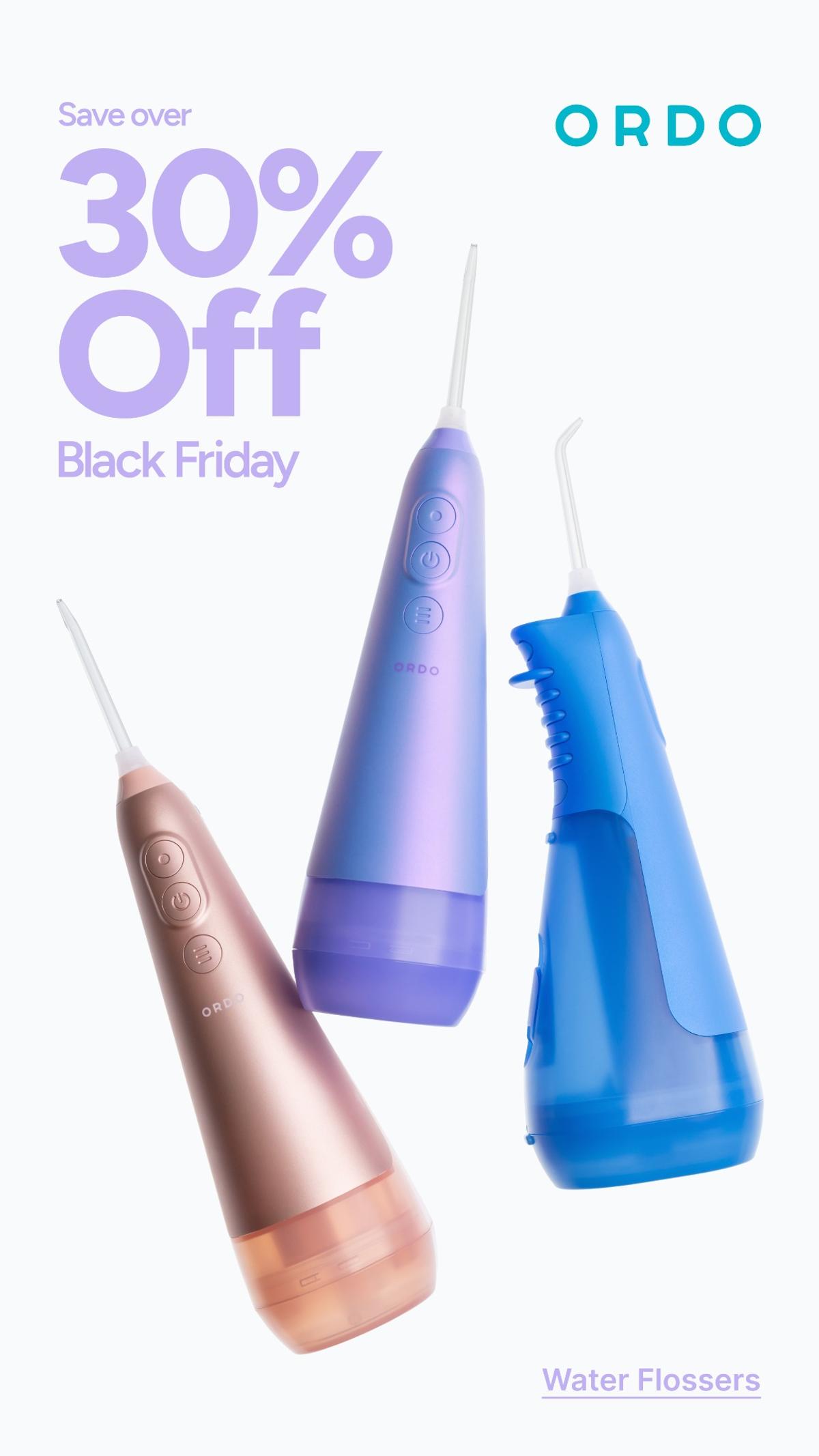
Ordo. Archived creative retrieved through VMA. Browse the brand’s Meta ads.
Ordo shows three water flossers in different colors against a pale background. The discount occupies the top left, and a small product label identifies what the devices are. The arrangement makes the range visible without turning it into a crowded catalog.
This is a useful reference when color is part of the choice. Showing several versions lets someone notice the one they prefer while still reading a single offer. The pastel treatment also shows that a Black Friday ad does not need a red background to announce a sale.
For a product people may not recognize, I would bring the category label closer to the headline or make it larger. A beautiful collection shot still needs to explain what the customer is looking at.
If the variants need different explanations, move them into separate cards. Our carousel ad examples show how to give each card a job while keeping the overall offer consistent.
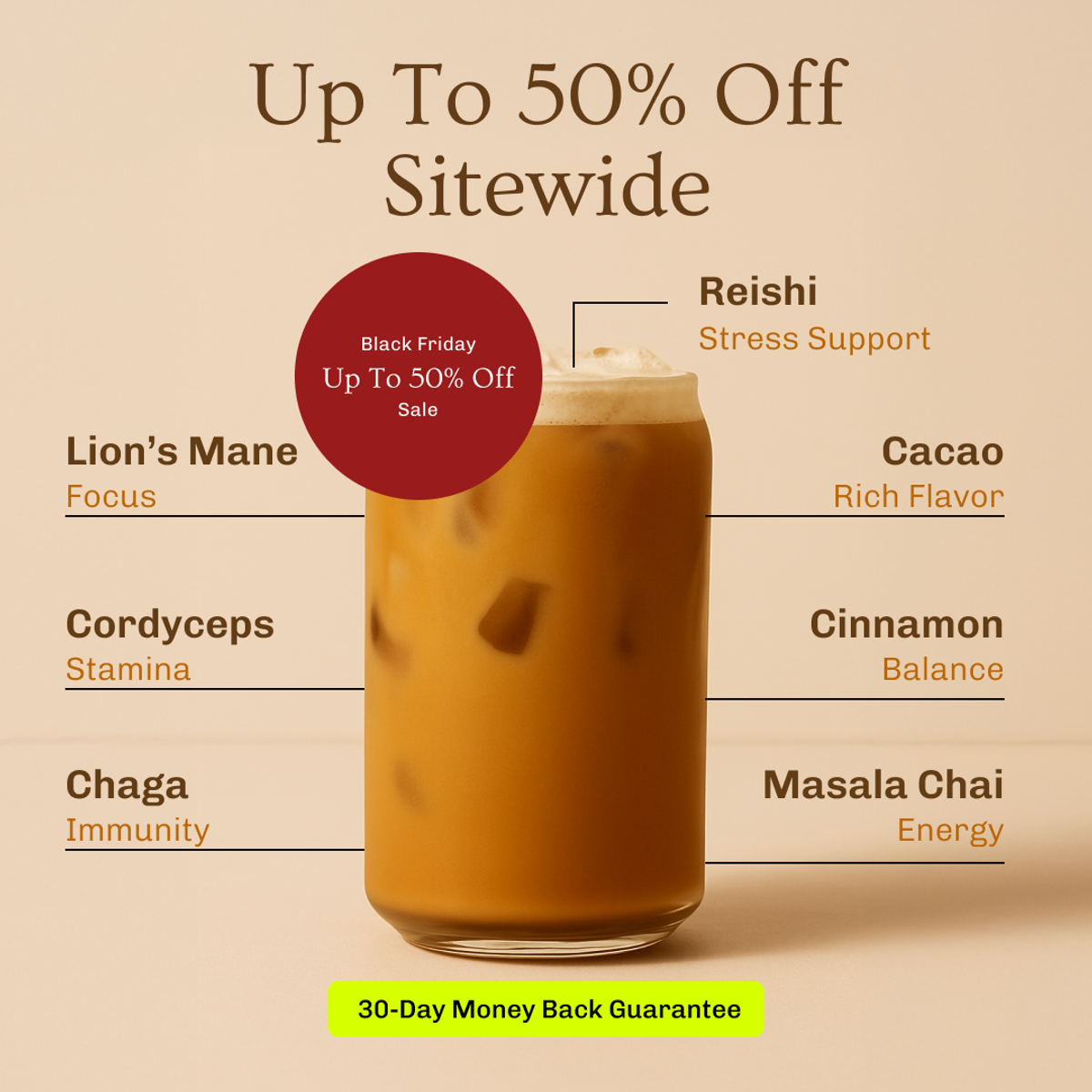
MUD\WTR. Archived creative retrieved through VMA. Browse the brand’s Meta ads.
The drink fills the center of this ad. Around it, MUD/WTR connects ingredients with benefits it claims, while the offer sits above and a money-back guarantee appears below. There is more to read here than in the Ordo example, but the image still has a clear center.
I would consider this structure for someone who needs to understand the product before the discount becomes interesting. It gives the shopper a reason to investigate the drink, then adds a promotion and a piece of reassurance.
The ingredient benefits are the advertiser's claims; the image does not establish that those benefits occur. If you adapt the layout, use claims your own product can support and give people access to the guarantee's terms.
The test I would make is a shorter version with one benefit and the same offer. That would help answer whether the extra explanation assists the purchase or simply asks too much of someone scrolling.
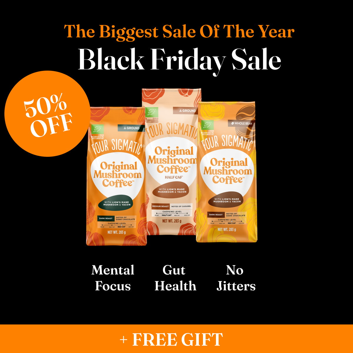
Four Sigmatic. Archived creative retrieved through VMA. Browse the brand’s Meta ads.
Four Sigmatic gives the discount its own orange circle beside the coffee packs. The free gift sits in a separate orange strip at the bottom. Between them, the product remains visible and the brand includes several benefit claims.
The layout separates the main saving from the extra incentive. I can find the offer quickly and then inspect what is being sold. It is also an example of why “Black Friday,” “biggest sale” and the percentage do not all need the same visual emphasis.
The gift itself is not shown, which leaves an unanswered question. If I were adapting this ad, I would test a version that names or pictures the gift. A specific item gives the shopper something more concrete to value than the word “free.”
Use this as a reference for arranging information, not evidence that a 50% discount is right for your margins. The creative does not tell us the brand's acquisition costs or profit on those orders.
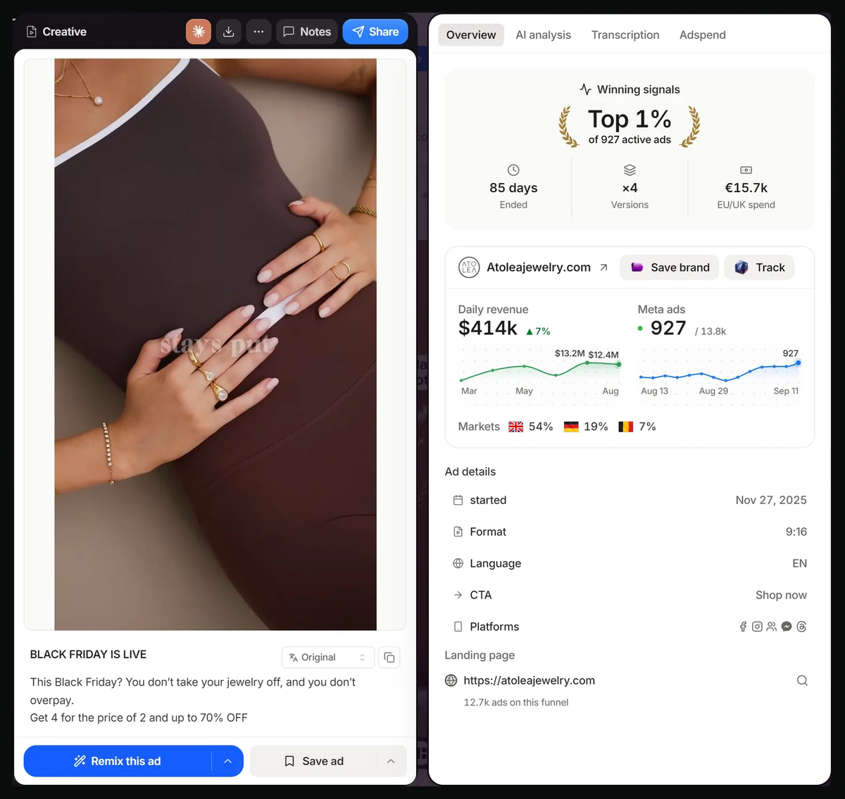
Atolea. Ad preview reproduced from Brandsearch. Analysis concerns the visible creative and copy; platform metrics in the screenshot are not verified results.
Atolea pairs jewelry worn together with copy offering four items for the price of two. The styling gives the shopper an idea of how several pieces might fit into one purchase.
I would borrow the connection between the picture and the basket. If the offer asks someone to choose several items, show combinations they could actually buy. A single isolated item leaves the customer to invent the rest of the order.
The copy also mentions savings of up to 70%. The screenshot does not establish whether those savings combine with the multibuy. For our own version, I would explain eligible items and how the discount is calculated before asking anyone to shop.
Test a styled combination against a clearly labeled selection of the same eligible products. Our comparison ad examples offer other ways to help someone weigh a purchase. Keep the terms identical across the test.
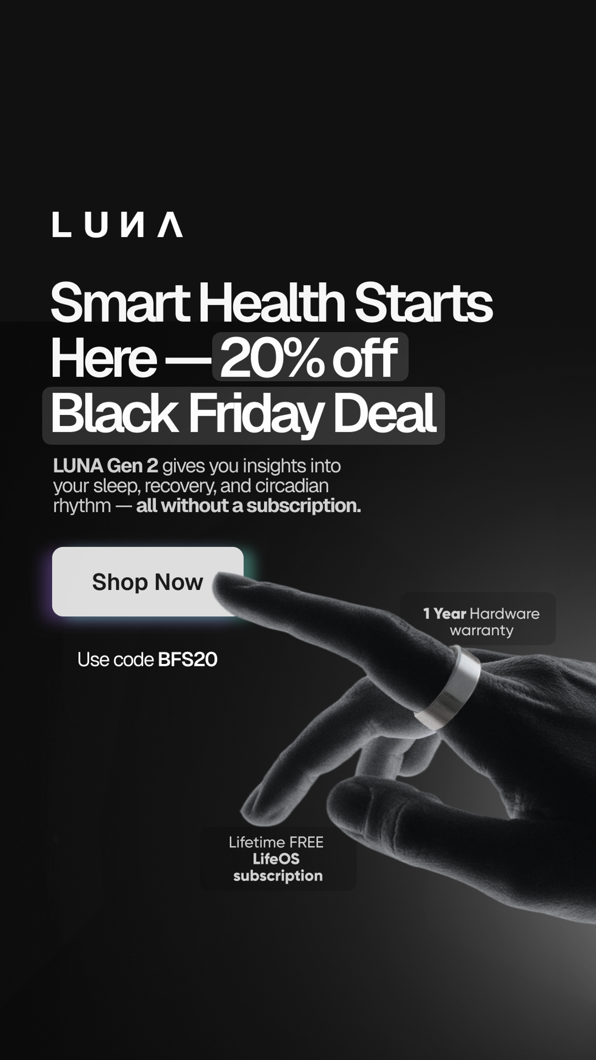
The Luna Zone. Archived creative retrieved through VMA. Browse the brand’s Meta ads.
LUNA combines its 20% offer with an explanation of the smart ring and a message about using it without a paid subscription. A hand wearing the ring gives the product scale, and the ad includes a hardware warranty and a promo code.
For this kind of product, the purchase price may be only one part of the customer's concern. Someone comparing devices could also be wondering what they will pay after buying the hardware. Bringing that question into the ad makes the offer more useful.
I would tighten the wording between the body copy and the small label near the ring. One says “without a subscription,” while another describes a free lifetime subscription. “No paid subscription required,” if accurate for the product, would make that distinction easier to follow.
For your brand, choose the objection customers really raise: refills, replacement parts, compatibility or recurring charges. A sale badge can sit beside that answer. It does not have to replace it.
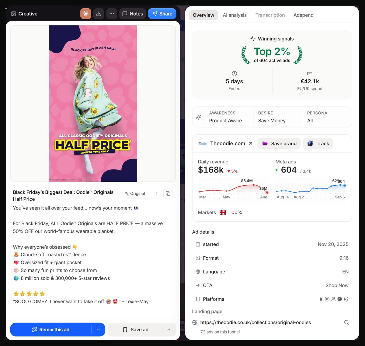
Oodie. Ad preview reproduced from Brandsearch. Analysis concerns the visible creative and copy; platform metrics in the screenshot are not verified results.
The Oodie puts a person wearing the product beside a half-price message. You can see its size, shape and pattern without leaving the ad. The offer applies to its Originals range.
This solves the problem I had with a logo-only sale graphic. A person who has never bought from the brand can see something they might want. The discount has a product attached to it.
For a wearable product, I would test a full view like this against a close view of the material. They answer different questions: what does it look like on me, and what might it feel like? Keep the same offer while testing the image.
The lesson is not to match the size of the discount. Choose an offer your margins can support, name the eligible range, and let the product occupy enough space to explain itself.
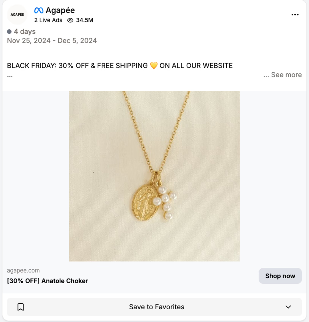
Agapee. Ad preview reproduced from Trendtrack. Analysis concerns the visible creative and copy; platform metrics in the screenshot are not verified results.
Agapée keeps the necklace photograph uncluttered and puts the Black Friday discount and free shipping in the accompanying copy. The product has room to be examined.
I like this as a test for a brand with good product photography. You do not automatically need a new sale graphic for every SKU. A useful existing image can become part of the campaign when the offer and destination are updated.
There is a tradeoff: the promotion depends on the surrounding copy being visible. I would check each placement preview. For a placement where that copy is easy to miss, prepare a version with a small offer line inside the image.
Test those two treatments with the same necklace and promotion. That gives you a more useful answer than assuming a minimal design always attracts a particular type of customer.
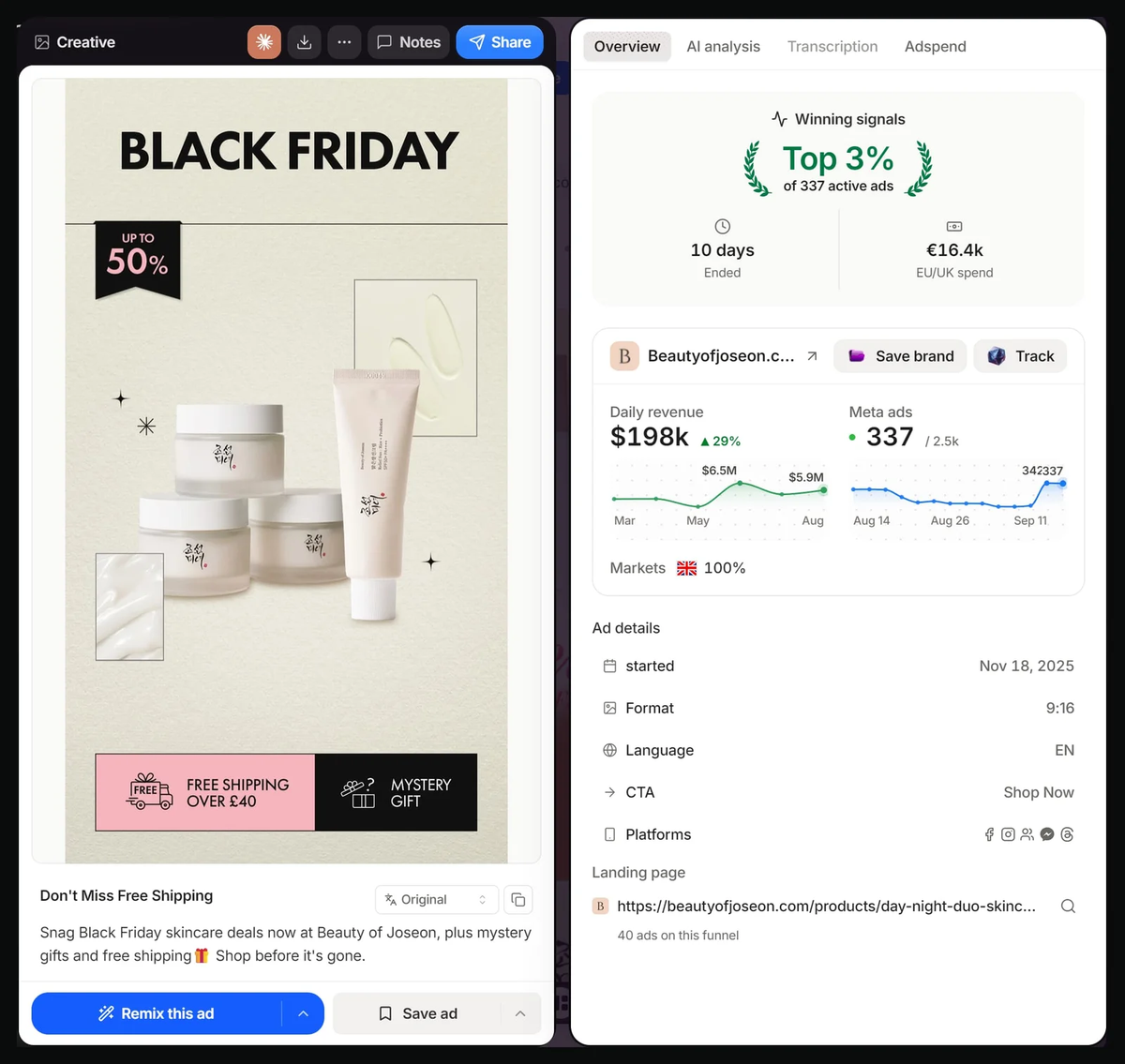
Beauty of Joseon. Ad preview reproduced from Brandsearch. Analysis concerns the visible creative and copy; platform metrics in the screenshot are not verified results.
Beauty of Joseon gives the discount a small badge, keeps the products visible, and places shipping and gift incentives along the bottom. The shipping threshold is shown with the benefit.
This arrangement is worth borrowing when a promotion has several parts. The shopper can distinguish the price reduction from the extras without reading one long headline.
I would make the gift conditions easier to find on the destination page. A mystery gift can invite curiosity, but the ad preview alone does not tell us who qualifies or what they receive. Those are purchase questions, not details to leave until checkout.
Before offering both a discount and extras, calculate their combined cost. Then test whether naming or showing the gift helps buyers understand its value. An extra incentive is only useful if customers want it and the order still makes financial sense.
In the US, Black Friday falls on November 27, 2026, and Cyber Monday is November 30. Your promotion can have a different window, but choose it before writing date-sensitive copy.
Start with the offer economics. Work out what remains after the discount, product cost, gift, shipping and other order costs, then decide what you can afford to spend acquiring the order. A competitor's discount does not tell you what your business can support.
Once that is settled, I would prepare a small set with distinct jobs:
These are messages to prepare, not a requirement to run four ads at once. With a small budget, start with a manageable number of different ideas. Use the same offer and destination where possible so you can interpret the creative comparison. Our creative testing guide explains how to plan that work.
Read the ad and landing page together before launch. Does the price match? Is the advertised item available? Can someone find the gift conditions or subscription terms? Does a promo code work for the exact basket in the image?
Then judge the campaign by orders and the money left after those orders, alongside acquisition cost. Clicks can help you diagnose interest, but a cheaper click is little comfort if the discount leaves you with an unprofitable sale.
Creative sources: VMA ad library and ad previews published by Brandsearch and Trendtrack, reviewed October 15, 2026. Each image links to its source or brand library. These are historical examples, not verified 2026 campaigns. Ads are reproduced for commentary. Historical prices, offers and advertiser claims are not current shopping recommendations. Campaign results and audience targeting were not independently verified.
Get notified when new insights, case studies, and trends go live — no clutter, just creativity.
Table of Contents


Rahul Mondal
Product, Design and Co-founder, Vibemyad

Rahul Mondal
Product, Design and Co-founder, Vibemyad


Ananya Namdev
Content Writer, Vibemyad