July 17, 2026 • 9 min read

July 17, 2026 • 9 min read
One of the most valuable new ad slots at the 2026 World Cup is literally called a hydration break. Your electrolyte brand is still advertising like it's 2014.
A premium electrolyte ad wins on restraint, not volume. Instead of neon blue, sweat, and "replace your electrolytes now" urgency, it runs a calm editorial system: a tight color palette, clean or golden-hour light, the product as the hero of the frame, and short ingredient-led copy in open space. The job is to make a stick of salt read like a wellness staple you choose every morning, not an emergency supplement you grab after a cramp.
That difference is worth real money right now. At the 2026 World Cup, the mandatory three-minute hydration breaks turned into some of the most valuable inventory in sports. According to the Wall Street Journal, Fox sold 30-second spots inside those breaks for $200,000, rising to $750,000 for US games, enough, by industry estimates, to earn Fox around $250 million from hydration-break ads alone. Powerade is the official sponsor of the breaks. When "hydration" is the name of the ad slot at the biggest event on the planet, the look you attach to your electrolyte brand stops being a design detail and becomes positioning.
Most Electrolyte and Hydration Ads Look the Same
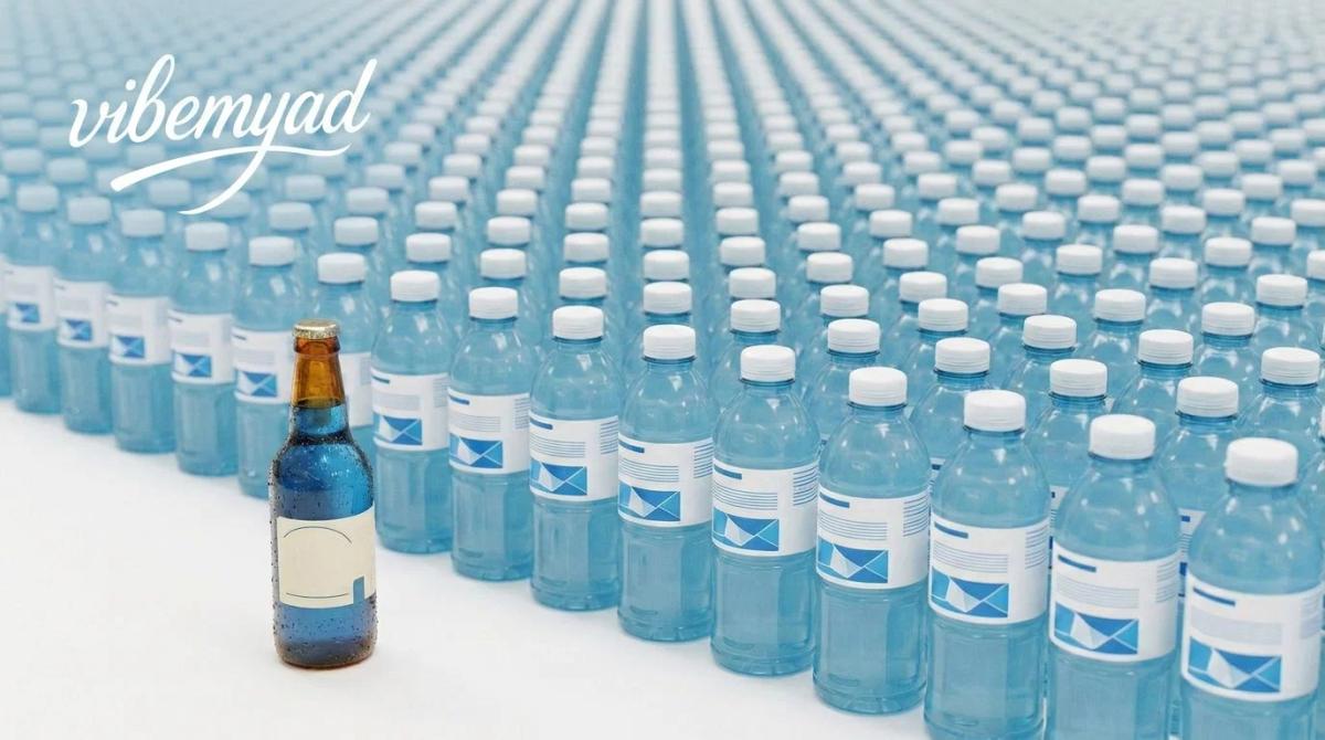
The category borrowed its visual language from sports drinks and never gave it back. A 2022 content analysis of 315 popular sports and energy drink ads, published in the journal Appetite, found the dominant persuasion tools were peripheral cues, athletes, celebrities, and promises of better performance, rather than anything about the drink itself. That worked when the buyer was an athlete replacing electrolytes after a hard hour of training. It works less well now, when most people reaching for an electrolyte mix are at a desk, on a flight, or rehydrating after a night out.
So the shelf and the feed fill up with the same handful of moves: cobalt blue, a lightning bolt, a sprinting silhouette, and copy yelling about cramps. Here's the problem with running the ad everyone else is running. When every brand shouts, the shout becomes wallpaper. Nobody's attention snags on the fifth identical bottle on the gym floor.
The gap is wide open once you see it. The loud lane is crowded and expensive to win. The calm lane is empty, and it happens to match how the category is actually growing. In 2026, the electrolyte-focused segment of US sports drinks- LMNT, Liquid I.V., Nuun, Electrolit- reached an estimated $3.6 billion, about 13% of the category, and it's these clean-label, social-first brands eating into the share that Gatorade (around 65–70% of the US market) and Powerade have held for decades.
What Makes a Hydration or Electrolyte Ad Look Premium?
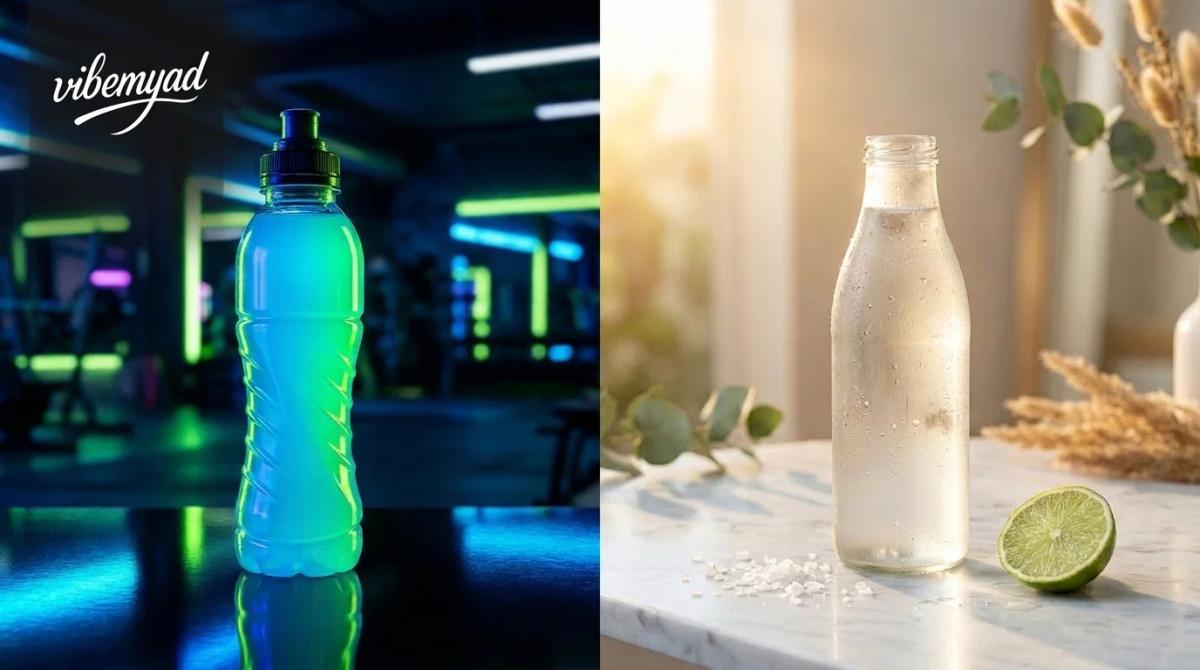
Premium is a system, not a filter. You can copy any single element and still look cheap; the effect comes from applying the whole register consistently across every ad you run. Here's the shift, side by side.
The last two rows do the heaviest lifting. Naming a specific mineral or salt source and briefly saying what it does ("sea salt for sodium, so water actually stays in your system") reads as confidence and transparency at once. Vague blends read as hiding something. If your formula is clean, the ad should act like it has nothing to conceal.
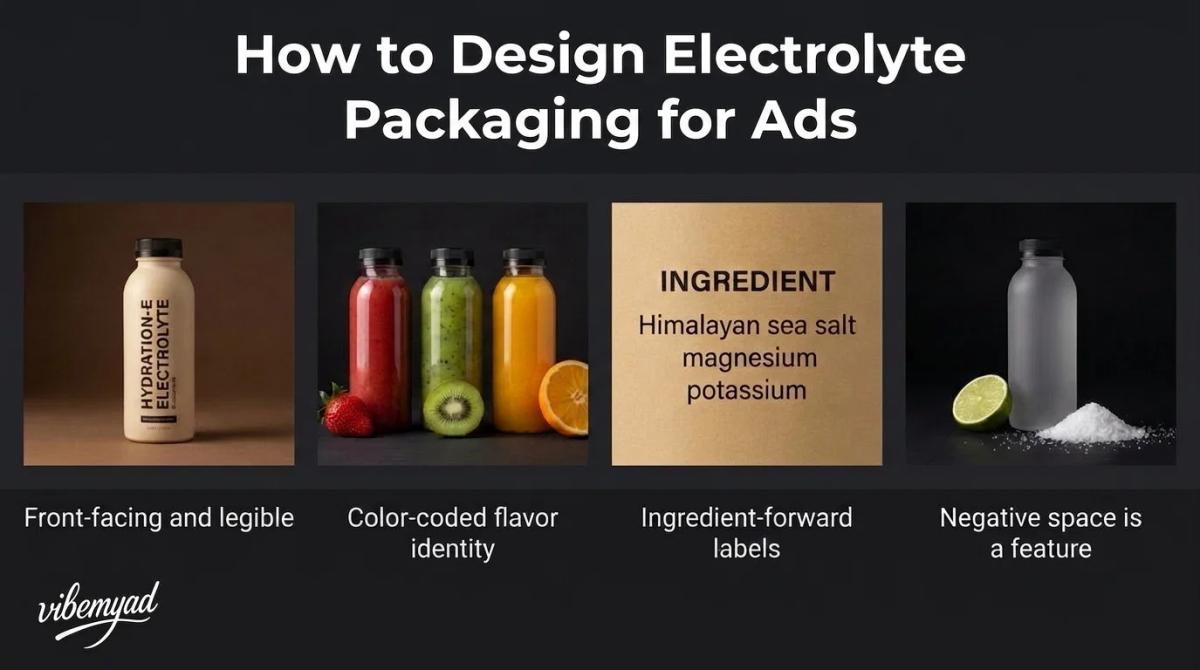
Packaging design and ads are the same problem now, because the packshot is the ad most of the time. If your electrolyte packaging design only works in hand at arm's length, it will die as a thumbnail. A few rules that hold up:
How to Design Electrolyte and Hydration Packaging for Ads
Packaging design and ads are the same problem now, because the packshot is the ad most of the time. If your electrolyte packaging design only works in hand at arm's length, it will die as a thumbnail. A few rules that hold up:
What Do Premium Electrolyte Drink Ads Look Like
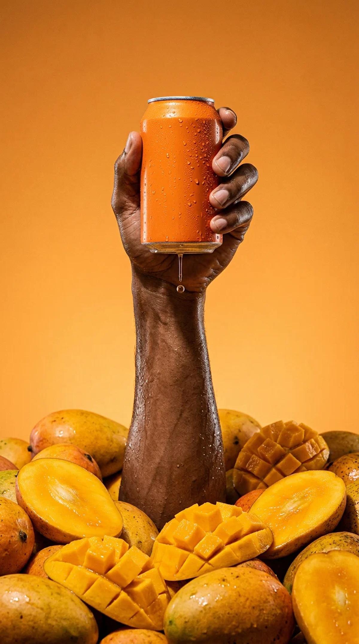
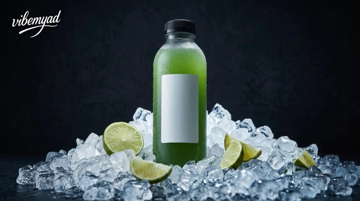
The electrolyte ads we see run the longest have one thing in common: the product owns the frame. The creative that churns out fast tends to bury the can in a lifestyle scene or crowd it with three competing claims. The ones that keep spending give the product the center, one clear claim, and room to breathe. That's exactly the premium register this whole piece is about.
If you want electrolyte drink ad examples to study, look at the brands winning the calm lane, not the loudest creative in the category. The premium challengers (LMNT, Liquid I.V., Nuun, and Electrolit) tend to lead with the product, a restrained palette, and one clear claim. Then look at Prime Hydration for the distribution lesson: it reached an estimated 5% of the US sports-drink market in under three years, almost entirely through YouTube and social, with founder and creator audiences over 100 million and essentially no traditional ad spend. Premium doesn't have to mean impersonal or studio-only. Creator-led and minimalist can share the same frame.
Electrolyte and Hydration Ads
Across those brands, three ad formats do most of the work, and it's worth generating all three for any launch:
Vibemyad
The aesthetic thesis only matters if you can produce it repeatedly. Vibemyad runs the research and the generation in one session at vibemyad.com/home, so you go from what's already working in the category to finished, on-brand ads without switching tools.
Generate Premium Hydration Ads With Vibemyad
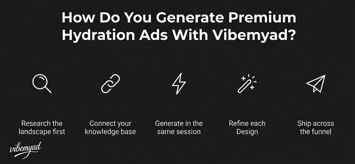
The aesthetic thesis only matters if you can produce it repeatedly. Vibemyad runs the research and the generation in one session at vibemyad.com/home, so you go from what's already working in the category to finished, on-brand ads without switching tools.
Research the category, ground it in your knowledge base, and generate on-brand ads, the whole loop in one session. Book a demo, claim $5 credits free, create designs for free, create ads for free. Pay-as-you-go, no subscription, and your credits never expire.
Get notified when new insights, case studies, and trends go live — no clutter, just creativity.
Table of Contents


Arpita Mahato
Content Writer, Vibemyad

Arpita Mahato
Content Writer, Vibemyad

Arpita Mahato
Content Writer, Vibemyad