October 02, 2026 • 11 min read

October 02, 2026 • 11 min read
Your customer already has a way to do the thing you sell. They drink another beverage, wear another watch strap, or buy the smaller pack because it costs less today.
A comparison ad has to give them a reason to reconsider that choice. Putting green ticks beside your product gets the layout started. It does not finish the argument.
The question we would ask before approving the creative is: what will the shopper understand about the difference after looking at this?
These 12 comparison ad examples offer several answers. Some put two products beside each other. Others compare a category, a pack size, or an earlier model. The selection includes US and international references from Vibemyad's ad archive, with market differences identified below. We are reviewing the creative, without access to campaign sales results. Prices, offers, and product claims belong to the archived ads.
A comparison ad helps a buyer evaluate a product against an alternative. That alternative might be a named competitor, a familiar category, another product from the same brand, or the customer's existing routine. An "us vs. them" ad is one version of this approach.
The difference should matter to a purchase. A lighter suitcase has an obvious use. A technical camera specification needs more explanation. Both can make a comparison, but they need different creative treatments.
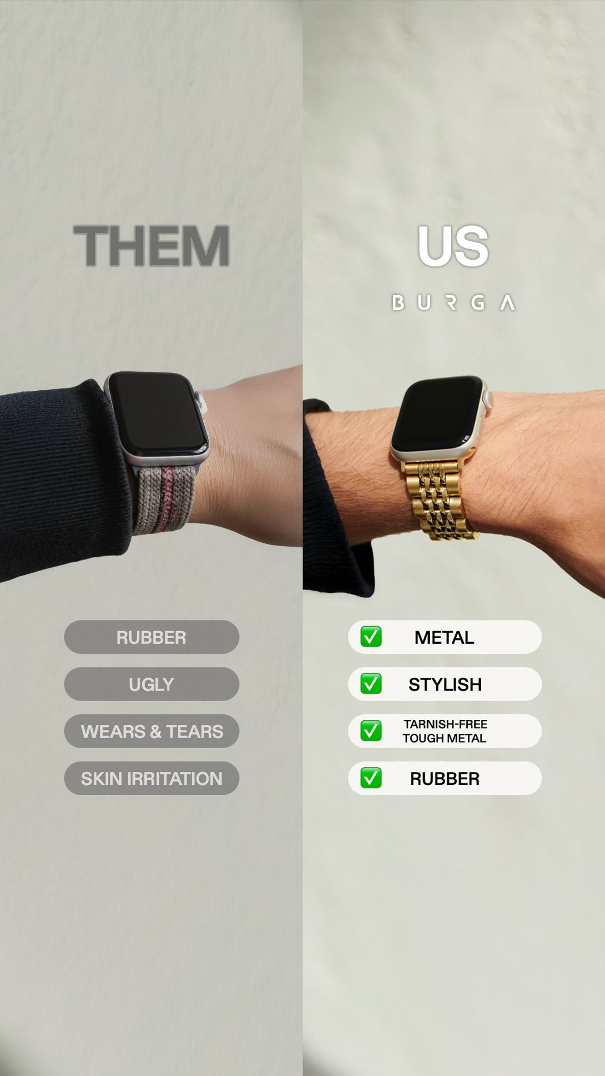
BURGA watch strap us versus them comparison. Source: Vibemyad ad archive. Reference img-8f2ef0f4060bb9f0.
Two wrists wear the same kind of device with different straps. BURGA places "THEM" over one and "US" over the other, then adds short comparison labels underneath. The gold-toned strap makes the styling argument before anyone reads the list.
That is the useful part of this execution. The photographs already share a subject and a similar crop, so the viewer can concentrate on the accessory. An apparel or accessories brand could use the same discipline to compare shape, finish, or styling.
We would be more careful with the written rows. "Ugly" is an opinion, while claims about wear and irritation need support. The image is strongest when it lets a shopper judge the visible difference. Start there, then add the few facts needed to make the choice clearer.
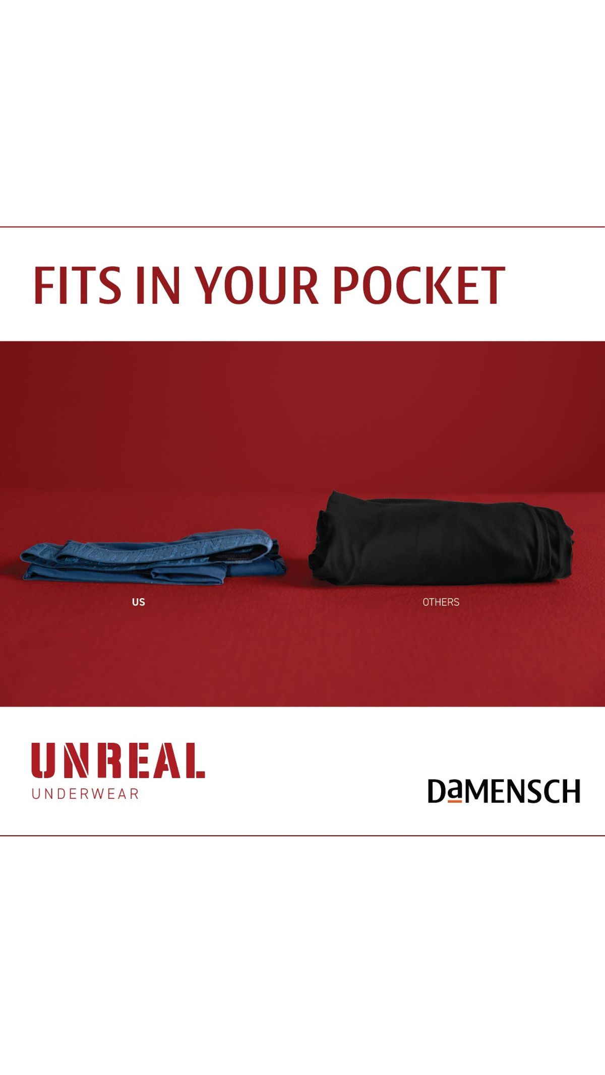
DaMENSCH folded underwear size comparison. Source: Vibemyad ad archive. Reference img-8f21b59e605e1f61.
DaMENSCH puts two folded garments on a red background under "Fits in your pocket." One occupies visibly less space. Small "us" and "others" labels identify the comparison, but the photograph does most of the explaining.
This Indian-market ad is a useful reference for a brand selling something compact. The benefit becomes an object you can inspect, rather than an adjective such as convenient or travel-friendly.
Our next variation would put the garment beside a pocket or inside a travel bag. That would connect the size difference to the moment it matters. For your own shoot, use equivalent products and consistent folding conditions. The creative loses its usefulness if the apparent advantage comes mainly from how the photographer arranged the alternatives.
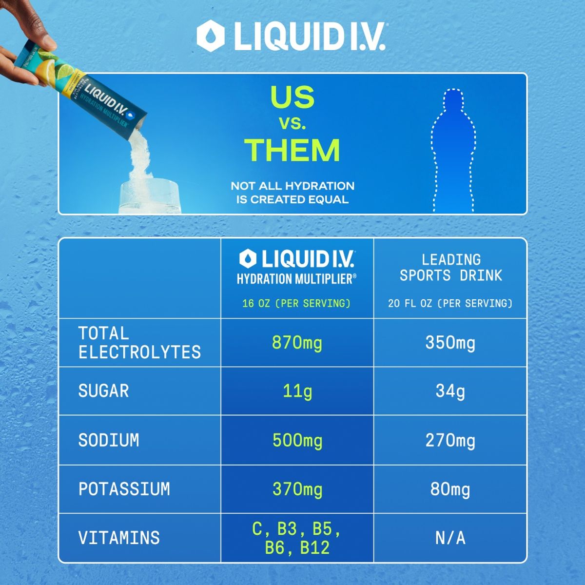
Liquid I.V. hydration mix versus sports drink table. Source: Vibemyad ad archive. Reference img-ebc988369595c1e3.
Liquid I.V. places its hydration mix beside a "leading sports drink" and compares several nutritional quantities. The blue background and grid make this feel like a compact product information panel, with the branded packet visible above it.
The choice of reference is sensible for the message: someone considering the mix may already know the sports-drink category. The table gives that shopper specific differences to investigate.
There is an important reading detail in this execution. Its column headings use different serving volumes, so the numbers are not an equal-volume comparison. A brand borrowing the format should make the basis prominent. We would also test a simpler version with the most relevant rows enlarged. A nutritional table helps only when someone can read what the figures mean.
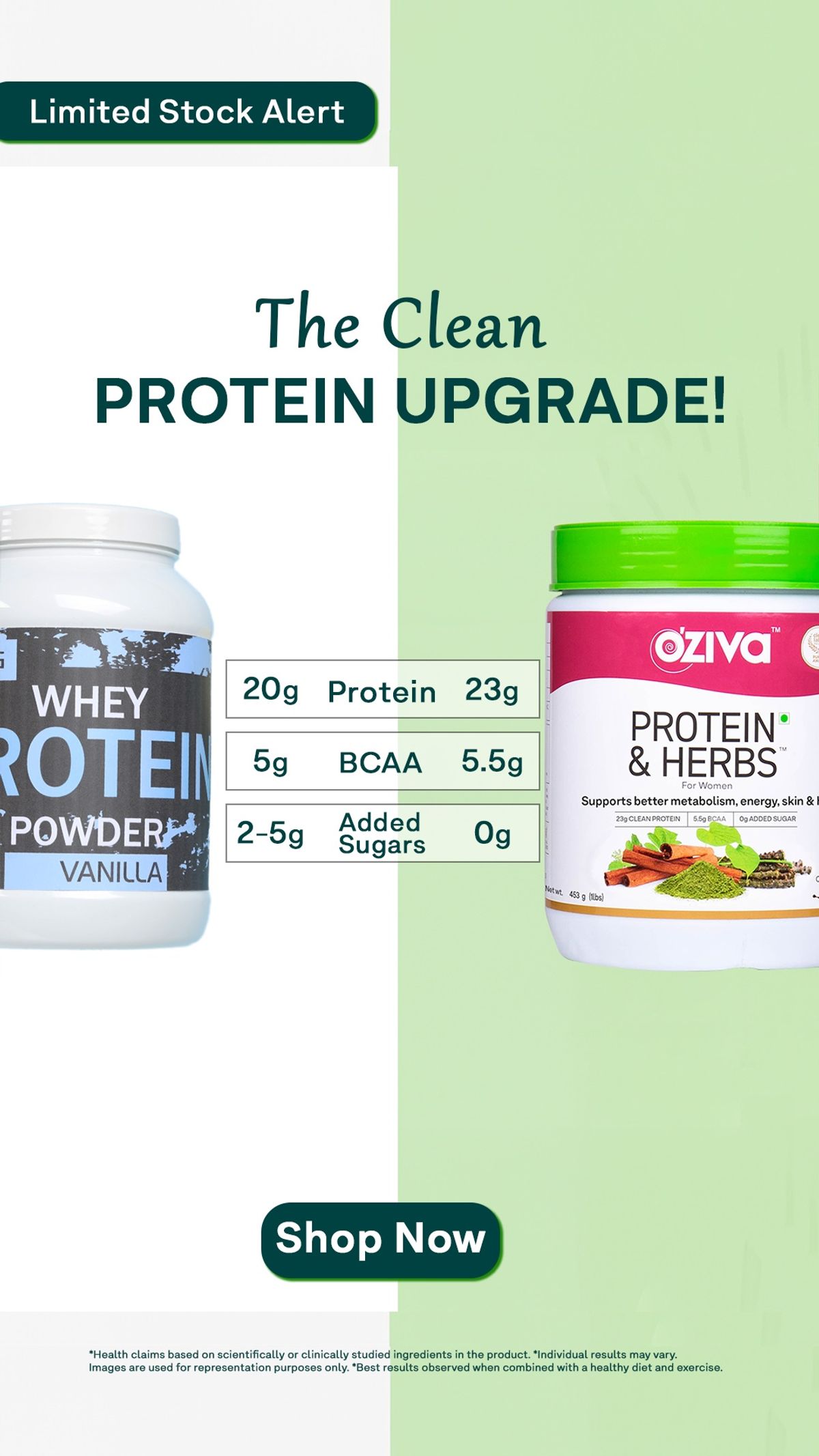
OZiva protein comparison table, Indian market. Source: Vibemyad ad archive. Reference img-ce1df0960f71cc32.
OZiva uses two product packs, contrasting background colors, and three central rows for protein, BCAA, and added sugars. The headline frames the choice as an upgrade.
Unlike a long specification chart, this Indian-market creative gives the eye a short path between the products. Each row asks the reader to evaluate one difference. That is a useful constraint for any brand whose product page contains more information than an ad can hold.
We would keep the three-row structure and make the reference product and serving basis easier to understand. The phrase "whey protein powder" covers many formulations. Your comparison needs to describe the actual alternative behind the figures. In a brief, write the source beside every proposed row before the designer starts arranging the table.
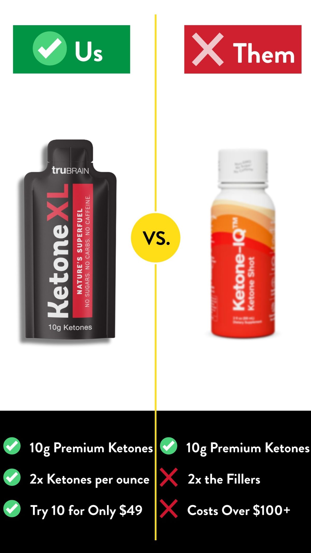
TruBrain ketone product and offer comparison. Source: Vibemyad ad archive. Reference img-9f9c65c14919b51e.
TruBrain pairs product photographs with green "Us" and red "Them" labels. The lower panel combines product claims with an introductory offer and a competing price claim.
What interests us here is that the price sits inside the comparison. It asks the viewer to evaluate both the product and the cost of trying it. That can be useful when a shopper has a practical reason to hesitate at checkout.
The density is the trade-off. Small rows ask the reader to reconcile quantity, concentration, and price at once. We would test an offer-led version separately from a formulation-led version. If you compare prices, show equivalent quantities and explain any introductory terms. The archived dollar amounts are part of this creative, not a current buying recommendation.
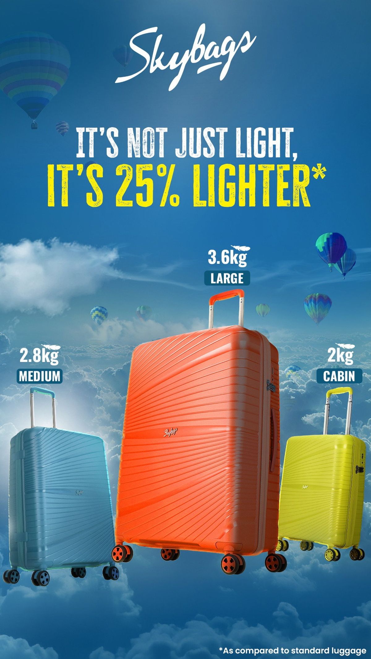
Skybags luggage weights and lighter claim. Source: Vibemyad ad archive. Reference img-dd1216a97a3d7b80.
Skybags gives its percentage-lighter claim most of the headline, then places weights beside three suitcase sizes. Bright cases against a sky background keep the product visible while supporting the idea of lightness.
This Indian-market reference shows how a general adjective can become more concrete. Someone looking at a suitcase can connect weight to carrying and packing it. The supporting size labels also help distinguish the products in the range.
The headline's reference to standard luggage still leaves a question about the benchmark. For a D2C brief, specify the product or category average behind the calculation. We would build the next execution around the cabin case alone, with its weight and a carrying scene. That would give one shopper one decision to consider.

Liquid Death soda category sugar comparison. Source: Vibemyad ad archive. Reference img-cf95b49491d3994c.
A single can takes up most of the image. Above it, Liquid Death compares sugar with top sodas; a smaller line supplies calories and grams of sugar. The background and typography keep the brand's familiar visual character.
This is a comparison ad without a second product photograph. The category reference supplies the alternative. That makes the format useful for a brand that can explain its difference in one sentence.
Our favourite detail is how little the layout asks you to do. Read the claim, see the can, recognise the category. For another beverage, the brief should establish the relevant serving size and comparison products first. Then decide whether the percentage or the absolute quantity will be more understandable to the buyer.
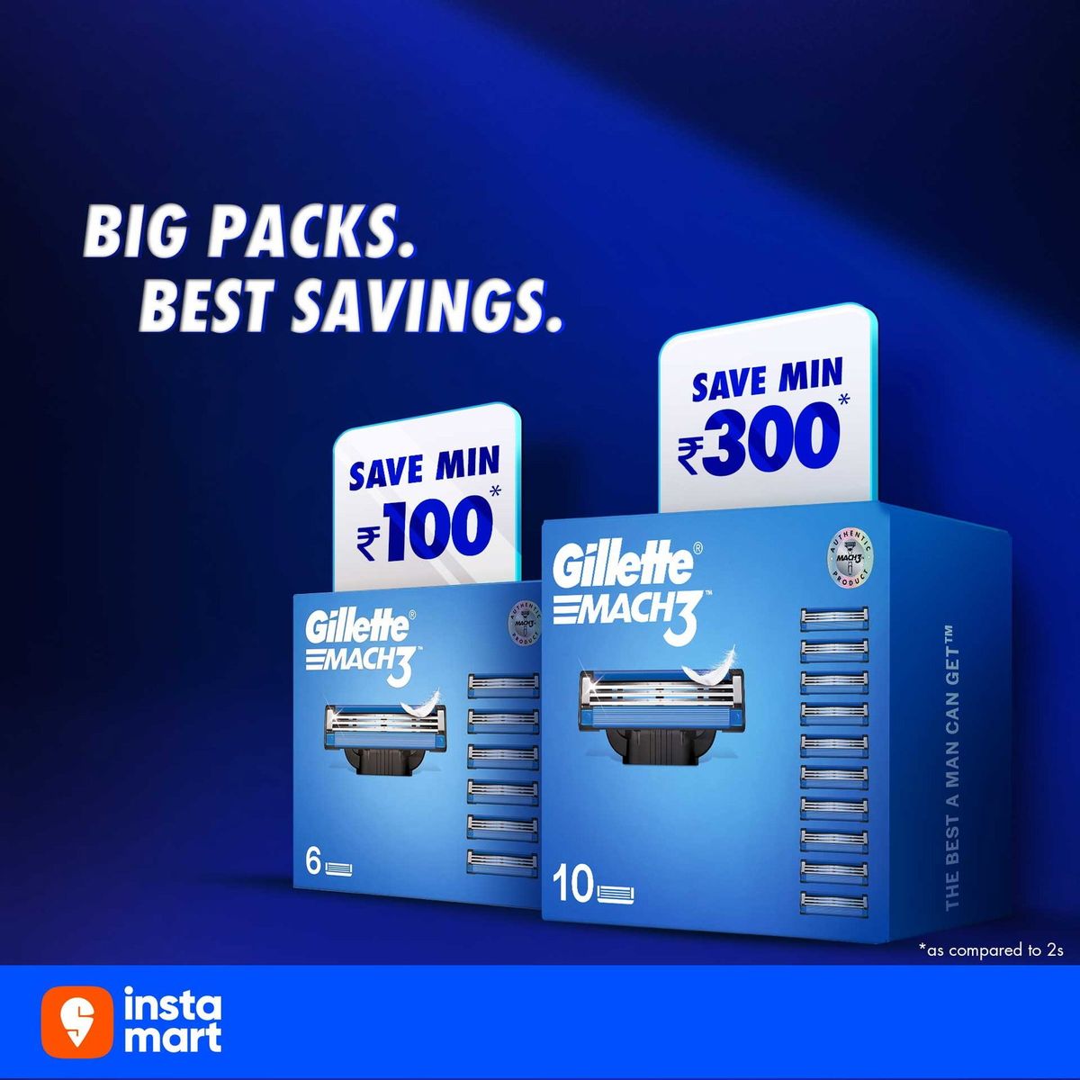
Gillette six and ten pack savings comparison, Indian market. Source: Vibemyad ad archive. Reference img-9660690fbf16b691.
Gillette's Indian retail creative places six- and ten-count MACH3 packs beside savings callouts. "Big packs. Best savings." gives the viewer the shopping decision immediately. A small note identifies the smaller pack used for comparison, and the retailer branding indicates where to buy.
This belongs in a D2C swipe file even though it is a retail execution. A brand selling refills, consumables, or bundles faces the same question: why spend more on this order?
We would adapt the idea with a clear per-unit price alongside the total. That lets a buyer see the trade-off between a lower unit cost and a larger upfront purchase. Keep the comparison tied to current pack sizes and prices rather than carrying an archived savings claim into a new campaign.

Nature Made supplement with within-brand nutrient comparison. Source: Vibemyad ad archive. Reference img-f55583e34b1a1ec2.
Nature Made leads with the intended audience, men aged 50 and above, then surrounds the bottle with formulation callouts. Its comparative nutrient claim refers to another Nature Made product in the fine print.
The useful distinction is the choice of competitor. A customer can be choosing between two products you sell. Your creative can help explain that choice instead of assuming the only competition comes from another brand.
We would make the alternative product more visible in a follow-up execution. That would help an existing customer understand which upgrade the ad proposes. For a non-health category, the same idea could compare a starter kit with a premium kit. Keep the explanation attached to the intended use; a larger number alone does not explain why that customer needs it.

Xiaomi camera technology compared with an earlier phone. Source: Vibemyad ad archive. Reference img-c96266198f0f9937.
Xiaomi uses an exploded technical illustration, a light-capacity multiplier, and a short reference to night photography. Its fine print names the earlier phone used as the comparison and attributes the measurement to internal testing.
This international technology example is useful for D2C teams selling products that need explanation. The graphic gives an abstract feature a visible structure. But a shopper still has to connect that structure with the photograph they want to take.
Our next creative would show an appropriate, consistently captured image comparison alongside the technical explanation. For a device, appliance, or piece of equipment, ask the same question: can the customer see the practical difference? A specification can support the argument after the outcome is understandable.
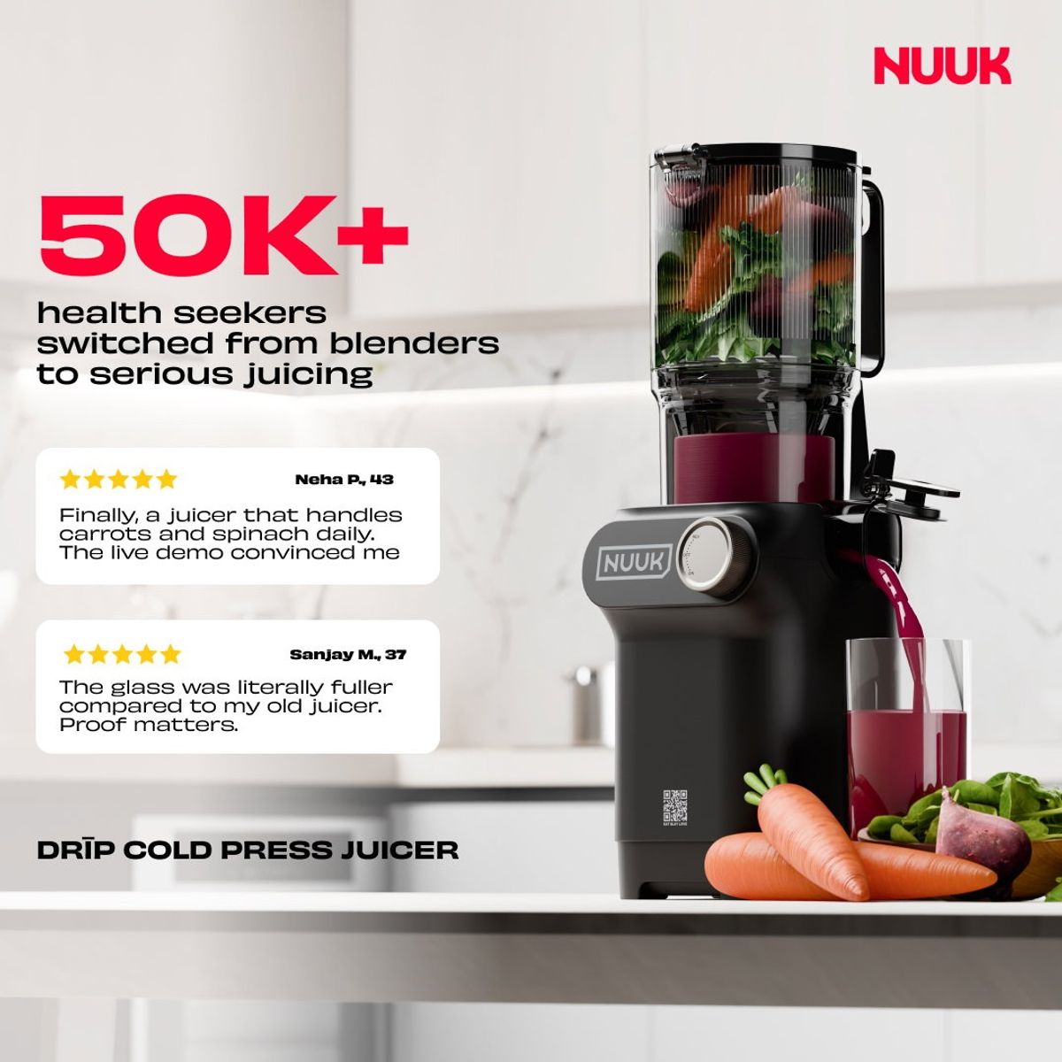
NUUK juicer with customer switching reviews. Source: Vibemyad ad archive. Reference img-e98b94c6b254ab56.
NUUK places its juicer on a kitchen counter with produce, a switching headline, and two review-style cards. One card discusses a demonstration; the other compares the amount of juice with an older juicer.
This Indian-market reference approaches comparison through experience. It gives the shopper a picture of the product at home and a reason someone else considered changing equipment. The alternative appears in the words rather than in a second product shot.
We would develop the demonstration into its own creative, using the same ingredients and conditions for each machine. The customer quote could sit beside the result. For brands with a useful review about switching, our testimonial ad examples show other ways to build an image around that experience.
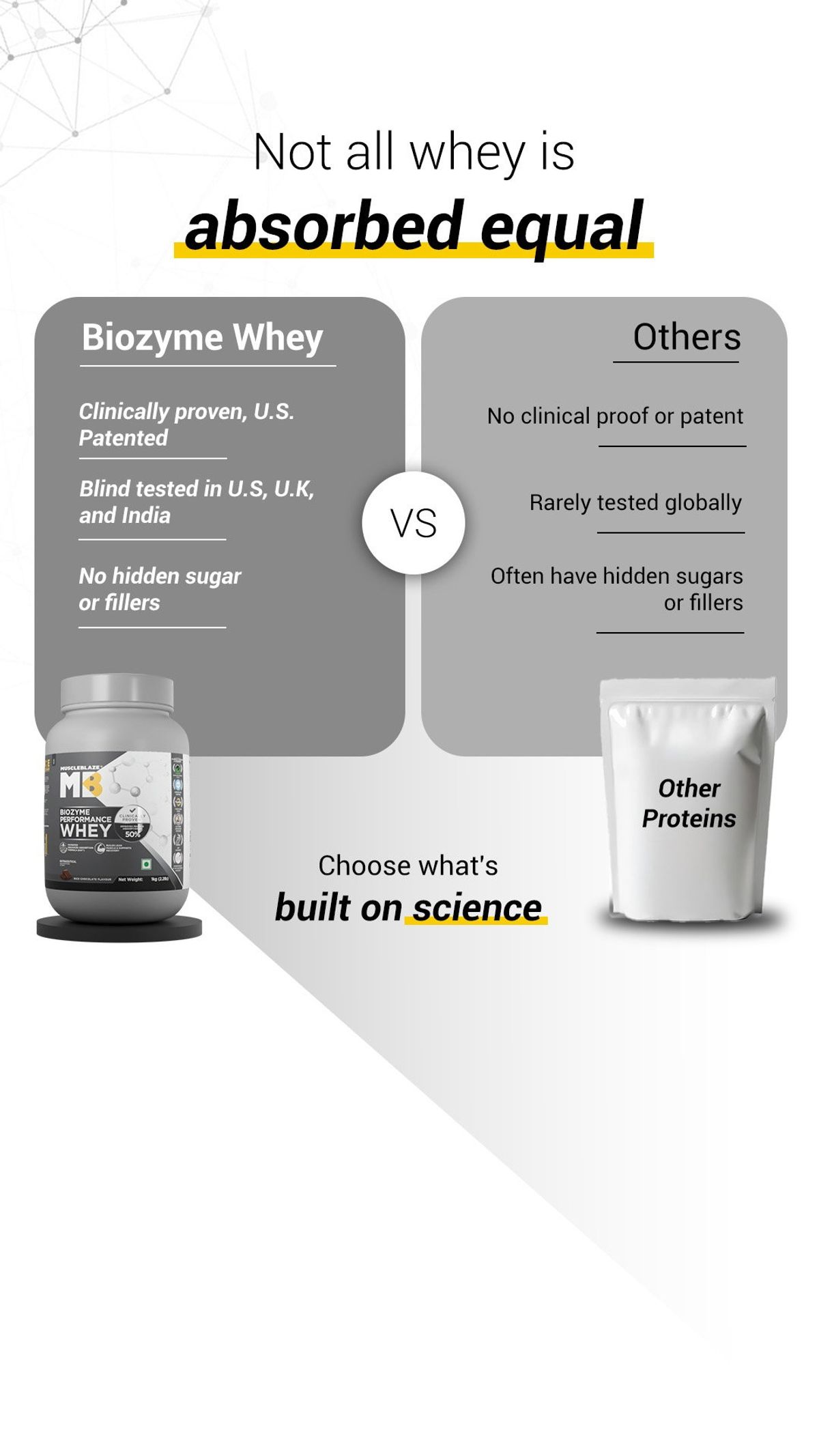
MuscleBlaze whey evidence comparison, Indian market. Source: Vibemyad ad archive. Reference img-bb38e08796e80b1f.
MuscleBlaze puts its whey product beside a generic alternative and organises the comparison around testing, a patent, and formulation claims. The headline asks the buyer to think about absorption rather than judging only the pack.
The layout is familiar, but the proposed buying criterion is different from a price comparison. This Indian-market reference shows how a brand can invite a more detailed evaluation of the product.
It also shows why the supporting material matters. A broad "others" column groups many products together. We would narrow that reference and connect each evidence claim to an accessible explanation on the destination page. The transferable lesson is to make the reason for trusting a comparison as easy to find as the comparison itself.
Begin with the alternative your customer recognises. Ask what they use today and what they would buy if your product disappeared. Their answer may be a category, a habit, or one of your own cheaper products.
Then choose the buying question. Is the product easier to pack? Does the bigger bundle cost less per item? Does the refill remove a step from the routine? Pick a difference you can show and explain accurately.
A hypothetical travel-accessory brief could compare how two equivalent items fit in the same bag. The shoot would keep the camera angle and bag constant. The copy would explain the space difference, and the landing page would show the dimensions. That gives production a specific assignment instead of a request to make the product look better.
Choose the layout after choosing the argument. A split screen suits a visible difference. A short table suits a few comparable facts. A single product shot can work when the category comparison fits in the headline, as Liquid Death demonstrates.
Our problem-solution ad examples help identify the frustration behind that choice. The fashion examples and skincare examples offer more category-specific visual references.
Before production, collect the reference products, dates, prices, and measurements behind the comparison. Put that information in the brief, where the writer and designer can use it. A footnote should clarify a claim the viewer understands, not introduce an entirely different interpretation of the headline.
For the first test, compare a small number of distinct arguments while keeping the offer and destination consistent where practical. Read purchases and acquisition cost alongside engagement. A confrontational headline can attract attention without attracting the right customer. Our first-campaign creative guide can help scope the initial set.
Get notified when new insights, case studies, and trends go live — no clutter, just creativity.
Table of Contents