October 02, 2026 • 11 min read

October 02, 2026 • 11 min read
"What problem does your product solve?" sounds like an easy question until you have to answer it in an ad.
A shirt brand says comfort. A skincare brand says confidence. A drinks brand says convenience. All reasonable answers, but none gives a designer much to work with.
Sweat marks before a meeting. A cable tangled around the gearshift. Half a bottle of wine you meant to finish yesterday. Those are situations someone can recognise, and situations an ad can show.
For a problem-solution concept, the connection is the first thing we would look for. Can you point to the frustration? Can you see why this particular product belongs in the answer? If the link needs a long explanation, the brief probably needs another pass.
These 12 problem-solution ad examples show how brands make that connection through copy, comparison, product design, and demonstration. All are static creatives from Vibemyad's ad archive. They include international references, labelled where relevant. We are analysing the creative, without access to the campaigns' sales results. Offers and product claims shown belong to the archived ads.
A problem-solution ad identifies a customer frustration and presents a product as a way to resolve it. The strongest versions explain the connection: a retractable cable reduces loose cord, for example, or a wider pad gives more coverage. Simply placing a product beside an unhappy person leaves that explanation unfinished.
The problem can be small. It does not need to involve a life-changing transformation. A drink spilling in a bag is enough if your customer regularly worries about it.
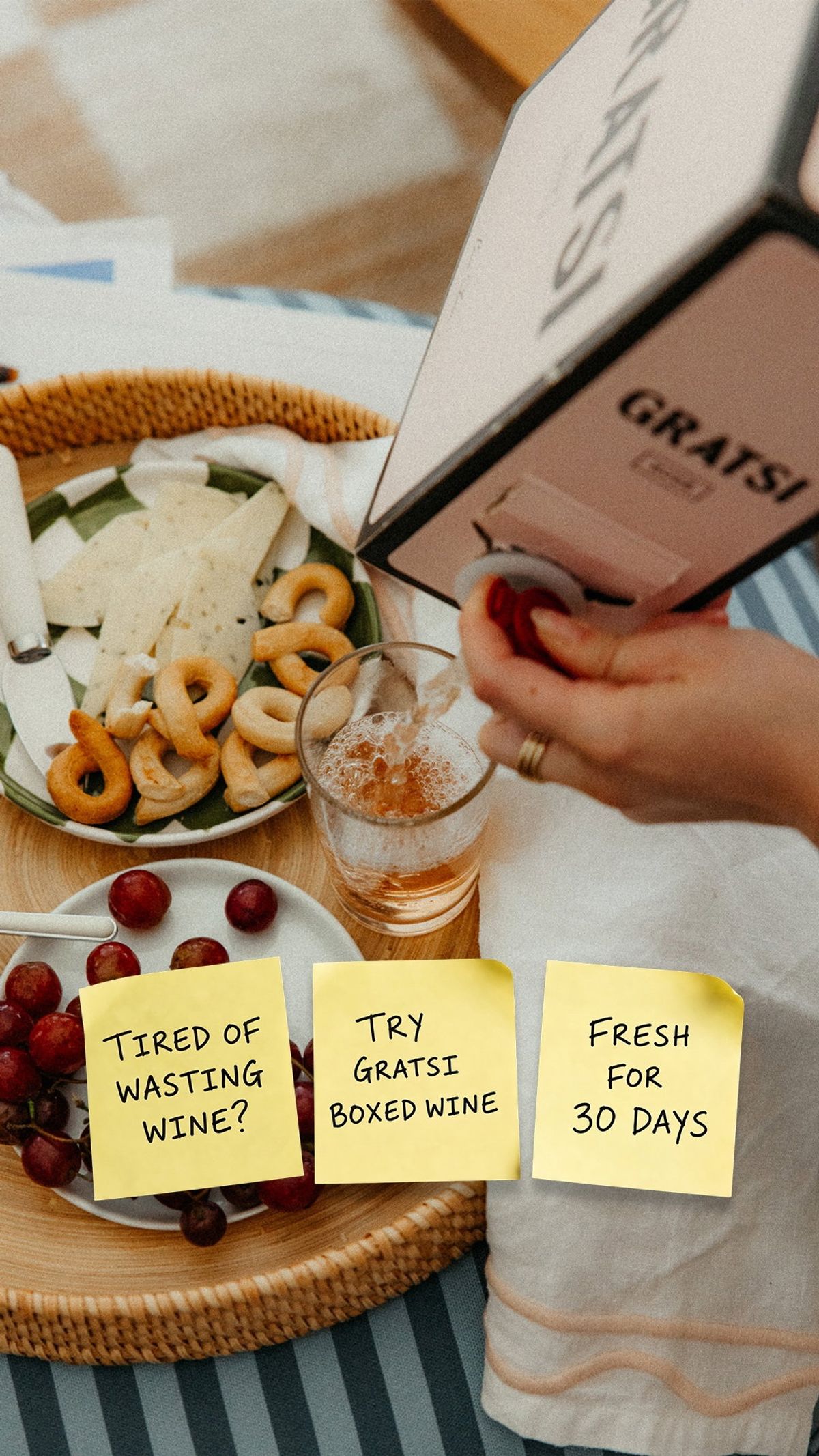
Gratsi wine box with notes about wasted wine and freshness. Source: Vibemyad ad archive. Reference img-94efb6843fe0842e.
Three sticky-note-style panels carry the argument: wasted wine, try boxed wine, freshness. Behind them, someone pours from the box beside food and a glass. The product already looks at home in the moment the copy describes.
This is the example we would start with if a brief felt too abstract. The headline names an ordinary annoyance, and the photograph shows the alternative in use. The viewer does not have to imagine what switching would look like.
The freshness period is Gratsi's claim in the ad, not a result established by this review. For another product, borrow the sequence: name the waste, show the replacement behaviour, and explain the relevant benefit. Keep the promise within what your product can support.
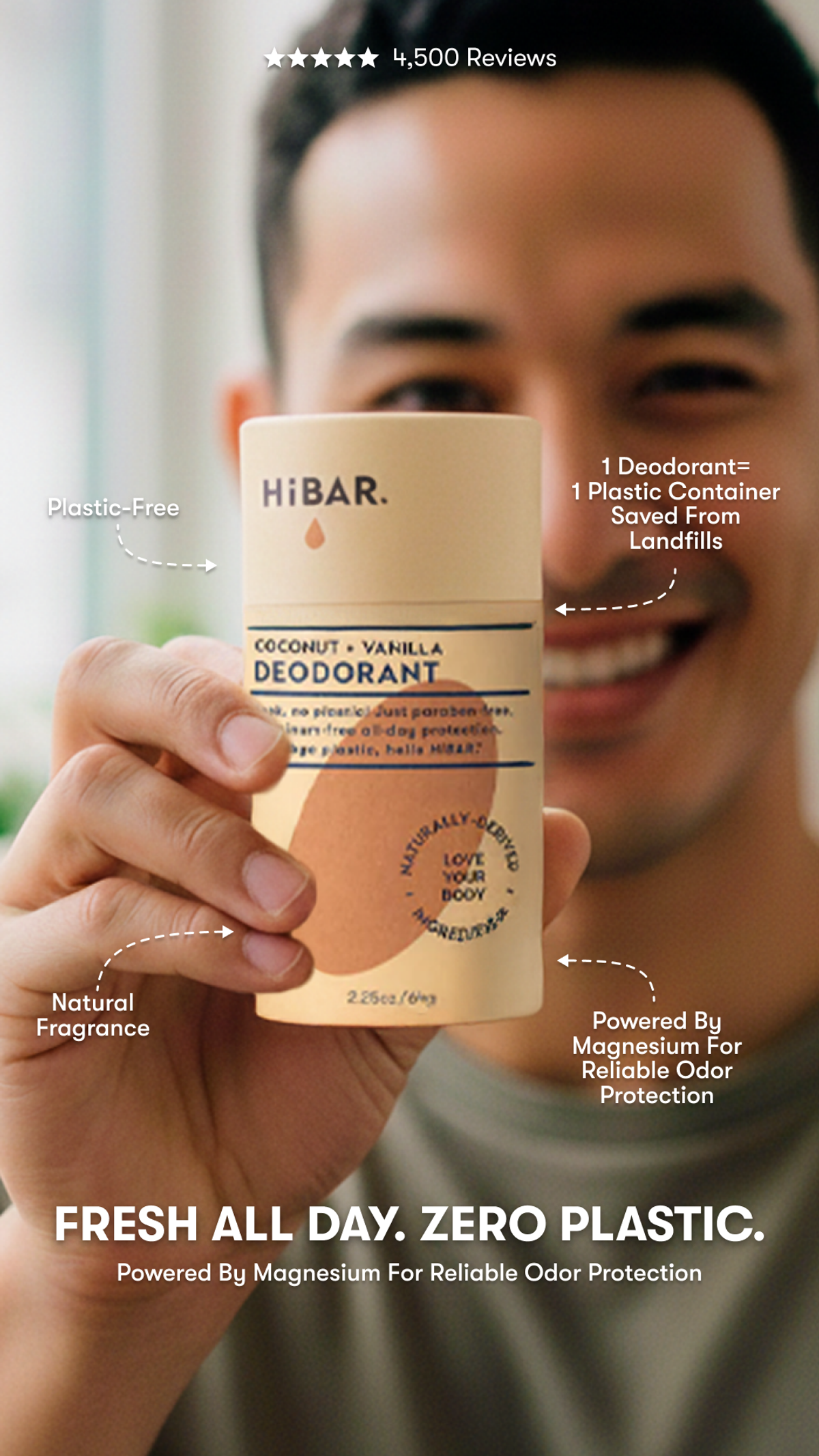
HiBAR plastic-free deodorant with product benefit callouts. Source: Vibemyad ad archive. Reference img-dfc2351963d32362.
Switching to plastic-free deodorant sounds appealing. But the question a shopper still has is simple: will it keep me fresh?
HiBAR addresses both concerns in one line: "Fresh all day. Zero plastic." A person holds the deodorant close to the camera, with arrows pointing to the packaging and callouts explaining its fragrance and magnesium-based odor protection. You can see what you would be buying, not just the environmental promise.
Our favourite detail is that the practical benefit comes first. For a D2C brand selling an alternative to an everyday product, that is a useful starting point: reassure customers about the job they need done, then explain what changes. We would simplify the surrounding callouts so the headline and product have more room on a small screen.
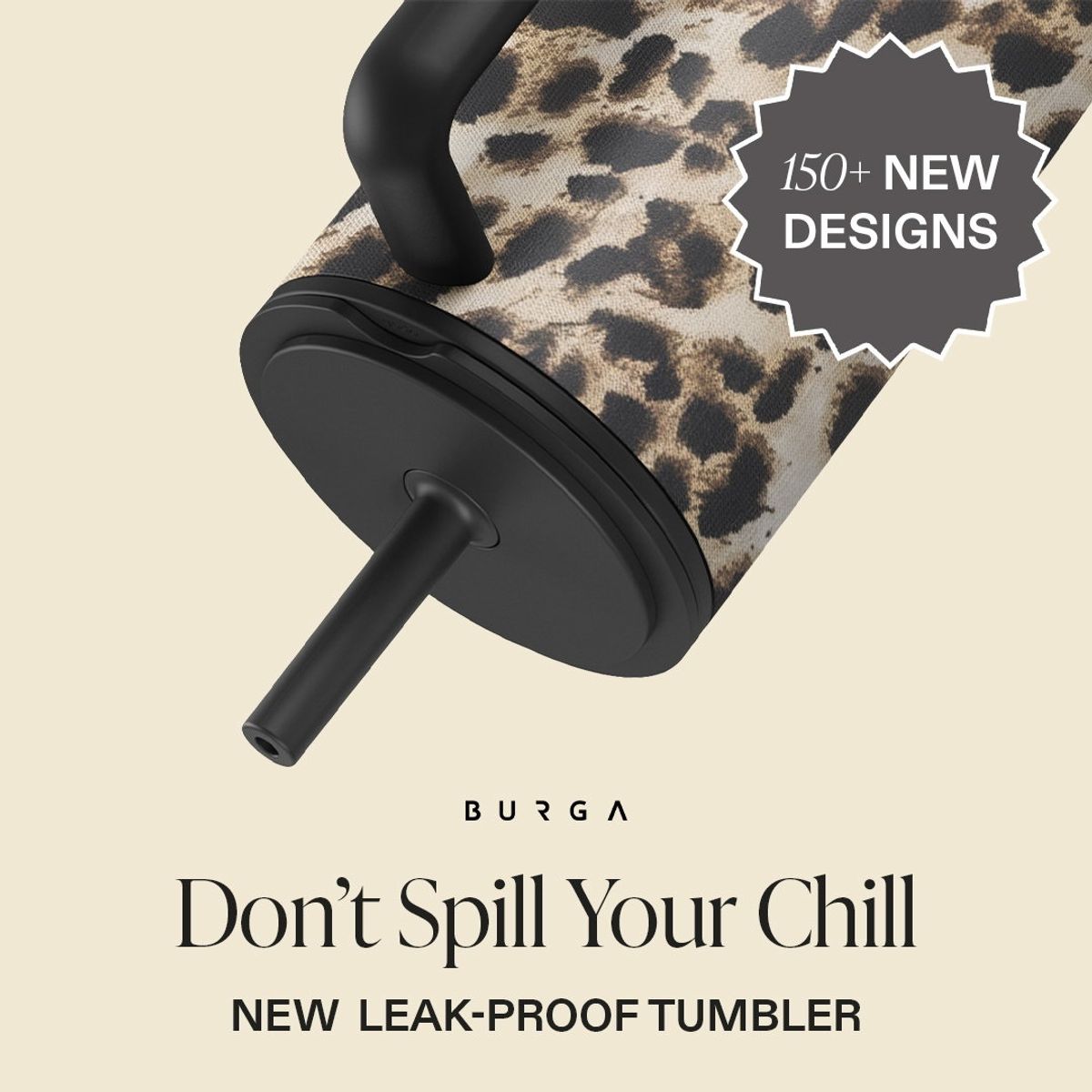
BURGA patterned tumbler with spill headline. Source: Vibemyad ad archive. Reference img-f071dbc665219c3a.
BURGA's tumbler appears at an angle beside "Don't Spill Your Chill" and a leak-proof product claim. The image gives the headline a physical object to attach to. The patterned finish also preserves the brand's interest in style.
We like that the problem does not consume the whole ad. You can understand the practical reason to consider the tumbler and still want it for how it looks.
An angled product photograph does not prove leak resistance. A useful companion creative would demonstrate the lid under appropriate conditions. If your product offers both utility and design, keep both in the brief, then choose which one should lead each execution. Here, the practical concern gets the opening line.
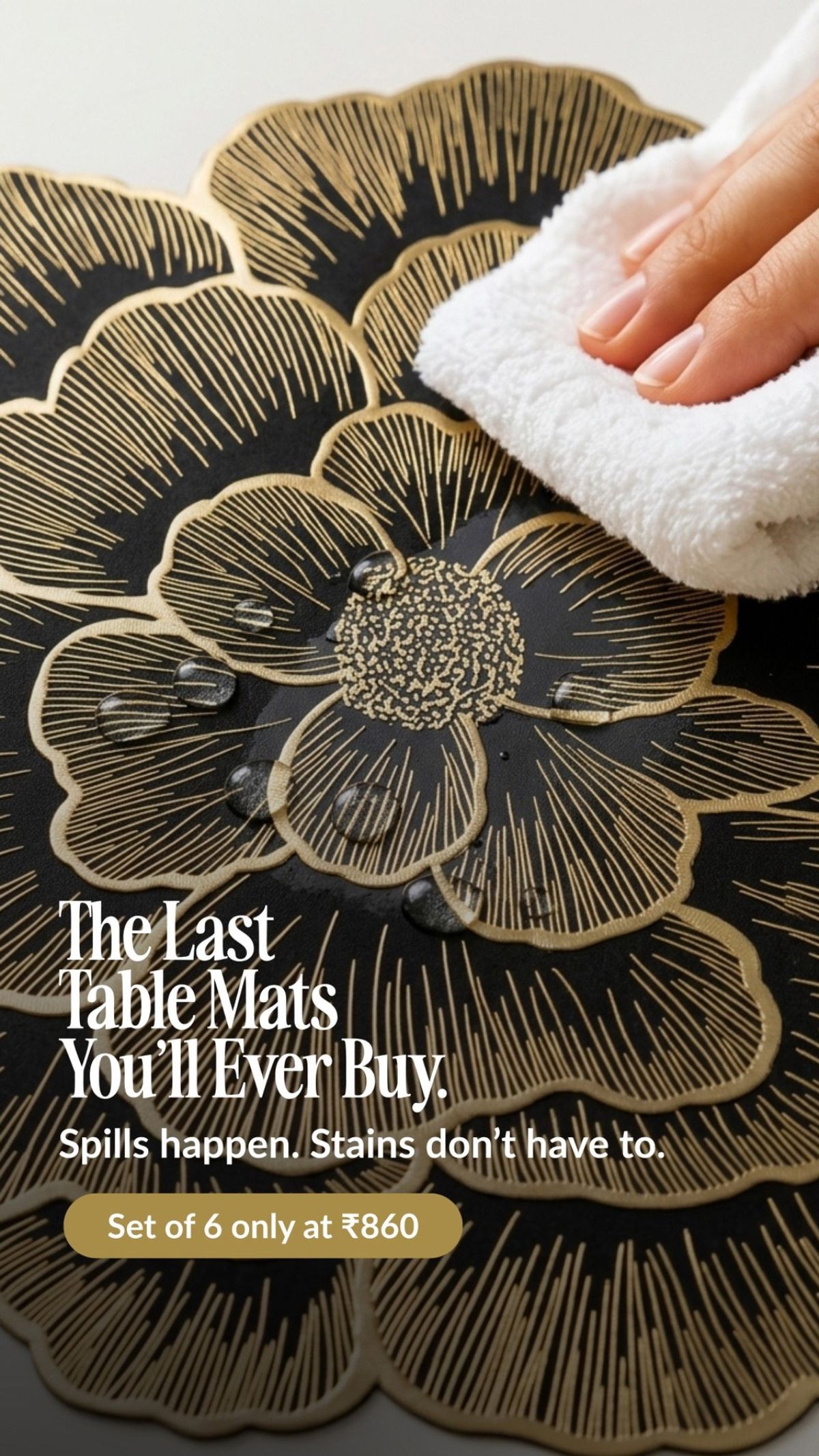
Nestasia table mat being wiped clean. Source: Vibemyad ad archive. Reference img-b0b3a2e06dcca59e.
A hand wipes a patterned table mat while the copy addresses stains. That small action carries the explanation. The viewer can see what someone would do after a spill rather than simply read that the product is easy to maintain.
This Indian-market example includes rupee pricing. Its creative lesson works elsewhere: a close view of a useful action can explain more than another product beauty shot.
The lifetime-style headline is stronger than the photograph can substantiate. We would take the wiping demonstration into a brief and use a more precise, supported durability claim. For home products, showing cleanup, storage, or assembly can give a shopper a concrete reason to choose you.
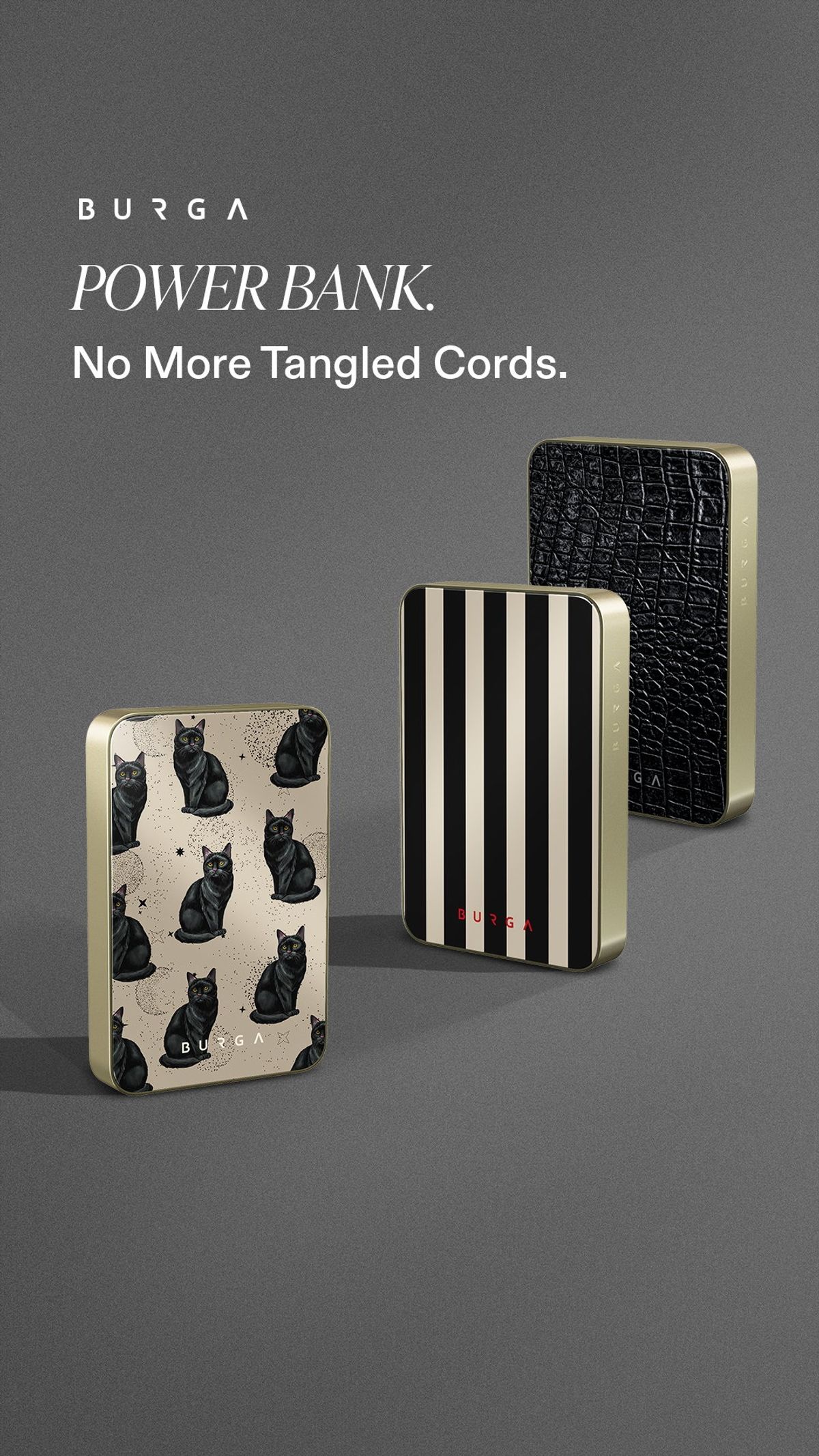
BURGA patterned power banks and tangled-cord headline. Source: Vibemyad ad archive. Reference img-ea6835a57a0a2de9.
Three patterned power banks sit beneath a short promise about tangled cords. The generous space around the products keeps the layout calm, which suits the relief the message is trying to sell.
The headline gives us a buying reason beyond another battery pack. The image, however, leaves the mechanism less explicit. Someone unfamiliar with the product may still wonder how the charging connection works.
That is where we would take the next variation: show the compatible device connected, with a clear explanation of the relevant charging method. The current image is a useful reference for simplicity. The follow-up should answer the question that simplicity leaves behind.
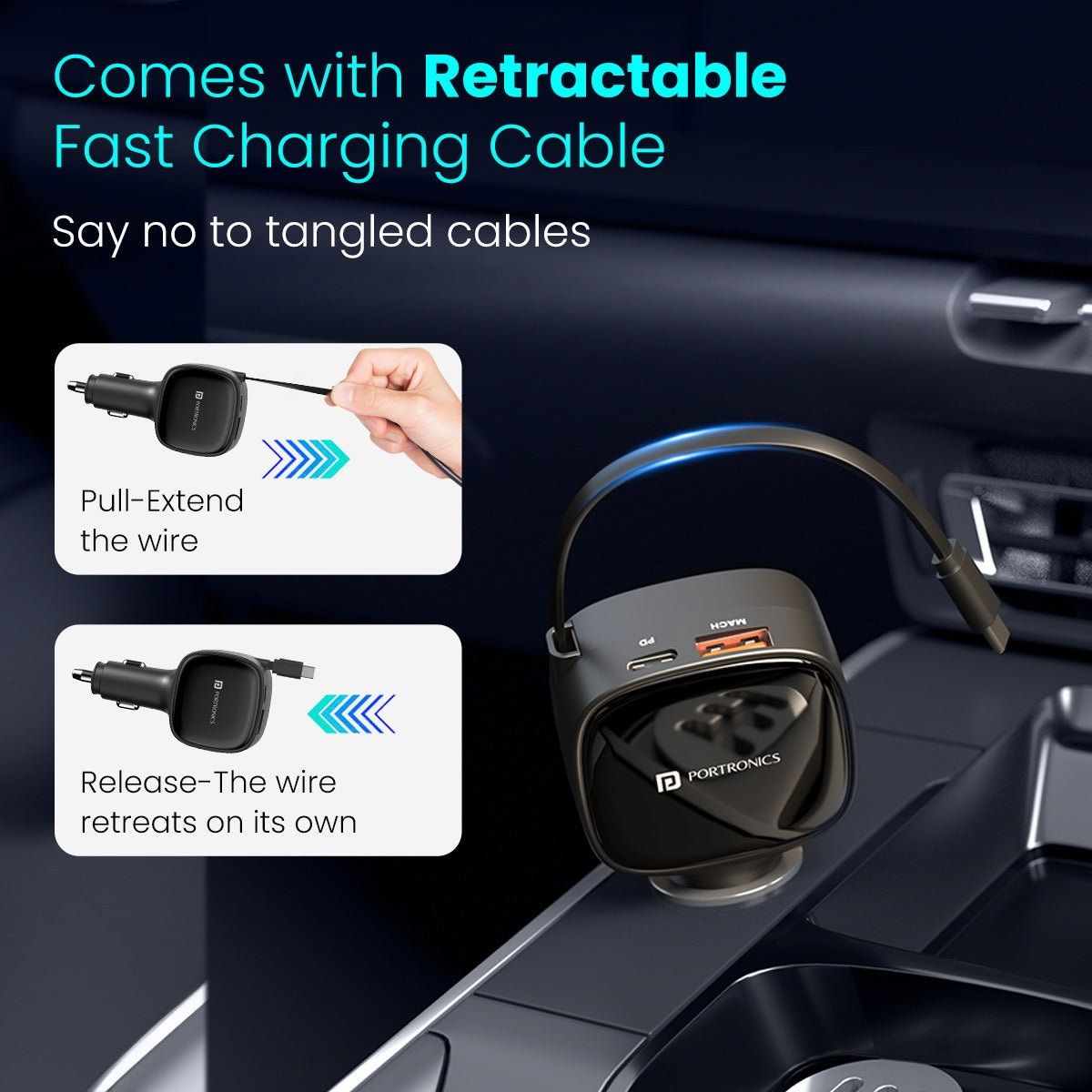
Portronics retractable car charger demonstration. Source: Vibemyad ad archive. Reference img-e20b1ce3d9e2c61b.
This charger creative uses two small instruction panels to explain the retractable cable. You pull to extend it; releasing it lets the wire retreat. The car interior supplies the use case.
Compared with the previous example, this ad spends more space explaining the mechanism. That is a sensible choice for a feature someone may not recognise from the product alone.
For a US campaign using this international reference, adapt the execution to the actual product and local specifications. Our production note would be to enlarge the cable action and reduce competing copy. The most persuasive part is the part that answers the practical question: where does the loose wire go?
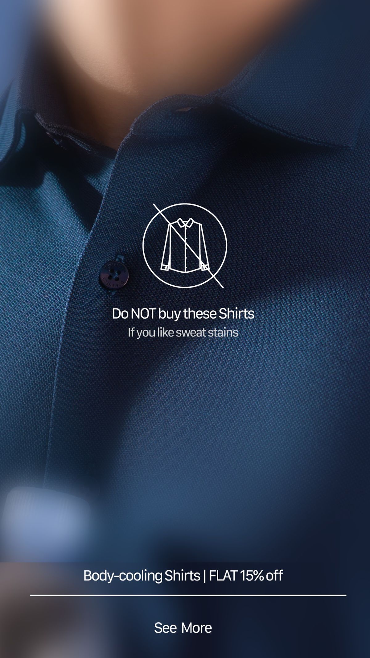
DaMENSCH shirt ad addressing sweat stains. Source: Vibemyad ad archive. Reference img-dd87c397c1f880f0.
The large instruction tells you not to buy the shirts. A smaller line finishes the thought by referring to sweat stains. That reversal creates a brief reason to look again, while the close crop keeps the shirt visible.
This Indian apparel reference is useful because the frustration is specific enough to picture. "Comfortable clothing" gives a creative team far less direction than a concern about visible sweat marks.
The execution depends on reading both lines. If the smaller one disappears on mobile, the ad tells people not to buy and loses its point. We would compare it with a direct version naming the benefit, then look at purchase quality as well as clicks. Curiosity alone would not settle the test.
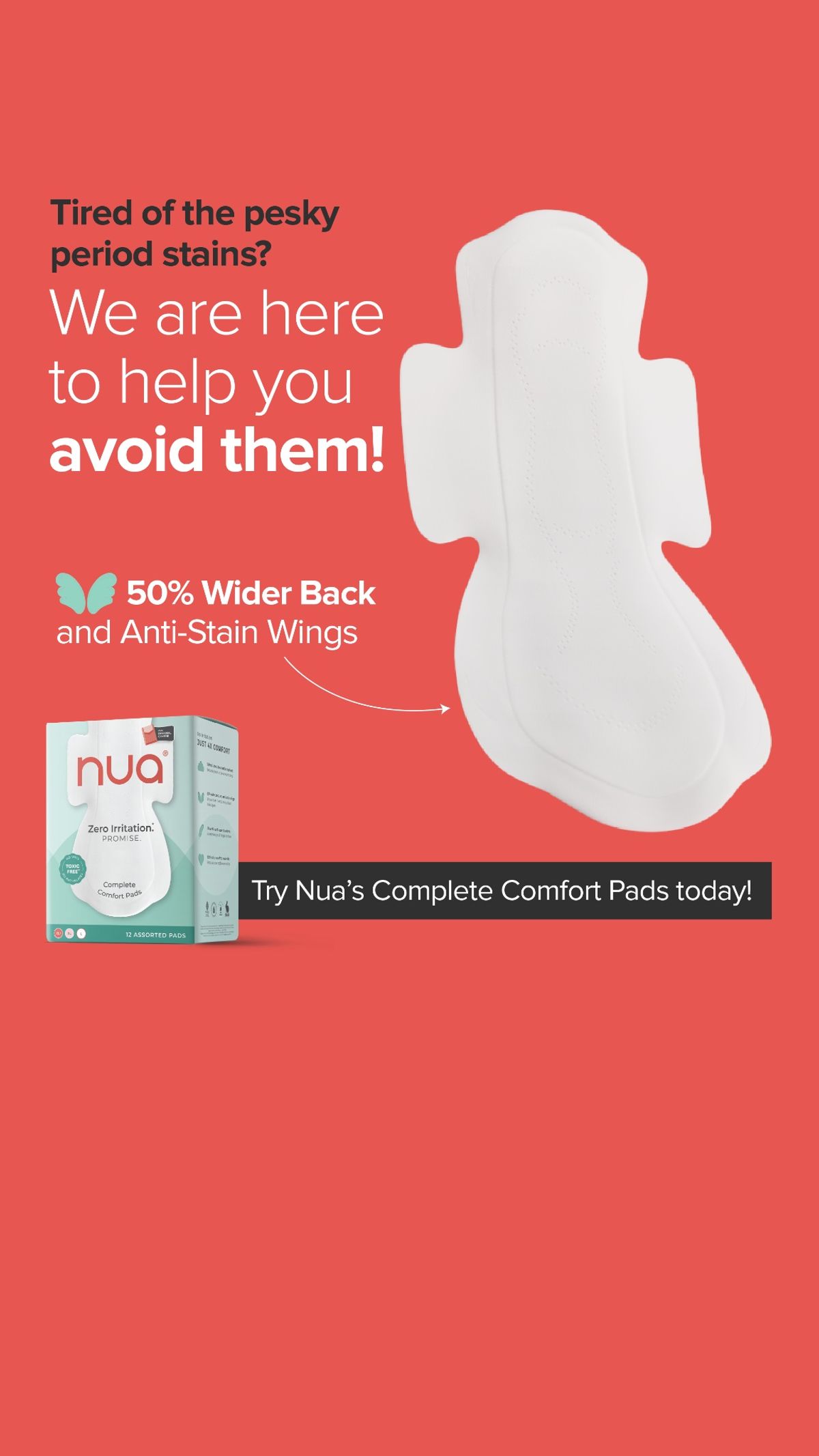
Nua pad showing wider back and wings. Source: Vibemyad ad archive. Reference img-90974f68e58f4de0.
Nua names period stains, shows the pad, and calls attention to its wider back and wings. The copy and silhouette support the same explanation: coverage is the product feature the advertiser wants the viewer to notice.
This is an Indian-market reference, but the brief is easy to understand without knowing the brand. A familiar concern connects to something you can point to in the product.
We would borrow that discipline. If a design feature addresses the problem, give the feature enough space to be seen. Any percentage comparison needs a clear basis in the supporting product information. The lesson is the connection between concern and design, rather than an instruction to reuse the claim.

Wakefit office chair comparison. Source: Vibemyad ad archive. Reference img-d4e41b3b0ab4dc65.
Wakefit places another office chair beside its own and compares adjustability, comfort messaging, and warranty. The red and green markers let the viewer recognise the format immediately.
Of those arguments, adjustability is the most concrete visual starting point. It gives a designer something to show and a shopper something to inspect. The broad comfort promise needs evidence beyond the layout.
For a US furniture brand adapting this Indian-market example, use accurate comparisons with a clearly defined alternative. We would also test fewer rows and a closer look at the adjustment points. A comparison ad earns its space when it helps someone choose; an overloaded checklist can make that decision feel harder.

Kitsch shampoo bar used on wet hair. Source: Vibemyad ad archive. Reference img-e9969e6980c79cf0.
A person uses a shampoo bar directly on wet hair. Lather makes the action recognisable, while the lower part of the ad carries product claims, including a waste-reduction claim.
The demonstration answers an objection that can sit underneath the environmental message: will this different format feel difficult to use? The image supplies a straightforward first answer.
We would keep that action at the centre of a brief for a format-switching product. Show the point where a new customer might hesitate. The numerical waste claim needs its own explanation and comparison basis; the photograph cannot supply that. The reusable idea is to make the alternative feel understandable before asking someone to change a habit.
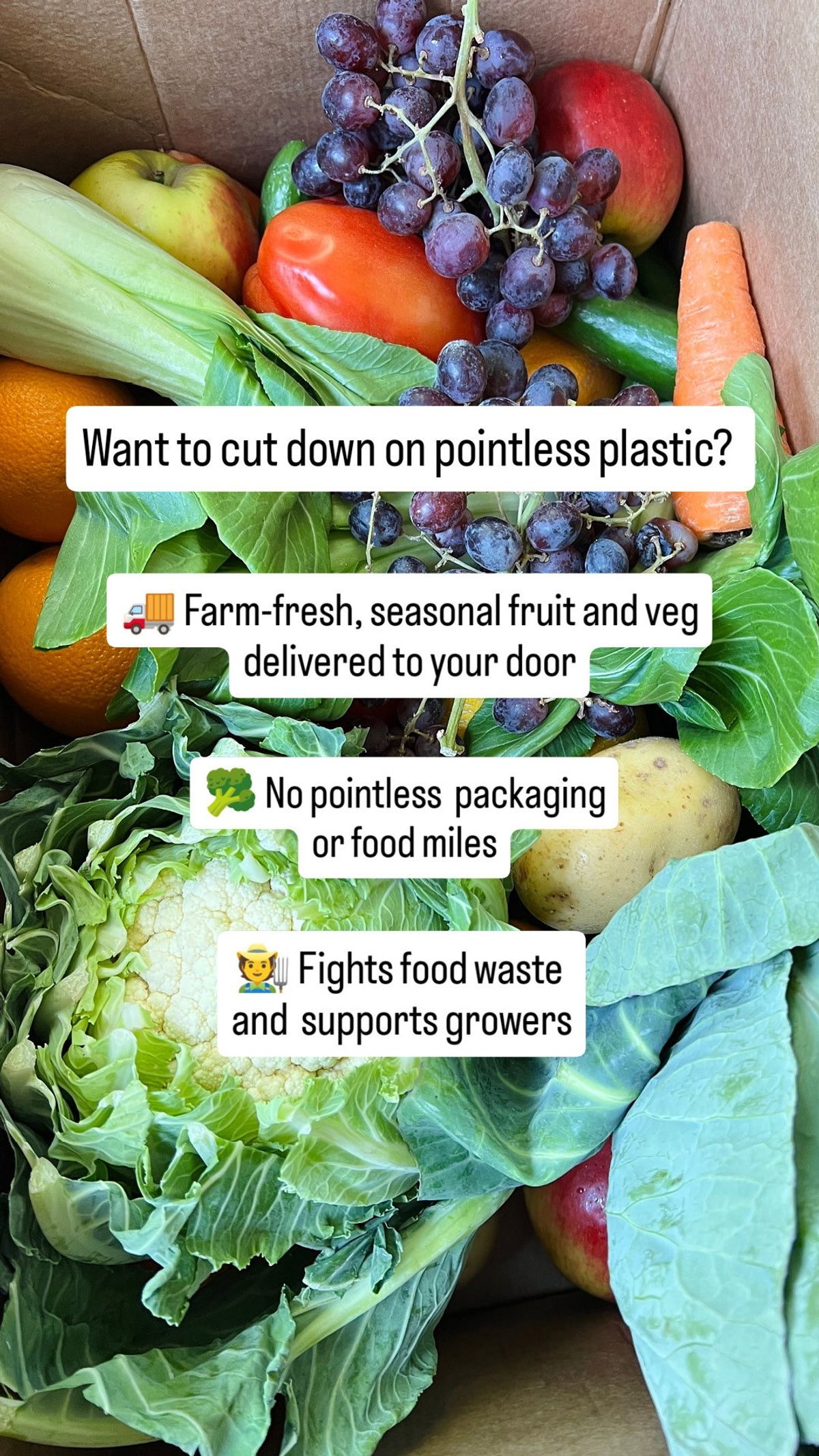
Oddbox produce delivery and packaging message. Source: Vibemyad ad archive. Reference img-a17b2dd31f15c305.
Oddbox opens with a question about unnecessary plastic over a photograph of produce in a box. The remaining copy connects the delivery with packaging, food waste, and growers.
This UK reference has a clear visual advantage: the customer can inspect the kind of delivery being discussed. The proposition has something tangible underneath it.
We would test giving the packaging concern its own execution rather than stacking several environmental arguments together. Those claims each need support, and each could attract a customer for a different reason. A focused version would make the learning clearer. If your product changes a familiar purchase habit, show what the replacement looks like in the customer's hands or home.
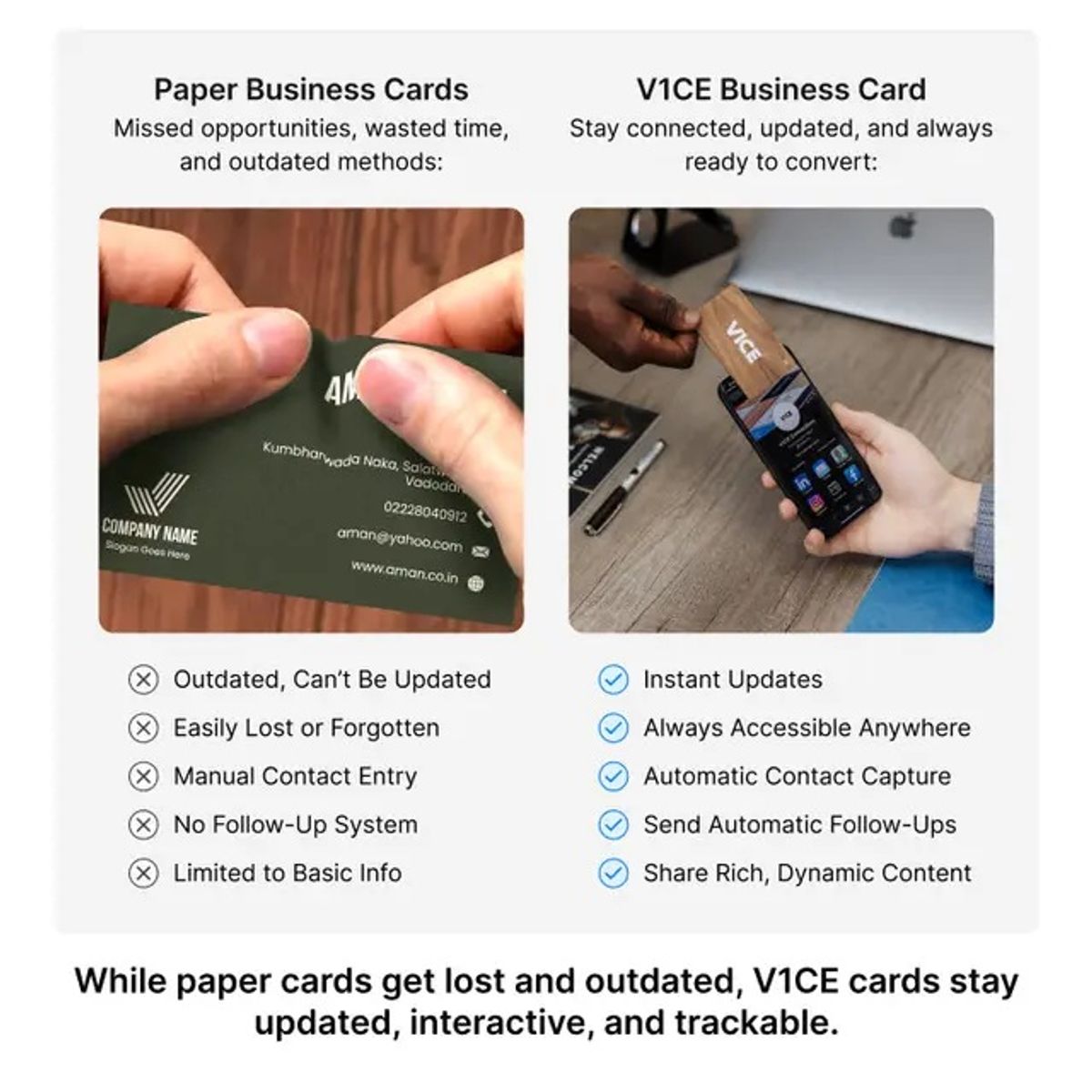
V1CE paper versus digital business card comparison. Source: Vibemyad ad archive. Reference img-ae2ed0d11b4fc472.
V1CE compares paper business cards with its digital alternative. The rows address practical tasks: updating information, capturing a contact, and following up. The pictures establish the two options before the reader reaches the list.
This is an adjacent example aimed at professionals, included because the structure transfers well to consumer products with a familiar incumbent. It compares the customer's process, not just the objects.
For a D2C adaptation, choose the few steps that genuinely change. A refill, reusable accessory, or connected device could use the same approach. Verify every comparison and avoid implying that all alternatives behave identically. We would start with three decisive differences and leave the rest for the product page.
Start with the language customers already use. Read support questions, product reviews, and returns feedback. Look for a recurring situation you can picture. "Hard to use" needs investigation. "I have to untangle it every time I get in the car" gives the team a scene.
Then write one sentence connecting that situation to a feature your product actually has. If the sentence only says the product is better, keep working. The mechanism should make sense without a paragraph of persuasion.
For a hypothetical charging accessory, a brief might read: show the cable catching around nearby objects, show the retracting action, then show where it sits when stored. The example describes a possible creative, not a claim about the products above.
Choose the format around that explanation. A static comparison can show two states at once. Video becomes useful when the movement between them matters. You do not have to delay the product until a fixed timestamp; test how much context the viewer needs while keeping the buying argument clear.
If customer experience supplies the evidence, our testimonial ad examples can help you choose a useful review. The fashion examples explore fit and styling, while the skincare examples examine another category where the explanation matters.
Test a small set of meaningfully different ideas within your available budget. Keep the product, offer, and destination consistent where practical so you can interpret the result. Our first-campaign creative guide explains how to scope that set.
Get notified when new insights, case studies, and trends go live — no clutter, just creativity.
Table of Contents