September 29, 2026 • 6 min read

September 29, 2026 • 6 min read
If you showed us two ads for an unfamiliar product, one beautifully styled but vague, the other less polished but clear about what the product does, we would start with the second. We can improve its design. The first still needs a reason for someone to buy.
That is our starting point at Vibemyad Marketing Agency: an attractive creative is not automatically an effective ad. Design earns its place by helping the right person understand and want the product.
An effective ad moves its intended audience toward the result you are paying for. For a D2C sales campaign, that means helping turn attention into purchases at an acquisition cost the business can support. A beautiful image, a busy comments section or a high click-through rate cannot establish that on its own.
Before measuring the result, you need a message worth testing. A customer meeting your brand for the first time should be able to work out what you sell, why it matters to them and what to do next. They should not have to guess what the product actually does.
Imagine a new shoe brand. A shoe photographed on a plinth with the headline "Move differently" tells you little. A picture of the same shoe beside a puddle, with a clear waterproof message, gives a rain-soaked commuter a reason to look. The second concept connects the product to a problem they recognize.
Start with one buying question. For a protein bar, it might be how much protein the customer gets for the calories. For a shoe, it might be whether their feet stay dry. For a sleep product, it might be whether two people can sleep comfortably at different temperatures.
Then decide what belongs in the image and what needs words. Show the product clearly. State the useful benefit. Add the evidence or explanation needed to make it believable. Make the next step obvious through the ad's copy, destination and CTA.
This is not a request to squeeze the product page into a square. Extra information helps only when it answers a real buying question. If five badges make the main benefit harder to find, the ad has become less useful.
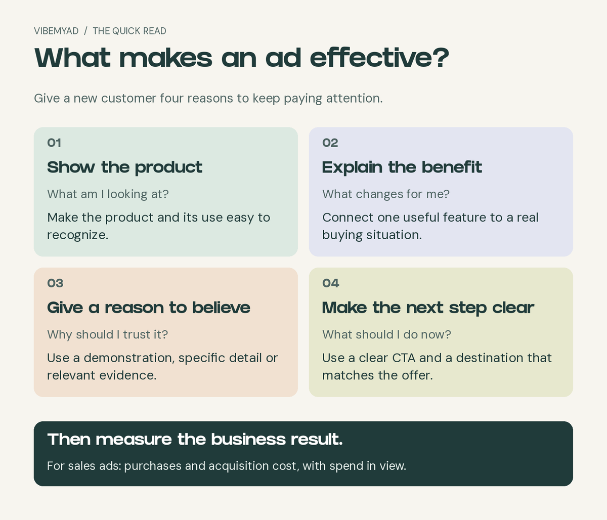
Four questions to answer before you judge the design.
An ad that stays in an advertiser's rotation is worth examining because the brand has continued to use that message. It gives you a better research question than simply asking which image you like.
The three static ads below come from VMA's ad archive. Their recorded start and end dates span 68 to 177 days. Those spans do not establish uninterrupted delivery, spend or profitability. We use them to select references, then judge the communication visible in each ad. The product claims shown belong to the advertisers.
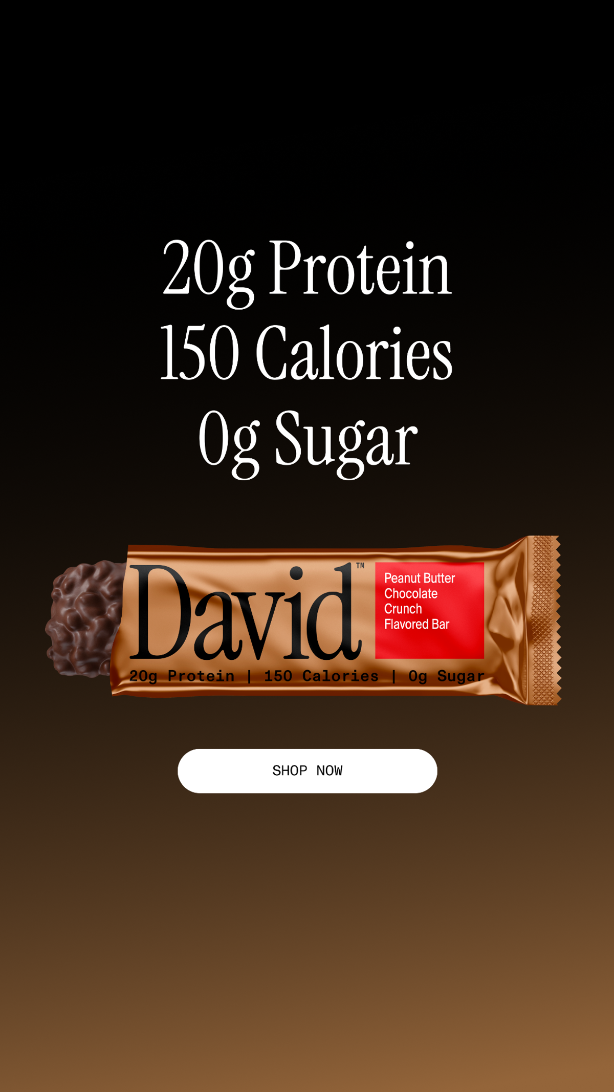
David Protein. VMA archive: March 18 to September 12, 2026, a 177-day recorded span.
The first thing you read is the nutritional proposition: 20g protein, 150 calories and 0g sugar. For someone comparing protein snacks, those numbers answer a more useful question than a broad promise to "fuel your potential."
The order matters. Protein states what the shopper gets; calories and sugar put that amount in context. The ad makes its comparison criteria available without asking the reader to open a nutrition label.
The unwrapped bar then shows what the customer will eat. Its texture and chocolate coating add an appetite cue to an otherwise numerical argument. The packaging keeps the brand and flavor attached to that promise.
Finally, the white Shop Now button is easy to find against the dark background. There is a straightforward path through the image: read the proposition, inspect the product, take the next step.
Our takeaway: if customers compare your category using a few concrete attributes, put the relevant ones together. Keep the food or product itself visible. A list of specifications alone gives people little to want.
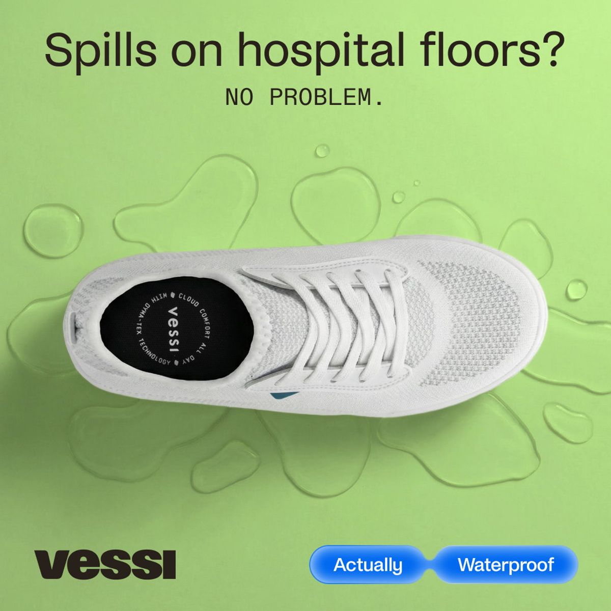
Vessi. VMA archive: July 23 to September 29, 2026, a 68-day recorded span.
Vessi opens with "Spills on hospital floors?" That single question gives the ad a setting and a potential customer. A healthcare worker can recognize the situation without reading a paragraph about footwear.
The shoe occupies most of the image. You can see the product you would buy, while the surrounding droplets reinforce the spill context. The short waterproof message supplies the functional reason to consider it.
The green background and generous spacing make a specific promise easy to read. This is a designed ad, but the design supports the explanation. Removing the headline would turn it into a much more general shoe photograph.
Our takeaway: translate a feature into the moment someone needs it. "Waterproof" is a property. Keeping your feet dry when something spills at work is a reason to care. A different audience might need a different setting, even when you sell the same shoe.
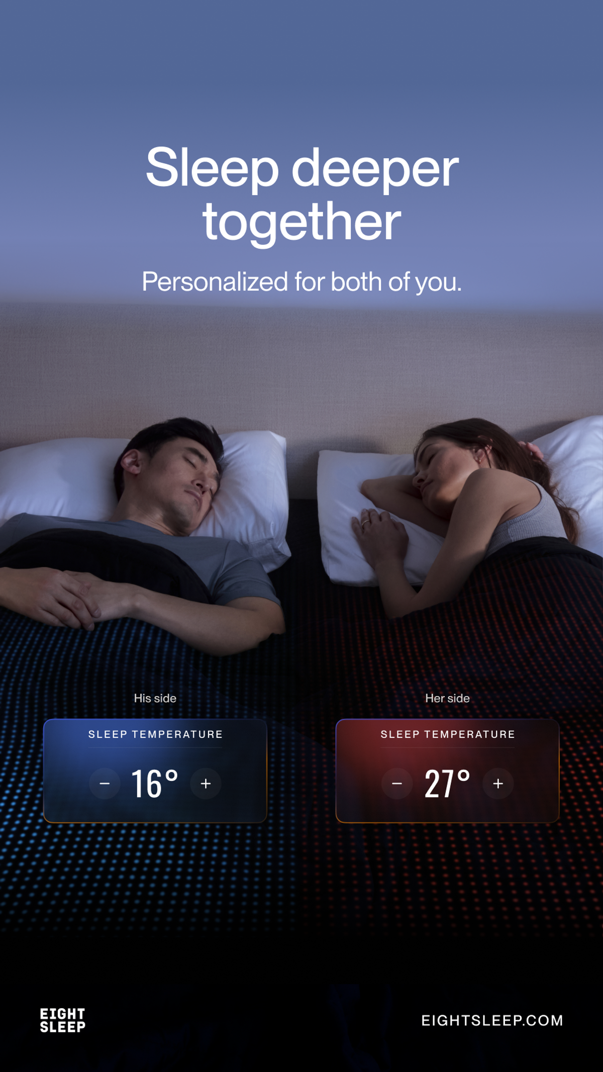
Eight Sleep. VMA archive: January 26 to May 29, 2026, a 122-day recorded span. This execution displays temperatures in Celsius.
"Sleep deeper together" starts with a shared outcome. The couple in bed makes the context familiar; the separate temperature displays explain what is different about the product.
The blue and red treatments divide the bed into two personal settings. You do not need a technical description to understand the proposition: the two sleepers can have different temperatures.
The supporting line about personalization now has something concrete behind it. Without the temperature displays, the same image could advertise bedding or a mattress. Without the couple, the controls would feel like an isolated feature.
Our takeaway: show the feature changing the customer's experience. For a US execution, we would use familiar temperature units and check that the destination explains the system, compatibility and price. The ad opens the buying conversation; the product page must continue it.
For a hypothetical waterproof commuter shoe, our brief would read: "Show a person stepping through a wet sidewalk in the actual shoe. Lead with keeping feet dry on the way to work. Support the waterproof claim with the brand's product evidence. Send the shopper to the featured shoe, with available sizes and price easy to find."
That brief gives the photographer a scene, the writer a benefit and the media buyer a destination. It is more useful than "make something like Vessi."
If you have the benefit but cannot decide how to express it, our guide to Meta ad copy versus visuals explains which job to give each element.
After launch, judge a sales ad using purchases and acquisition cost alongside spend. Use clicks to investigate interest, and the landing page to investigate what happens next. If shoppers click but do not buy, a prettier image may not solve the problem.
For more ways to connect a customer problem to a visible product benefit, browse our problem-solution ad examples.
Get notified when new insights, case studies, and trends go live — no clutter, just creativity.
Table of Contents