September 29, 2026 • 6 min read

September 29, 2026 • 6 min read
A premium handbag and an unfamiliar sleep device can both need excellent photography. They do not necessarily need the same amount of explanation.
The handbag's shape, styling and finish may be the reason someone wants it. A photograph of the sleep device may leave the same person asking what it actually does. That is why we would not choose copy or visuals as the universal winner on Meta.
Our view at Vibemyad Marketing Agency: give the most space to whatever the customer needs to make the next buying decision. Sometimes that is a close look at the product. Sometimes it is a sentence that makes the product worth looking at.
Ask what the person already knows. Do they recognize the brand? Can they identify the product from the photograph? Are they choosing on appearance, trying to solve a problem, or deciding whether the offer is worth the money?
A buyer considering a bag for its appearance needs to see proportion, texture and how it looks when carried. A buyer considering a temperature-controlled bed needs to understand the benefit before the product photograph means much.
Budget and expectations matter, but income alone is a poor creative brief. A wealthy shopper can still need detailed reassurance about an unfamiliar purchase. Someone with a smaller budget can still choose a familiar product because they love its design.
Write a more useful audience description: "Already knows the category, likes the product, still uncertain about the price" or "Has the problem, has never heard of this solution." Those descriptions tell a writer and designer what to address.
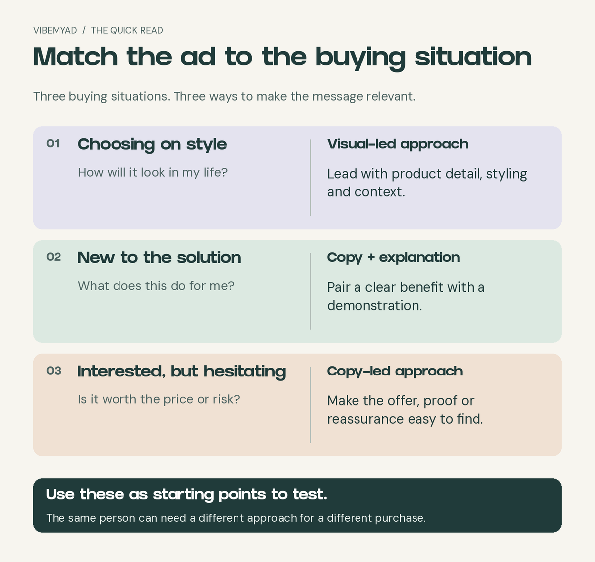
Match the message to the customer's buying question. These are starting points for testing.
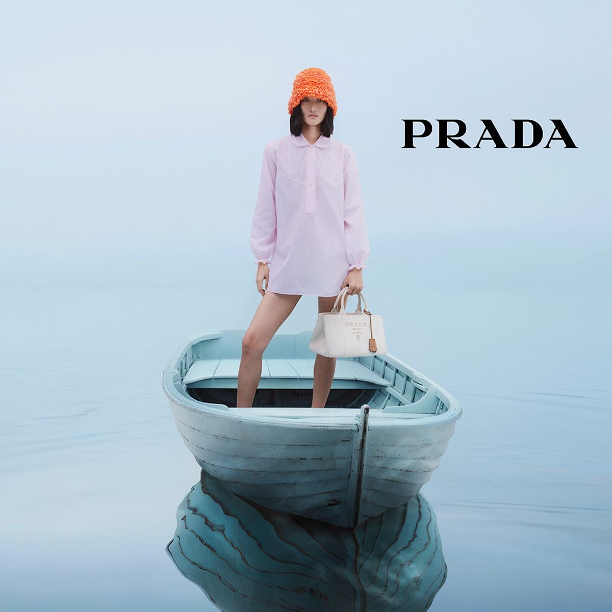
Prada fashion ad, sourced from the VMA ad archive.
The model, white handbag and pale blue boat create a complete setting. The pink outfit and orange hat give the composition contrast without filling it with promotional labels. The visible copy is essentially the brand name.
Here, the image contains product information. You can see the bag's scale against a person, the way it is carried and how it fits into an outfit. A paragraph describing those details would be less immediate.
The open space keeps the styling easy to inspect. Adding a large discount badge or several feature callouts would compete with the presentation that gives this execution its character.
For an audience already interested in Prada or this kind of fashion, that is a plausible reason to lead with the visual. It is not evidence that affluent people refuse to read, or that every unknown D2C brand can communicate as much with a logo.
What we would borrow: show the product in the context the customer wants to imagine. For a new accessories brand, we would also test a concise line about the specific design or material advantage rather than assuming the name already carries the meaning.
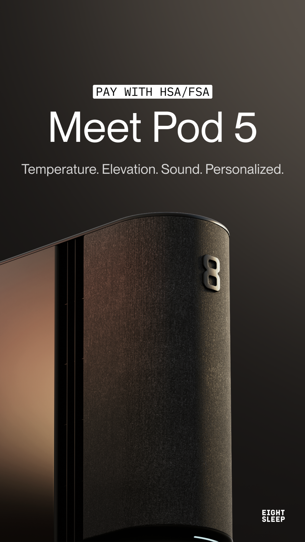
Eight Sleep Pod 5 ad, sourced from the VMA ad archive. Payment wording reflects the original advertisement.
Eight Sleep uses a dark background and a close, carefully lit product image. The finish and shape get attention, but the photograph alone does not explain why someone would want this equipment beside their bed.
"Meet Pod 5" names the product. The next line identifies temperature, elevation and sound, then ties them to personalization. Those words give the photograph a purpose.
The HSA/FSA payment message addresses another part of the decision: how an eligible customer might pay. It is supporting copy with a different job from the headline. A brand using a payment message like this must make eligibility and terms clear on its destination.
This is where the copy-versus-visuals argument becomes too simplistic. The styling presents a considered piece of equipment. The words begin explaining its function and purchase route. Remove either and you lose something useful.
What we would test for an unfamiliar audience: keep the product photograph, but compare the introduction headline with one clear customer benefit. That would test whether naming the product or explaining its relevance earns more useful traffic. It is a proposed test, not a claim about Eight Sleep's results.
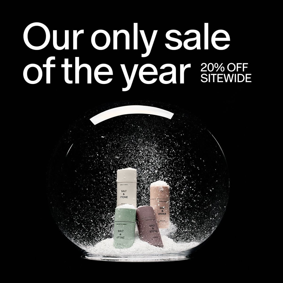
Salt & Stone sale creative, sourced from the VMA ad archive. This is a historical offer, not a current promotion.
Salt & Stone leads with "Our only sale of the year" and pairs it with a 20% off sitewide offer. The products sit inside a snow-globe composition against a dark background.
The image keeps the packaging and seasonal mood visible. The copy gives a shopper a reason to consider purchasing at that moment. The sale message would disappear if you removed the words, however polished the photograph remained.
We would consider this approach for someone who already understands the product and is weighing when to buy. That is an audience hypothesis based on the message, not access to the brand's targeting.
For a first-time viewer, the same execution may leave more questions about the products. The accompanying ad text and landing page would need to answer them. For an interested shopper, repeating a full product explanation could distract from the offer.
What we would borrow: let the current buying obstacle determine the headline. When value or timing is the obstacle, make the offer readable while keeping the product presentation consistent with the brand.
If appearance is a major buying reason, improve the product view first. Show the detail, scale or use that helps someone choose. Keep enough copy to identify the offer.
If people cannot tell why the product matters, write the benefit first. Then choose a visual that makes it easier to understand. A stylish photograph cannot explain an invisible feature by itself.
If the customer understands the product but hesitates, address the specific objection. Depending on the purchase, that might mean price, delivery, sizing, evidence or returns. Include the relevant reassurance, not every possible reassurance.
Our breakdown of what makes an effective ad shows how three other brands connect product information to a buying reason.
Suppose you sell a new bag with an unusually useful laptop compartment. Your question is whether shoppers understand that feature. Start with the same photograph and offer, then compare a design-focused headline with a laptop-fit headline. Once you have a promising message, compare an exterior photograph with a clear interior view.
Keep the destination and audience setup comparable. If you change the headline, image, offer and landing page together, you can compare the complete concepts, but you cannot confidently credit one element.
The six creative choices discussed across these two articles are references, not verified performance results. For your own sales campaign, compare purchases and acquisition cost, with spend and purchase counts visible. A cheaper click can still lead to a more expensive customer.
Use our first-campaign testing guide to scope the number of variations your budget can support.
Before asking the team for another design, finish this sentence: "The customer needs to understand ___ before they will consider buying." That answer should shape both the copy and the visual.
Get notified when new insights, case studies, and trends go live — no clutter, just creativity.
Table of Contents


Arpita Mahato
Content Writer, Vibemyad

Arpita Mahato
Content Writer, Vibemyad


Ananya Namdev
Content Writer, Vibemyad